Sunday, June 30, 2013

Pinocchio Art


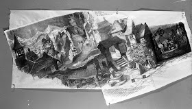
Just like the personality animation in Disney's Pinocchio the world that was created for the characters to live in is spectacular. Many different locations had to be explored, from an Alpine village and an amusement park island to the bottom of the ocean and the inside of a whale.
Vis dev art as well as layouts were carefully planned and rendered with light that reminds me of Rembrandt. 
Every piece of art you see from this film indicates just how much of a labor of love it was for everyone involved in the production. Of course the Disney artists had deadlines to go by, but studying this kind of work you can almost count the overtime hours, and see their determination to make Pinocchio the absolute best film possible.


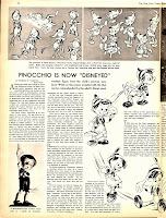
A 1939 article from New York times Magazine.


Thursday, June 27, 2013

Happy Birthday!


Today is Kathryn Beaumont Levine's birthday.
All best wishes, and remember, Kathy, tomorrow is your un-birthday!!

Wednesday, June 26, 2013

Tigger Outtake


These are a few scenes with Tigger and Pooh that ended up being cut from the feature film Winnie The Pooh. As I mentioned before Tigger's entrance used to be very different from the final version. Just like in the original shorts, he was always looking for something or someone to bounce on.
We animated the whole sequence that way, but after a screening it became clear that Tigger really wasn't that interesting just bouncing around. So the sequence was rewritten, and new and different business was added which included a red balloon. It turned out for the better.

I did enjoy animating these early scenes though.
Tigger grabs the wooden sign away from Pooh and enthusiastically starts bouncing on it, until he gradually looses interest. This was a scene that required some careful analyzing. Tigger's emotion starts out being euphoric, then he becomes bored and somewhat annoyed. It was lots of fun doing it.
I animated both characters for the first two scenes, Marc Henn did Pooh in the last shot.


                                                                                                         © Disney

Monday, June 24, 2013

Mel Shaw's Beauty & the Beast


Mel Shaw was a very cool guy.
He was funny, and he could draw everything…really well…really fast! He was a wizard with pastels.
I first saw his art when I started at Disney in 1980. His office was overflowing with incredible Vis Dev work for a proposed sequel to Fantasia, then titled Musicana. As I mentioned before, the whole concept for that film was stunning!
Behind Mel in the photo are sketches for the Scheherazade sequence (top) and for Finlandia.


Mel later became a member of what I should call Le Groupe, a selection of Disney artists who in 1989 were sent to London and later the Loire Valley in order to prepare the next animated feature Beauty & the Beast. (I was lucky enough to be part of this group along with Hans Bacher, Glen Keane, Tom Sito and Don Hahn.)

You can find out more about this research trip on Hans' great blog:

Here are a few wonderful Mel Shaw doodles and sketches from this earlier version of the film.
They include Belle, the horse Philippe, but also a later eliminated character, her aunt Marguerite.


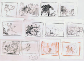
These continuity pages show several story threads: 
Maurice gets mad at his sister Marguerite, and Belle rides off on Philippe to find and prevent Gaston from killing the beast. Lovely thumbnails.


A couple of atmospheric pastels. Did this man know light or what ?!


I believe this photo was taken in a London restaurant. Hans Bacher might correct me on this.
After the death of his first wife Mel married John Lounsbery's widow Florence. She came along on the trip. And there's me with Hans.


Mel passed away not long ago on Dec. 5, 2012.
He had talents in so many areas, he was an architect, sculptor, painter and story artist.
There really wasn't anything he couldn't do. 

Sunday, June 23, 2013

Character Designs from Long Ago


Going through my archives I keep finding drawings I didn't know I had.
Like these peculiar design sheets that bring back a lot of memories.
Way back I was on the original crew for Oliver & Company. The idea of replacing some of the original human characters with animals sounded very appealing to me. I did a first pass on most of the main characters, including Fagin, before story work was put on hold. I eventually left the project to work on Roger Rabbit.
This is a small street gang made up of cats and dogs who would eventually run into the kitten Oliver.


At one point Michael Eisner wanted the animation department to pursue the idea of turning the book The Catcher in the Rye into a film. I only worked briefly on the project before it was cancelled.
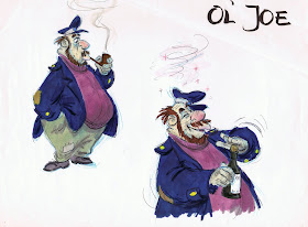
I do remember the main character being a dog. These drawings show the old sailor  Ol' Joe, no idea how he fit into the story back then.


I did this design of the Gorilla Bouncer from the Ink & Paint Club in Roger Rabbit in a hurry.
The footage was ready to get animated, but we didn't have a final model on him yet.
Dick Williams asked me to come up with something quickly, we faxed the sketch to Robert Zemeckis , and within ten minutes he gave his approval from the US. Once in a while things have to move fast even in animation. 


Friday, June 21, 2013

Pierre Lambert's Sleeping Beauty


I need to recommend this new coffee tablet/art book by Pierre Lambert, who in recent years has published several extraordinary volumes on Disney animated features.
For now Sleeping Beauty is only available as a French edition, but believe me, even if you don't speak the language, you will be amazed.
There are endless top quality reproductions of backgrounds, cel set ups, vis dev work, layouts and animation drawings. A few pieces from my collection made it into the book as well.
If you like this movie, the book really is a must have. 
You can order it from Stuart Ng right here:


I know the price is a bit high, but the book is totally worth it. So if you have a birthday coming up, or if you have $170 to spare, treat yourself to a spectacular insight into the making of Sleeping Beauty.

To celebrate the book's release I am posting these animation drawings which are NOT included in this edition.

"Here is your precious princess!" Maleficent is about to uncover Aurora's body in front of the Three Fairies. A great scene by Marc Davis, subtly drawn with incredible weight and dramatic overlap in the fabric.


Frank Thomas researches design and proportions for the Three Fairies.


This sketch almost represents their final appearances.
I've heard people say that the Fairies softer designs don't match the graphic style of the movie.
But as you can see, Frank followed the same principles of strong straight against curved lines, just like other animators for their characters.


I love these explorations, variations on one main idea. Subtle shifts for shapes and forms reveal individual personalities.


A couple of Prince Phillip roughs by Milt Kahl. He has just been freed from the chains around his wrists. The way he turns his hand to loosen up the joint is awesome.


A huge rough of Samson, the most stylized horse in Disney animation.


Milt also drew these King Hubert pencil/watercolor designs, before his outfit was simplified.


King Hubert runs to meet his son, he is about to discuss Prince Phillip's future.
An absolutely gorgeous drawing, this is a hop to break up the pattern of the run.


Monday, June 17, 2013

Мушка Update


It's been very busy around here, making a movie!
The story of "Mushka" is roughly storyboarded all the way through. It's a great feeling to be able to follow the whole story visually for the first time instead of reading the script.

That's me in a recent story meeting with scriptwriter Myka (sitting) and Matthieu Saghezchi who helped me draw the first rough pass. As soon as we were done sketching this early version, we started on corrections and improving ideas. That process will continue all the way through production.
But the story reel will go up soon, can't wait to see sequences timed out with temporary music and dialogue (there will be very little of that actually).
There are a couple of character designs that need to be finessed….but all in all that's where we are at the moment. 
So much fun!!


Photo and sketches ©Andreas Deja

Saturday, June 15, 2013

Joe Grant Sketch


I don't have much time tonight for a post, still, I want to put up something.
I find this sketch showing early versions of Pinocchio and Honest John absolutely fascinating.
Evil and innocence in one drawing. The tone here is much darker and more severe than what we see in the final film.
The fox's expression reminds me a little of Joe Grant's designs of the witch for Snow White.
It is a haunting image, no trace of comedy whatsoever.

Friday, June 14, 2013

Fantasia Maquettes


I have always been in awe of Disney's character model department. Joe Grant was the head of this unit during the Golden Age Of Animation. 
Not only were rough model sheets produced here, but also three dimensional sculptures to help the animators visualize their characters.
The chosen poses for these maquettes always showed beautiful movement, appeal and expressiveness. The final look in the film might differ a little from these early representations, but what a great source of inspiration for the animation.
The photo above is from the 1941 Disney film The Reluctant Dragon, which includes a tour through Disney's magic animation factory. The guest being shown around is actor/writer Robert Benchley, who is visiting a made up model department.
Every one of these little sculpts is a masterpiece, representing not only the personality of a character, but the essence of Disney, period!