Wednesday, July 30, 2014

Ronald Searle 1952


This Searle illustration, probably done for a magazine, is fascinating to me. You have to go back as far as the early 1950s to find a tattoo artist depicted like a university professor.
Searle creates an incredibly detailed backdrop for his two subjects, but your eye still stays on the two men, who are drawn with less line work. This type of realistic and thoroughly observed work informs you about Searle’s solid drawing knowledge, which served as a basis for his much more caricatured book illustrations. A true master, who continues to influence many artists to this day. 

Monday, July 28, 2014

Mr. Snoops


This post on Madame Medusa’s partner in crime Mr. Snoops is long overdue. 
Brilliantly drawn and animatedly by Milt Kahl, his part in the movie The Rescuers is relatively small. This is due to the fact that actor Joe Flynn, who voiced the character, died in 1974 during production of the film. Director Woolie Reitherman decided to build Snoop’s role around the already recorded dialogue, instead of using a sound-alike actor for further development. 
Snoop’s design is based on animation historian and teacher John Culhane. Milt had given a talk at his class in New York and was inspired by John’s appearance. 


Joe Flynn


John Culhane (from a magazine article in “American Film”)


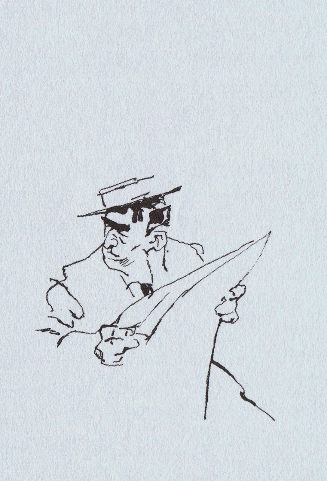
Snoops is one of many Kahl masterpieces. He is a chubby man, dressed in a baggy suit, wearing oversized glasses and 1970s platform shoes. Milt took great care and delight in defining the character’s bulgy anatomy. His arms are relatively short in contrast to his big pear shaped body. 
As in all of Milt’s characters, Snoop’s chubby hands are beautifully defined. They are worth studying frame by frame, because…they are just plain fun to watch in slow motion. There is as much personality in these hands as there is in Snoop’s expressions.
Here are a few of Milt’s roughs.


Snoops pretends not to be intimidated by the aligators Nero and Brutus…but he is.
This leads to some funny walks as he is trying to avoid them. 

A couple of Milt’s thumbnail sheets.


I have more material on Snoops for another post.

To see a previous post on Nero & Brutus go here:
http://andreasdeja.blogspot.com/2011/06/nero-brutus.html

Saturday, July 26, 2014

Frank & Ollie's Last Assignments


By the time I stated at Disney in August of 1980, Frank and Ollie had already finished work on their last film The Fox and the Hound. The rest of the studio was still wrapping up sequences, correcting rough animated scenes and trying to meet deadlines for clean up animation. 
But Frank and Ollie were still around at the studio, upstairs in the animation building, working enthusiastically on their first book The Illusion of Life.
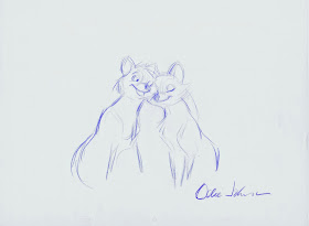
For the film Frank had animated the section in which Tod and Copper meet in the woods for the first time as cubs. Ollie had focused on the sequence with grown up Tod getting to know Vixey.
Both animators worked together as they always had, talking over the acting for particular scenes and exchanging drawings. (They also layed out continuity sequences for young artists to animate). 
Overall they thought that the type of personalities and situation in the film didn’t challenge them like previous animal assignments. It seemed to them they had done similar work on earlier movies with fresher results. Frank and Ollie were ready to let young people take the medium and develop it into new directions. 
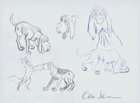
But as you can see in these final drawings, they both still had that sincere, emotional touch with character.


These are Frank's drawings:


Thursday, July 24, 2014

Disney Tigers


Post #500:
Here is a look back at Tiger characters that were part of Disney films during Walt’s life.
As I mentioned before, tigers are not particularly popular characters to do in animation, because of the costly and time-consuming procedure of having to add all those stripes, 24 frames per second.
Nonetheless Disney didn’t shy away from this challenge whenever a story called for a tiger. 

Tillie Tiger was the female lead in the 1936 Silly Symphony Elmar Elephant. 
After being bullied by a bunch of animal kids, Elmar emerges as a hero when he helps save Tillie’s life during a fire. 
Ham Luske animated most of her scenes, a few of them were done by his assistant Ward Kimball. Beautiful innocent stuff!


The film Dumbo featured brief scenes of a tiger family, as they travel with the circus. I love their designs, cartoony, but based on the real animal.


The 1945 short Tiger Trouble introduced a hilarious tiger, who enjoys pestering his hunter Goofy.
Animation by Milt Kahl, Eric Larson and John Sibley.


In 1960 the studio tested the new xerox process on the short film Goliath II, in which a tiny elephant tries to avoid being eaten by a tiger.
Bill Peet storyboarded the project and also illustrated the story as a terrific childrens’ book.

John Lounsbery animated most of the footage with this tiger. 


For a brief moment Madame Mim turns herself into a tiger in an effort to defeat Merlin as a mouse.
I’ve always loved this design by Milt Kahl, animated by J. Lounsbery.

As you can see in this storyboard by Bill Peet, the early version of the character didn’t show any resemblance to Madame Mim yet. But what fantastic visual ideas for Merlin and Mim as they morph from one animal type into another.


A Disney character that needs no introduction


I mentioned before in a previous post that in preparation for Shere Khan Milt Kahl researched tiger movement and anatomy by studying footage from the 1964 Disney live action film A Tiger Walks.


This frame from the title sequence shows clearly what influence these scenes had on Milt’s animation of Shere Khan. The tiger’s front weight is clearly on his left leg, as the other leg swings through.
I’ve always admired how Shere Khan’s shoulders move up and down during a walk to show the shift of weight.


I am not exactly sure when Mushka, the tiger will reach the screen, but we’re working on it, and the project is surely coming along, in terms of story, music and styling.

Tuesday, July 22, 2014

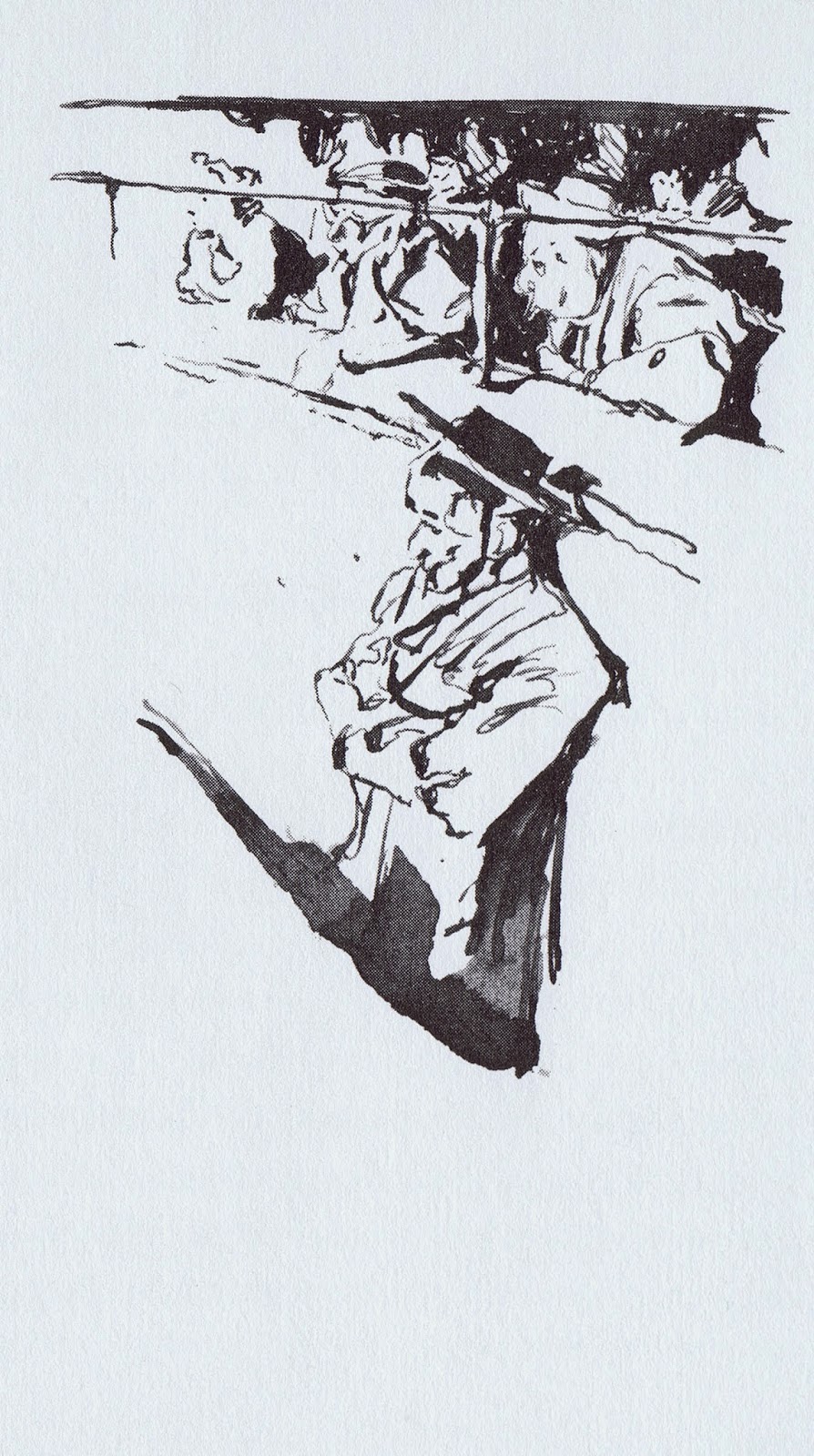
Busch Bullfight Illustrations


In 1932 Ernest Hemingway wrote the non fiction book “Death in the Afternoon”, which details the ceremony and traditions of Spanish bullfighting.
In 1965 Wilhelm M. Busch illustrated the German version, titled “Der Unbesiegte”.
These are small, but powerful brush and pen sketches that capture the intense emotion of the bullfight.

His portrayal of Spanish bystanders is equally interesting, and I love how Busch places his illustrations in the vertical space of each book page.