Tuesday, December 30, 2014
Counting Scars...
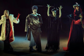
I cannot believe that I am am just now finding out about this video, made by "Oh My Disney".
Apparently in some survey about Disney villains Scar won this year as the most evil one.
What a production number...(it reminds me of certain parties when I lived in Paris, Disney themed always).
Well...this is a big ego booster, I try and not let it go to my head. Check it out!!
https://www.youtube.com/watch?v=VqrBsMFRaLA
Maleficent
Animator Marc Davis went through a few experimental designs before settling on the final look for Sleeping Beauty's villain Maleficent. We all know her final appearance, as can be seen in the image above. Marc's color ideas for the character clashed with production designer Eyvind Earle. Instead of a combination of black and red, Earle insisted on black and purple. Marc was never happy with this concept, to him the color red represented fire, an appropriate element in defining Maleficent's appearance.
Maleficent surrounded by a group of Goons, who proved to be rather useless to her in finding the whereabouts of Aurora.
Marc also did design work on characters he didn't animate like this group of forest animals pretending to act as Prince Charming.
Monday, December 29, 2014
Ben & Me
A gorgeous background from Ben & Me, a 20 minutes film released by Disney in 1953. Wikipedia says:
"Ben and Me was Disney's first animated two-reel short subject and released theatrically on November 10, 1953. It was adapted from the children's book written by author/illustrator Robert Lawson and first published in 1939. Though both book and film deal with the relationship between a mouse and American founding father Benjamin Franklin, the book, with illustrations by Lawson, focused more heavily on actual historical events and personages.
The short received an Academy Award nomination for Best Short Subject. It was released on VHS under the Walt Disney Mini Classics label in 1989 and was later released on DVD as a short film in the "Disney Rarities" volume of the Walt Disney Treasures collection. It was also released on DVD in 2012 under the Disney Generations Collection."
The film was directed by Ham Luske, Bill Peet wrote and sketched the screen story. Among the group of animators were top talents like Woolie Reitherman, John Lounsbery, Ollie Johnston and Les Clark.Here are a few of Peet's continuity drawings that deal with personality development, layout and camera moves. They show just how much of a storyteller and cinematographer Bill Peet was.
Images Disney/Heritage Auctions
Saturday, December 27, 2014
Paul Jouve's Big Cats
He was an expert in depicting all animals, but I am particularly impressed with his big cats. They remain a constant reminder during my work on Mushka, that it is essential to capture the power as well as elegance and grace of these magnificent animals.
The image above is a book illustration showing Shere Khan, an Indian tiger. But his heavy, bulky body reminds me of the Siberian tiger I am dealing with in my film.
Jouve knows big cat anatomy like nobody's business, yet occasionally he does things like putting leopard spots on what is essentially a tiger drawing. Or he puts stripes on a cat that resembles a leopard. The main thing though is that he is a master when it comes to drawing or painting feline poses. A great source of inspiration for my film.
For my first post on Paul Jouve, go here:
http://andreasdeja.blogspot.com/2011/08/paul-jouve.html
Monday, December 22, 2014
Saturday, December 20, 2014
Magnificentness
Realism was not the name of the game in those days, but believable stylization was. They created worlds that were different from ours, they took us to imaginary places that were far removed from photo realistic imagery. Walt's films are like dreams, the kind we don't want to wake up from.
Here is a short line up of final production images, some of them are holiday related.
Wednesday, December 17, 2014
Animal Sketchbook 1991
It is not very wise to follow a post featuring Busch drawings with samples of your own work. But here it is, since I had nothing else prepared.
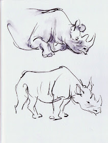
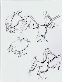
When Disney announced the production of The Lion King way back, the animators were encouraged to start sketching at zoos and wildlife parks. These drawings are from a sketchbook dating back to that time.
I had then just found out about brush pens and was eager to try them out. The fluid lines coming out of the pen's tip almost eliminate any stiff drawing on the page, on the other hand bad drawings are still possible. You can still come up with wrong proportions or weak poses. The brush pen is only a drawing tool, but a very cool one. The thick and thin contours seem to add a little life, and by smudging the ink on paper you can achieve some rough rendering, which sometimes helps to define volumes.
Just a technique, the main thing of course should be focused observation and the attempt to put down specific poses that define the animal.


