Friday, January 30, 2015
Sherlock Holmes & Dr. Watson
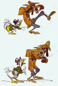
Way back my art school (Folkwang Schule, Essen, Germany) didn't offer any animation classes. As a student I decided to give myself various assignments in order to explore my potential as a future animation artist. I would create model sheets a la Disney, animate walk cycles and try to explore character concepts for an imaginary movie project.
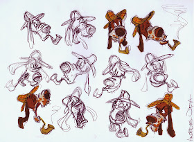
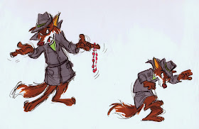
Early in 1980 (still at art school) I wondered what the cast of Sherlock Holmes might look like, if depicted as animal characters, similar to Disney's Robin Hood.
It was a way for me to practice the Disney style in rough form (I had just found out that Disney designers and animators worked pretty loosely). So I practiced staging, expressions and a little bit of color exploration with Magic Markers. I never showed these sketches to my art teachers at school, knowing how much they disliked the Disney approach to animation. The one person I did show them to was my friend Hans Bacher, who had graduated from the same art school and was at that time in business as a designer, storyboard artist and animator for several German agencies and TV stations.
Without Hans' constructive criticism and input I would have been completely lost.
So here I figured Sherlock Holmes as some kind of bloodhound, Dr. Watson as a duck, the inspector as a fox, and a policeman as a lion.
When I look as these sketches now after so many years, I still sense my unstoppable passion for Walt Disney's Animation, so many years ago. (A passion that is even stronger today).
Wednesday, January 28, 2015
Disney Book Illustrations
As a kid I was always searching for new Disney books which told stories using original stills from the movie. Looking at those film stills it felt like the movie stopped, and I had the chance to study the images thoroughly. Background paintings, inked or xeroxed cels and the overall color mood.
Then I discovered the Disney Golden Books. The pages in them showed special illustrations, in which the staging was often re-arranged to tell the story in a comprehensive way. Veteran studio background artists like Al Dempster, Gustaf Tenggren and even Mary Blair created beautiful paintings in Gauche or Watercolor.
Disney Editions recently published The Art of Disney Golden Books by Charles Solomon. It has great insight into the history of this popular book series. The art work is brilliantly reproduced, and each illustrator is profiled. I highly recommend this book:
http://www.amazon.com/Disney-Golden-Books-Editions-Deluxe/dp/142316380X/ref=sr_1_2?s=books&ie=UTF8&qid=1422510234&sr=1-2&keywords=disney+golden+books
Wilhelm Kuhnert
German animal artist Wilhelm Kuhnert (1865 - 1926) is somebody who's work seems to get better the more you study him. At first glance his drawings and paintings communicate the kind of bland realism that is so typical for a number of modern wildlife artists. But then dramatic, non formulaic poses of big cats and other wildlife emerge, showcasing the artist's unique observation. Unlike some other artists of his time, who studied animals at zoos, Kuhnert actually travelled to Africa, India and other places to see lions, tigers and elephants up close.
For obvious reasons I am very interested in his depiction of big cats. Wether resting, stalking or hunting, Kuhnert always finds the most intriguing poses to portray the animal's emotional state. By contrast his environments often don't come up to the quality of his painted animals.
See what you think!
Sunday, January 25, 2015
Who All Created Shere Khan?
We all know that the villainous tiger in Disney's The Jungle Book is a Milt Kahl character, but you'd be surprised to find out how many artists had a hand in creating this iconic bad cat.
Milt himself stated at one time that he really can't claim full ownership of a character he animated, because of other people's involvement in shaping its personality. He said, you've got the voice, which is so important, the story work as well as input by the director and other artists.
Milt felt like that by the time he gets his hands on the character, his contribution might be relatively minor.
Well...that's being overly modest, Milt never made any "minor" contributions to any of his animated characters.
Let's take a look at Disney artists who were involved in Shere Khan's development.
Story man Bill Peet doodled these poses, shown above, on a writing pad. Great drawings, but no specific character type is emerging yet. Peet left the studio early on in production of the film, his overall vision of Jungle Book clashed with what Walt had in mind.
Ken Anderson produced a ton of sketches as he explored the film's villain. This drawing still lacked menace, too comical.
I believe the following story sketches are Ken's work as well. By now he shows a tiger, who is confident, arrogant and above it all.
Go here to see story artist Vance Gerry's work on this sequence, and how it compares to Milt's final staging:
A publicity photo of actor George Sanders, who provided the tiger's voice, next to his animated alter ego.
A model sheet made up of Milt's magnificent animation drawings. Draughtsmanship and performance for the ages.
More on Shere Khan here:
and here:
Saturday, January 24, 2015
Disney Ladies
Disney female characters are among the most difficult to animate, depending on the degree of realism in their portrayal. Look at this clean up drawing of Cinderella, which was drawn right over Marc Davis' rough drawing. Simplicity, elegance and appeal. Her face is perfectly depicted, if you are off by the width of a pencil line, this character would look like an alien from outer space. All facial features need to be drawn within perfect proportions without looking technical or cold. I don't think draughtsmanship like this exists today (which is not necessarily a bad thing), this was the art of that particular generation.
Years earlier, before Disney got into animated features, two 1934 short films The Flying Mouse (pictured below) and The Goddess of Spring tried to portray a female character with realism. The result did not please Walt Disney.
By the time Snow White went into production, Walt knew that live action reference was necessary to convincingly bring the title character to life. And only top draughtsmen were assigned to her animation and clean up drawings. Marc Davis created these delicate clean ups over animator Grim Natwick's rough animation. The scene shows Snow White reacting to the Witch's sudden appearance by the kitchen window.
The film's Evil Queen, animated by Art Babbit, demanded the same thorough and accurate draughtsmanship. Every pencil or ink line needed to define the character's subtle forms perfectly.
A rare rough animation drawing of Pinocchio's Blue Fairy, who represents American female beauty from the 1930s and 1940s. Gorgeous!
Les Clark drew some of the nature fairies for Fantasia's Nutcracker sequence. Not easy to portray a nude character with such innocent charm. This section, though mostly effects animation, ranks among my all time favorite moments in Disney Animation.
Fred Moore created the look for many Disney girls during the 1940s and early 1950s.
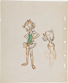
A beautiful rhythmic key drawing from the short Casey Bats Again, a charming character doodle of a skinny young girl and a model sheet from All the Cats Join in, another favorite of mine.
Walt Disney stated once that he was amazed to see the quality of draughtsmanship on a cel, which was traced from a clean up drawing that was traced from a rough animation drawing.
With each tracing and re-drawing some loss of drawing quality is bound to happen. But when you have a super dedicated staff, that loss is minimal.
These two cels from the film Cinderella are proof that the studio's process allowed brilliantly drawn characters to make it to the screen.
Again, Cinderella's face looks beautiful, even after having been re-drawn several times.
Iwao Takamoto's super precise clean up studies over Marc Davis' animation. At this point Disney's graphic portrayal of a female heroine reached a level of sophistication never seen before. The stuff takes my breath away.
Marc Davis sketched Maleficent, before turning the image into a color design drawing.
Though theatrical, flamboyant and dramatic this character still required realistic handling in order to come across convincingly. One of the greatest Character designs in Disney history.
Marc's next villainess also ranks among the greatest in Disney history. Cruella De Vil is ugly, but you just can't take your eyes off her. She might be Disney's gutsiest design ever. Sometimes I wonder why Walt didn't stop Marc and asked him to tone her down. I am VERY glad he never did.
Watching Cruella on the screen makes me almost giddy, and happy to be a part of this fantastic medium.
Madame Medusa is Milt Kahl's swan song before he left Disney. The story material was not as outstanding as Cruella's, but in many ways Milt outdid himself as an artist and thought outside of the box. The make up removal sequence alone is animation history.
Cruella and Medusa are caricatured villainesses, but their drawing base is still realism. They move with real weight, hand gestures are impeccable and every head angle is convincing as well as intriguing.
Images Disney/Heritage Auctions


