Friday, February 27, 2015
Cinderella's Romanticism
From the moment the storybook opens we find out that romance is the predominant visual theme of the film. What a lovely way to take us into this world through gorgeous book illustrations and the soulful narration by Betty Lou Gerson ( who would later voice Cruella De Vil).
Cinderella's background paintings remind me of grand stage sets for a Viennese Operetta by Johann Strauss. Everything is exaggerated in order to enhance a dreamlike, sentimental mood. The movie was made on a shoestring budget, yet the its visual presentation is opulent and luscious. You combine that with rich storytelling, and you get a classic for the ages.
Wednesday, February 25, 2015
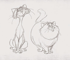
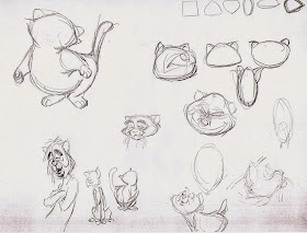
Aristocats Doodles
For the film The Aristocats individual assignments were given to each of the supervising animators. Milt Kahl developed the relationship between the movie's human characters like Madame Bonfamille, her lawyer George Hautecourt and Edgar, the butler. Ollie Johnston drew key scenes with Duchess and her three kittens, and Frank Thomas animated O'Malley's song as well as the two dogs in the countryside, Napoleon and Lafayette.
John Lounsbery was put in charge of designing and animating most scenes featuring O'Malley's jazzy musician friends. It was Ken Anderson's idea that the five of them would be from different ethnic backgrounds and speak with individual accents like Russian, British, Italian etc.
Here are a few of Lounsbery's character doodle sheets, in which he explores a variety of shapes and proportions for the cats, as well as props that might link them to their respective country.
http://andreasdeja.blogspot.com/2011/06/john-lounsbery.html
Monday, February 23, 2015
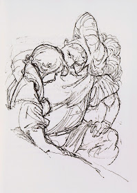
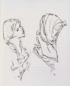
Wilhelm M. Busch 1959
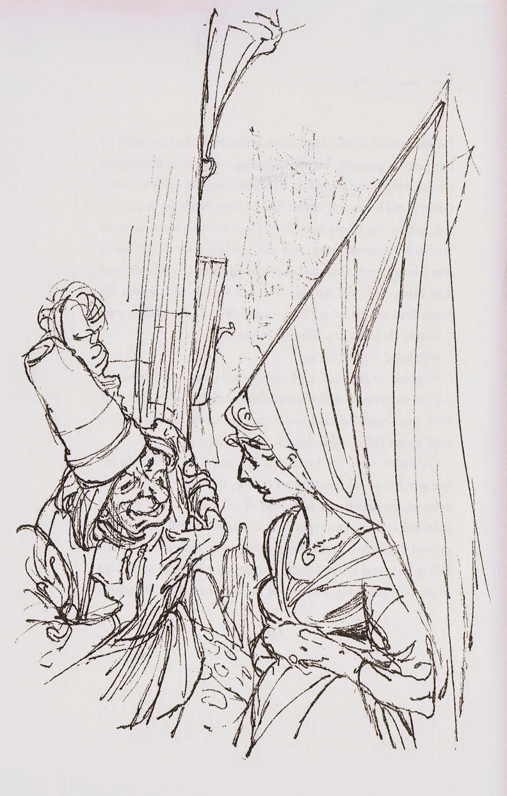
Busch illustrated Balzac's Les cent contes drôlatiques in 1959. This German 200 pages + edition has a ton of incredible drawings, spontaneous and bold, showing master draughtsmanship. Inventive staging and unconventional characters make these sketches a delight to study. Work like this inspires me to no end.
It is breathtaking!
Here is a selection of images from the first half of the book. If you'd like I can do a part II in a later post.
Wednesday, February 18, 2015
Lecture Series
I did this illustration for the cover of Storyboard Magazine quite a few years ago. Characters like Scar and Hercules and Lilo were yet to come. I learned a lot during those years, just by animating a lot.
From my experience you can read about animation, its techniques and history, but you learn best by doing it.
How I go about animating a scene (from thumbnails to final tie down) will be the subject of my first 2015 online lecture with Virtual Animators this coming Saturday, February 21, at 11 AM US Pacific time.
I'll try and break down my working method as much as possible...and answer questions you might have.
If you are interested in joining me, go to Virtual Animators' web site:
We are planning a new lecture about every other Saturday, covering all kinds of topics related to character animation. I look forward to diving into this new venture, let's have some fun!
Tuesday, February 17, 2015
Joe
I LOVE this drawing!
The way the pose is balanced, the feeling for fabric like the stiff apron and the soft chef's hat.
Guess what? This drawing does not appear in the movie Lady & Tramp. Animator John Lounsbery reworked the part where Joe lifts a sizable chunk of spaghetti with meatballs from a pot and slams it on to a plate.
The final film version shows him looking already at the plate during this part of the action. Who knows wether Lounsbery decided to make this change, he might have been asked by the director or Walt himself to alter the animation during a sweatbox session.
So much life and energy in the drawing, the sort of feeling you can only get from pencil animation.
I think I am going to frame this one.
For more on Joe and his buddy Tony, go here:
http://andreasdeja.blogspot.com/2013/10/tony-and-joe.html
Sunday, February 15, 2015
Ken O'Brien
...is pictured second from the left in this group photo from 1965 showing Disney's top artists at WED (Imagineering). The more I find out about O'Brien's work the more I tip my hat to this artist. He worked on many Disney classics starting with Pinocchio all the way to Sleeping Beauty.
Great animator with draughtsmanship that is rooted in the rhythmic and charming drawings of Fred Moore.
Here are a couple of photo stats of Jim Dear from the production of Lady & Tramp, followed by Ken O'Brien's interpretations of the poses pictured.
O'Brien died in 1990 at age 74, I wished I had made the effort to meet him way back.
If anybody knew him, feel to tell us about him and leave a comment.
A previous post featuring a couple of his drawings of Tiger Lily:
And this post includes a great group sketch from Lady & Tramp:
Thursday, February 12, 2015
Eric Larson on Lady & Tramp
Eric Larson is flipping a scene with his character Peg for singer/songwriter Peggy Lee, who provided the voice for this sultry canine.
Eric usually downplayed his capabilities as a draughtsman when compared to animators like Kahl, Davis or Frank and Ollie. But his assignments for the film Lady and the Tramp show clearly that he was not only a great actor with a pencil, but that his drawings were right on par with the studio's high standards. Peg's animation during her song "He's a Tramp" is beautifully timed in its rhythm and elegant moves.
These rough animation drawings are loaded with appeal and flair.
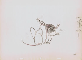
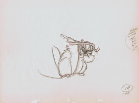
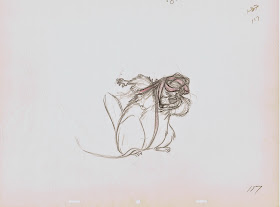
The Beaver's footage was shared between Milt Kahl and Eric, and their scenes work seamlessly together. In the drawings below the Beaver tries to figure out a way to put on the dog muzzle, or as he calls it "a log puller". He is struggling to find a way how to put this thing on, and you can see that Eric struggles a little to work out the involved action. But it's a beautiful struggle, and in the end the drawings show great clarity in the scene's staging. A lesser animator would get all caught up in trying to figure out the technicalities of this piece of action. What beautiful drawings and what a beautiful scene.


