Sunday, February 27, 2022

Fred Ludekens


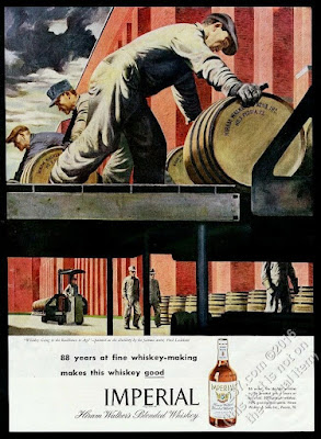
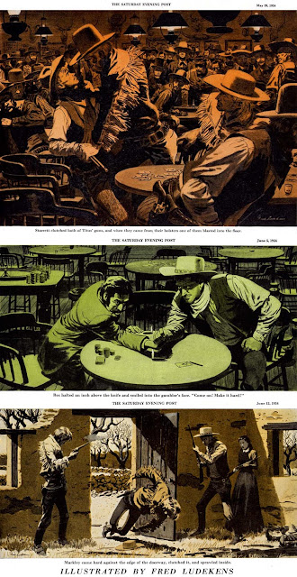
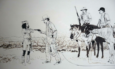
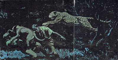
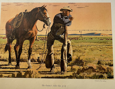
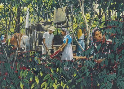
Fred Ludekens (1900 - 1982) was an American illustrator and a member of the founding faculty for the "Famous Artists School" (Art courses through mail correspondence.)
He was also a mentor to a young Milt Kahl, before Milt joined Disney in 1934. Both artists shared a studio in San Francisco and worked for an advertisement agency, most likely Lord & Thomas. 

Ludekens was almost nine years older than Milt and naturally more experienced in the field of advertisement illustration. It is interesting to speculate what kind of influence his early art might have had on young Milt. I think there are a few similarities between these two artists. 

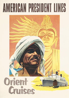
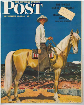
As you can see in these images, Ludeken's style has deep roots in realism. The compositions are highly organized, and there is a graphic flatness to them, on purpose. Busy line work is carefully contrasted with flat shapes. Confidence and formality are attributes that come to mind.

These are qualities you also find in Milt's drawings. But...since he ended up working in the field of animation, the added element of motion makes his drawings and animation supreme. 


Saturday, February 26, 2022

Wednesday, February 9, 2022

Fred's Dwarfs


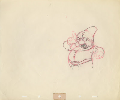
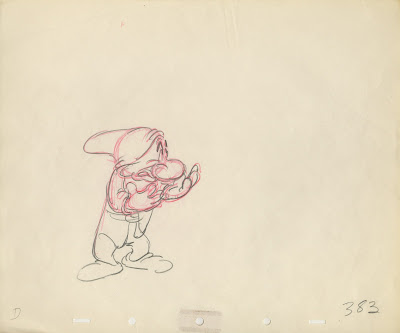
This pair of rough animation drawings showing Doc and Grumpy make for a great "flipping experience"
When you flip one drawing over the other, positive change is happening. That's an Eric Larson term. 
When Doc's head and body move upward, his hands change their positions slightly away from the body.
His belly moves downward, away from the head. The tip of his hat also changes direction.

The same goes for Grumpy. His spine goes from straight to curved, as his upper body moves forward a bit. The knees bend sightly to show the shift in weight.

You might want to print out these key drawings and flip them back and forth. For young animators this is the kind of stuff that can make a lightbulb go off!


For more on Fred Moore's dwarfs go here:

Saturday, February 5, 2022

Bob Peak


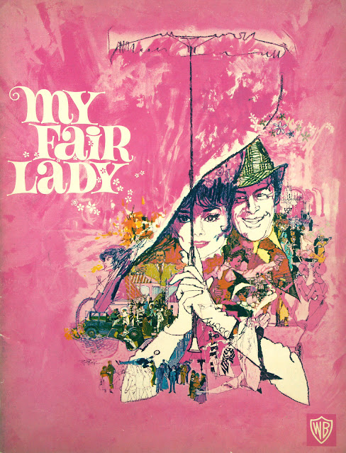
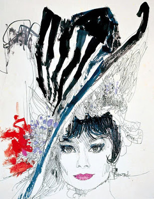
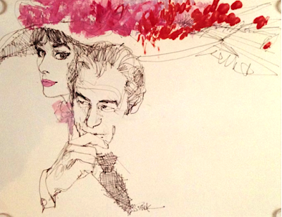
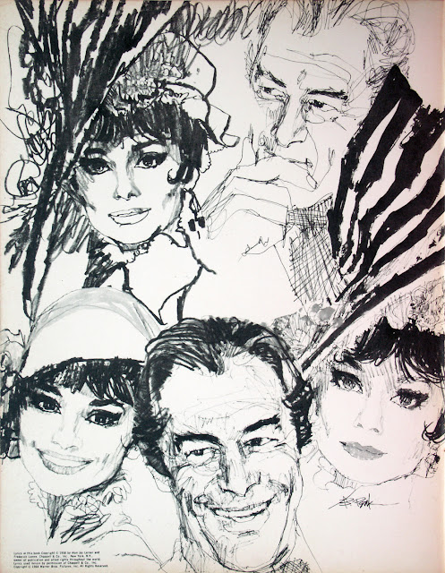
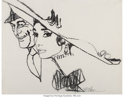
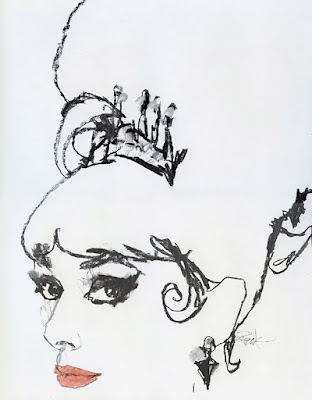
As a kid I was almost obsessed with the drawings Bob Peak created as part of the promotional material for the 1964 movie musical My Fair Lady. I was way too young to see the movie at that time, but these beautiful advertisement sketches were all over the newspapers and magazines. I loved the overall design of the poster, but also the sheer draughtsmanship. Those  wonderful loose yet accurate lines. I know that Peak used plenty of photographic reference, he probably even drew over some of those photos provided by the studio. But the end result is massively impressive and showcases his background in fashion drawing.

Peak would conceive many movie posters after My Fair Lady, for films like Camelot, Rollerball and Apocalypse Now, but this is my favorite. 

Peak passed away in 1992, age 65.