Thursday, March 13, 2014

Outtakes


Back in 2003 I played around with animal designs that were influenced by TS Sullivant. Some of these drawings made it into my published animal sketchbook “A Different Stripe”.
Here are a few outtakes that didn’t make it. 
The one above should come with the caption:”Vilkommen, Bienvenue, Velcome!”

The story of Peter Pan portrayed by pig characters.


Other stuff.


Here is the link to a previous post about “A Different Stripe”:


Tuesday, March 11, 2014

Wilhelm M. Busch 1963


More Busch book illustrations. 
These are from the German 1963 edition of “Viechereien eines Poeten” (Too difficult to translate.)
For the book Busch illustrated short verses about animals. I love the compositions and those unconventional poses of people and animals. Gorgeous organic drawing!
And what great feeling of space.

It’s good to have artistic heroes, he is one of mine!


Sunday, March 9, 2014

Edgar II


Just to add to my last post, this photo shows Milt actually animating that scene with Edgar, the butler, from The Aristocrats (He is working on key drawing #33). Winnie the Pooh and the Blustery Day had just won an Oscar, and a photographer was sent to animators’ offices to take pictures of various artists posing next to the statue and the film’s poster. 
What’s more interesting though is what you see in Milt’s bookshelf: Two editions of Edward Muybridge photographic studies on animal and human locomotion. Those books are still available today and provide terrific study of how living beings move. I recall Milt commenting on these ancient photo collections from the era of the dawn of photography. In particular the animal edition had been useful to Milt whenever he was faced with animating somewhat realistic horses, deer or tigers. 
Check out Wikipedia’s page on Muybridge:


Here are a bunch of Milt’s extraordinary Edgar rough animation drawings from different scenes. He did not care much for the movie as a whole, nevertheless when it came to doing his part, he gave it all he’d got. Superb drawing, staging and acting!


Friday, March 7, 2014

Edgar


The butler in the film The Aristocats doesn’t fall into the category of “Disney’s most evil Villains”, but that doesn’t mean that his character can’t entertain and delight as a milder, more gentle baddie.
When you have animators like Milt Kahl, Frank Thomas and John Lounsbery bringing Edgar to life, you know that there will be some terrific performances on the screen.
The sheet above shows Milt’s character designs. I like the loose skin under his chin and in the back of his neck, which provides opportunities for sqash and stretch. Milt loved working on scenes with Edgar, because his personality called for strong emotions, from deep frustration when he finds out that the cats will inherit Madam’s fortune, to gleeful excitement, when he believes that he has successfully gotten rid of the cats.
That particular situation is explored in these sketches by Ken Anderson, who came up with fun ideas that show Edgar in a self-congratulatory mood.


Milt animated this scene, in which Edgar celebrates with a cigar and a bottle of champagne.
The way he casually lifts up the bottle, lets it twirl in the air before adjusting his grip is fantastic.

“Ha, Edgar, old chap. Get used to the finer things in life.”


Wednesday, March 5, 2014

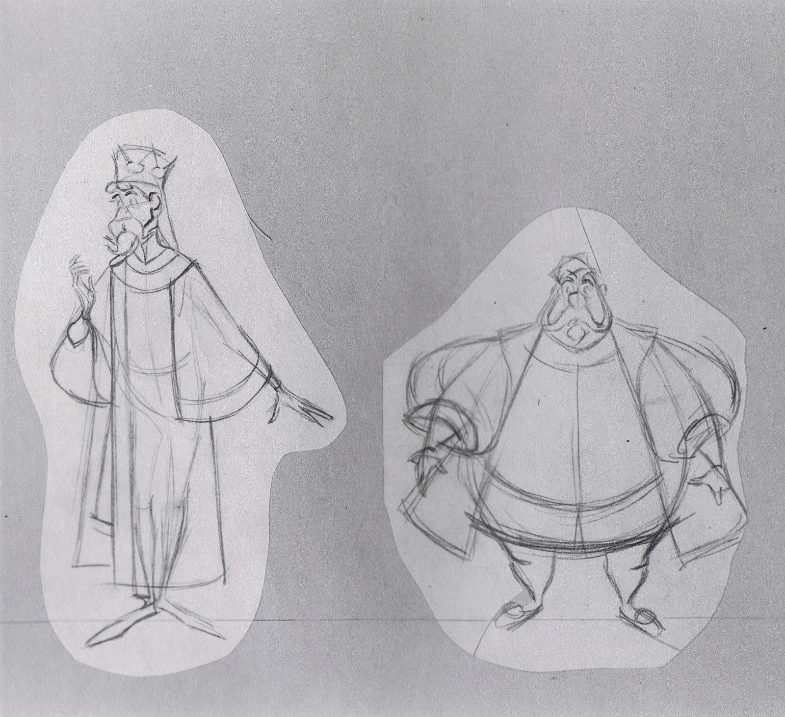
King Stefan & King Hubert


These two father figures from the film Sleeping Beauty were animated by Milt Kahl, John Lounsbery and other animators, but it was Milt who was responsible for the final character design.
This new stylized drawing style was right up his alley, even if it presented challenges. But there was nobody at Disney who enjoyed solving drawing problems more than Milt Kahl (even though he stated that this was always hard work for him.) He reveled in the fact that he was able to give new Disney characters the “That’s it!” look. Perfection that can not be improved. 
The Kings are configured of solid round and square shapes, their lines are either straight or curved. There is an architecture to this type of drawing. It’s one thing to come up with good looking designs like these, but then to be able to turn and move them around in space is astonishing. 
A few rare examples when Milt used color in his pre-animation research.


Milt refined the way King Stefan’s sleeves would be drawn. When an arm is bent, even the shape of the inside sleeve becomes a very unique design, while showing proper weight at the same time. A few years later Merlin from The Sword in the Stone would benefit from the same graphic sleeve treatment.


Monday, March 3, 2014

Three Nudes and a Hippo


In this watercolor by Heinrich Kley a troubadour tries to move a hippo, who carries two baroque ladies resting on his back. Who knows if there is any special meaning to this situation or wether it reflects any social commentary during the early 1900s, when it was painted. Maybe the hippo represents the German economy, which wasn’t moving, who knows?
But by itself it’s quite a beautiful piece to study. The image was already somewhat faded when I got it, but with a little help from photoshop it’s possible to bring this scene back to life. The guy is giving all he’s got to make the hippo budge, while the two women wait comfortably for the ride to eventually continue.

Here is the link to my first post on Heinrich Kley a while back:


Saturday, March 1, 2014

From Ken to Milt


Here is another design idea for Madame Medusa (and Penny) by Ken Anderson.
He definitely tried to incorporate the idea of the classic Medusa image with snakes growing out of her head. 


Milt Kahl eventually came up with his own design for the character. His Medusa resembles one of his earlier creations, when Madame Mim briefly turns into a beautiful woman. 


This Anderson sketch shows Medusa and Penny in an awkward embrace. Milt liked the situation and the way it was staged, and he made use of it in a scene toward the end of the film. “(Ah, ah, ah, Snoops, that is no way) to speak to our little Miss Penny.” 
The way Milt animated Medusa approaching Penny doesn't look like a person...more like a weather system. Amazing.


Milt liked showing soft skin when it gets in contact with something solid (in this case Medusa’s head). He once said, that he gets a kick out of seeing a nude in a Degas painting sitting on a hard surface like a wooden chair. It’s a chance to show contrast, the way flesh reacts to that surface.


Thursday, February 27, 2014

Gaston's Chest Hair


That's talented French actor Alexis Loizon in the photo, who currently plays Gaston in Paris in the stage production of Beauty and the Beast (La Belle et La Bete). As you can see, Gaston still uses antlers in all of his decorating, and his chest hair is as predominant as ever.
When we were animating Gaston's song way back, one of his lines stuck out:
 "…and every last inch of me 's covered with hair! " I did not have the time to do that scene, so one of my animators in the Gaston unit gave it a shot.
The animation turned out to be fine, but when Gaston stretched his shirt to reveal his chest, the design of his chest hair looked a little odd to me. It seemed to have been combed from the center outward. I suggested we try a different look for the chest hair, and guess what…everybody had a different take on what the hair should look like. I encouraged my colleagues to submit a drawing that showed their idea of appropriate Gaston chest hair. After a while we had at least twenty different designs to look at. 
These are just some of them. 


Eventually I worked with an effects animator to create the final look, a mix of stubble and curls.

Probably the most unusual design issue I ever came across at Disney.