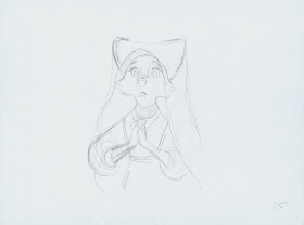
Isn't this a beautiful drawing of Maid Marian by Milt Kahl?
Look at the care and the dedication in this sketch.
Milt came up with this appealing design for Robin Hood's love interest after studying Ken Anderson's early concept work.
Below are some of Ken's sketches of the character, and as usual they provide a teriffic starting point for any future development.
The thing with Ken's concepts is that graphically hey can be taken in a hundred different directions when it comes to finalizing them for animation. It just depends on who and what artist follows Ken's work to put his own spin on to the designs.
Milt would always add sophisticated draughtsmanship and appeal. His stuff is rooted in realism, even when it comes to anthropomorphic, talking foxes.
Here is an interesting quote from John Grant's book Encyclopedia of Disney's Animated Characters:
"What is intriguing, however, is that the animators have succeeded in making a vixen have the screen presence of an attractive woman. In part this must be due to her voice, supplied by Monica Evans, but this cannot be a total explanation. One must simply applaud the skill of the Disney animators."
Indeed! Milt had a way with designing appealing female animal characters such as Lady from Lady & the Tramp and Maid Marian.
Frank Thomas animated her beautifully during the archery tournament with sensitive, feminine acting.
Milt's sketches below were done for those Thomas scenes in order to maintain model consistency.
A cel from one of Milt's own scenes.


Beautifull drawings indeed. Hmm, which is better Ken´s or Milt´s, they´re different. I think Ken´s Marian is somehow "stronger" woman, with flirting pose is great! :) When final Marian seems to be more "traditional" princess.
ReplyDeleteI like Marian design... but even more her movements and behaviour. She's very expressive and femenine.
ReplyDeleteDespite all that "how bad was disney in the 70s and 80s", the character animation in those films is astounding. My favourites are Robin Hood and The great mouse detective, so energetic !
Milt Kahl was a genius designing female appealing characters. As you say, even though is a vixen you can say is attractive. Robin Hood is indeed a great character design course. Is there a documentary on Robin Hood? The DVD edition I have does not include one. But your posts are great. I always want to know more about how the achieved those great films. One question no directly related. You mentioned in a past post Milt was The one who gave Disney's final character design since Song of the South. Did he work that way in Alice in Wonderland? Did he design also most of the characters?
ReplyDeleteThis is amazing work! I love the expression and the innocence in Maid Marian's face and eyes!
ReplyDeleteI have a question for you Mr. Deja and I apologize that if this is the wrong place for it, but here it goes... I was wondering if you would do a short video hand drawn animation tutorial. Nothing too long, just some techniques and methods that work for you. I'm a computer animator but I'm passionately a hand drawn animator. I'm training myself in hand drawn animation using books and video from other animators... but I was hoping you would do a few. I'm apologize ahead of time if this causes a flood of requests on the subject... :)
Yes, I agree. That would be spectacular. :D
DeleteI'm nowhere near being an animator or professional artist, but I'd definitely find a short tutorial very interesting as well!
(And good foresight, apologizing ahead of time, haha.)
did Milt ever advise you on your own drawings and scenes?
ReplyDeleteRobin Hood was released when I was 7 years old. I collected cards of the movie and I spend hours and hours looking at those characters and his lovely xerox backgrounds. I love specially this film. Thank you for the post
ReplyDeleteKen's poses here are so designy, but strong...I'd say it was high time we had a strong side female in a Disney cartoon (Eva Gabor never counts), but I do love how demure Ken made her out to be. (Even if, after the ending was changed, we don't see her for the entire third act.)
ReplyDeleteYou ever notice the way Milt Kahl, whenever he has a female character, tends to break the wrists and push the palms away from the body? Alice's croquet game, Marian's first scene with Skippy, Medusa's opening phone scene, Madam Mim explaining the Wizards' Duel rules, Madame Bonfamille's opening scenes with Georges... They break their wrists, fold their hands around, and tend to keep their upper arms pitched upwards, like a melodrama figurine. Gives an amazingly weak and filmy effect onscreen (and even though as a feminist I should be against this, it works for the female characters.)
To all the people who say that Disney artists couldn't develop stylized icons of handling (Virgil Ross style), I point this out to them.
A version of "The Cunning Little Vixen" what I'm developing has a central Sharp-ears with the same eyes as that final sketch by Ken, minus the fangs and lashes...Hopefully they won't say I ripped it off! XD
Awesome! For some reason, it makes me feel good to find rare pieces of animation like this. Milt and Anderson are one of my favorite animators. hahah, and of course I really like your work too, Deja. xD
ReplyDeleteI always liked this movie but it's very underrated, it would be cool to see some concept arts for the Sheriff of Nottingham (It seems everyone but me hates that character :\ ), I like how Milt draw wolves and other wild animals like Shere Khan.
I like very much the black hood prototype. I think it's the sexiest of all, yet very elegant.
ReplyDeleteBut I can see why it was rejected: It's too close in resemblance to Maleficent's dress and horns.
I guess the nun-like hood was choosen because of the pureness looking it has.