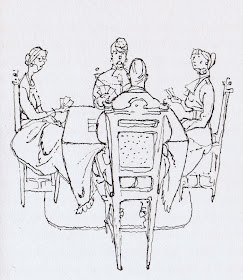
More tiny Busch spot illustrations for a novel by Ernst von Salamon titled "Glueck in Frankreich" (Happiness in France). The reason why I love these drawings so much is because of their economy of lines. Just like in a Milt Kahl drawing, every line counts to communicate an idea in the simplest way possible. Anything that isn't essential to telling the story is left out! You only get the bare bones.
Busch is also able to create real space with so little. Just amazing!
Busch is also able to create real space with so little. Just amazing!
Leaving things out is a marvellous thing, anybody can render an image to death. But presenting only the bare essentials makes for a fascinating artistic statement.


I can't put my finger on it but this drawing style reminds me of Paul Fierlinger's animation style. Maybe it's the simple yet still very effective style.
ReplyDeleteIt's five in the morning and I have been wanting to ask a question for a long time, but I was never sure if you'd answer so I kept backing out. My question is: "How do you feel about using drawing tablets for animation?" Being left handed I've constantly smudged my animations when I do it on paper and with a tablet I don't get that. Sure it doesn't give you that "natural" feeling that animation on paper gives you but I feel that both sides have their advantages and disadvantages. I was just curious.
ReplyDeleteThank you
Thanks again and again with this Busch work.
ReplyDeleteThese are always so inspirational. :D
ReplyDeleteThank you again, learned to know Mr Busch´ works via your blog, and they just amazing.
ReplyDeleteAnother great artist who i´m fan of, is Rene Gruau. He have also same kind of beautiful illustrations made with ink and few colours.