Sunday, January 28, 2018
A Harper Goff Mystery
Sadly I never met Harper Goff, an artist who contributed in so many ways to Walt Disney's "mid century success".
He met Walt in 1951 in London in a model-making shop. They both wanted to purchase the same model train. To make a long story short, Goff joined the Disney staff soon after and became involved in the Disney's live action film 20.000 Leagues under the Sea. He designed sets for the film as well as THE Nautilus submarine. Goff also played the banjo as a member for The Firehouse five plus Two, a Dixieland band that included Disney artists Ward Kimball and Frank Thomas. He became an important designer for various Disneyland and Disney World attractions.
So here is where it becomes interesting. This painting, featuring Harper Goff and his wife Flossie was auctioned off a few years ago. The artist is no other than French painter Albert Brenet, who I posted about a few years ago, with no knowledge of any Disney connection.
https://andreasdeja.blogspot.com/search?q=brenet
I really don't know how these artists met, but it had to be in 1958 or before.
When it comes to Disney it's a small world between Animation and Fine artists.
Friday, January 26, 2018
Realism before Caricature/Animation
All of Disney's animators sketched a lot of life dalmatians before getting into animation production.
You might think that this extensive research would not have been necessary, since just a few years prior the crew animated plenty of dogs for Lady and the Tramp. They already knew and had analyzed anatomy and movement for a variety of dogs. So why start all over again for 101 Dalmatians?
The answer is because it was a Walt Disney production. And the philosophy was that you can't animate an animal until you have studied the real thing.
I totally believe in this. No matter how stylized your final character design ends up, if it doesn't have characteristics of the real animal or person, it won't be convincing.
A lot of realistic research of dalmatians was absolutely essential in order to achieve THIS for the animated film.
For more on studies of real dalmatians for the classic film, go here:
Tuesday, January 23, 2018
Just a Great Drawing
Ever since I saw a publicity photo of a young Milt Kahl holding a drawing of Brer Rabbit, I realized that this man is an extraordinary artist.
There was nobody, at Disney or anywhere else, who drew like this. The mix of appeal, anatomical "cartoony" accuracy and overall insight into the character is breathtaking. And Milt maintained this level of excellence for twenty-four frames per second. It is a shame that drawings like this one had to be cleaned up by an assistant. How wonderful it would be to see pencil tests of Milt's rough animation for Song of the South.
As Milt himself put it :"That picture was a high for personality animation."
Saturday, January 20, 2018
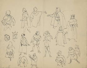
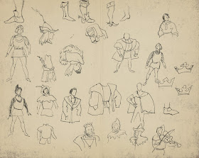
Costume Designs for Sleeping Beauty
Marc Davis loved doing research for any given project he was involved with. All of these pages show his drawings. I imagine Marc had a whole bunch of books on medieval art and costumes nearby for inspiration as well as for historic accuracy.
These might be some of the first sketches he did for Sleeping Beauty during the early to mid 1950s.
After the production of Peter Pan most of his colleagues moved over to Lady and the Tramp.
But Marc skipped that film and instead began creating designs for Sleeping Beauty's minor characters, before focusing on the heroine as well as the villainess.
I love the simplicity in these drawings. Marc is already thinking about simple, uncluttered concepts that could be applied to full animation.
Here is a link to one of Marc's many color costume designs:
https://blogger.googleusercontent.com/img/b/R29vZ2xl/AVvXsEhgoUZNAjH34Pgsd5DoryvYrdf8O1fh5ZbNjG0cGmkNP9lUzCbxh8dLVolrch8qpi8C3mz72ZuyAfj0ZVqBQdVipFMUpPYZeiwBpkmmFIHNrb8SA55HbSv5sdFDhLrj6XF-zrKIRdAqym4/s1600/SBB-3.jpg
Wednesday, January 17, 2018
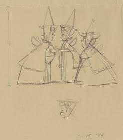
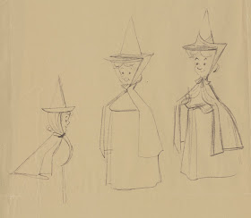
Designs for The Three Good Fairies
These 1950s xeroxes come from Ollie Johnston's estate. He labelled them:
Don DaGradi character designs. I am not sure that these are by DaGradi, they look more like Tom Oreb sketches to me.
In any case, you can see that right from the beginning, during the character design phase, the crew was going for a style they had not done in feature films. Strong, graphic shapes that still needed to reveal distinct personalities. Frank and Ollie, who animated all personality scenes with the Fairies, were able to maintain the stylized designs in their work. But according to them, it wasn't easy to get used to. The idea of drawing your characters by applying flat shapes, while moving them dimensionally presented a challenge that was foreign to many animators.
My favorite sequence featuring the Fairies is when we see them inside a jewelry box, as they try to come up with a plan to counter Maleficent's curse. Every one of those scenes is worth studying closely. The acting is nuanced and believable, and the overall animation is fluid and graceful.
More on the Three Good Fairies here:
http://andreasdeja.blogspot.com/2011/06/faries-combo-blogmov.html
http://andreasdeja.blogspot.com/2017/03/i-havent-posted-vintage-disney-pencil.html
http://andreasdeja.blogspot.com/2012/01/frank-and-ollie-animated-most-of.html
http://andreasdeja.blogspot.com/2013/06/pierre-lamberts-sleeping-beauty.html
Sunday, January 14, 2018
More Ken O'Brien Roughs
I've written about animator Ken O'Brien before. On Lady & the Tramp he had the ungrateful task of bringing the human characters of Jim Dear and Darling to life. They were both based on live action reference, and a lesser animator might have ruined such an assignment.
But O'Brien knew very well how to work best with that kind of reference. He altered the poses from the live action quite a bit by strengthening body rhythm and overall movement. His drawing and animation is sort of a healthy mix of Fred Moore and Milt Kahl.
Look at the image above, he handled those 3/4 rear vews with such ease! I find myself working that kind of an angle on characters over and over. Its not easy, but look at O'Brien's approach! Intuitive and perfect.
Go here for previous posts on the talented Ken O'Brien:
http://andreasdeja.blogspot.com/2013/01/young-lady.html
Images Van Eaton Galleries:
https://vegalleries.com/productions/walt-disney
Images Van Eaton Galleries:
https://vegalleries.com/productions/walt-disney
Friday, January 12, 2018
Bald Mountain Art
A few pieces of art from "Night on Bald Mountain" that were sold by Heritage Auctions last year.
This segment from Fantasia remains animations' most nightmarish, astounding, horrific and beautiful moment.
Between Kay Nielsen's concepts and Bill Tytla's extraordinary animation, on top of the brilliant Mussorgsky's composition, there is a visual power that has not been matched in this medium since. Sheer terror without an ounce of comedy for balance.
Not every sequence in Fantasia came "together" in terms of story, animation and color, but Night on Bald Mountain is one of those cinematic achievements that is absolutely perfect. It went all the way, nothing is compromised in its presentation. It is a benchmark for what animation could do in 1940, and a reminder of the power of Drawn Animation.
Check out this previous post on Chernabog:
Monday, January 8, 2018
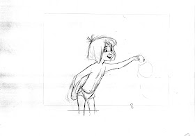
Ollie's Mowgli
Ollie Johnston animated practically the whole "Bear Necessities" song sequence from The Jungle Book. He had such a natural, instinctive feeling when it came to developing Baloo and Mowgli's relationship. It looks to me that he didn't overanalyze his animation, there is a strong gut feeling for how the characters' friendship evolved and changed.
In this scene Mowgli mimics Baloo's actions, as he tries to pick a thorny fruit from a cactus.
What a beautiful reaction when Mowgli pricks his finger. The whole head reacts first, his hair bursts, with his face wide open. He then shakes his hand, puts his finger in his mouth, then shakes the hand again.
Actually the whole body is involved in Mowgli's reaction. His legs go up and down. This is intuitive, insightful character animation, with traces of Ollie's mentor Fred Moore.
These clean up lines were done right over Ollie's rough animation drawings.
These clean up lines were done right over Ollie's rough animation drawings.


