Imagine as a Disney animator looking at these terrific development visuals for an upcoming feature! How can you not get super excited, you just want to get to work! The Dance of the Hours from Fantasia is one of the best things ever animated. If you worked on this short, you can practically retire because this piece represents a high for the medium that would not be repeated.
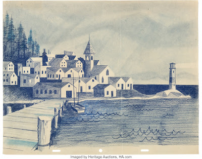
An extraordinary layout for the 1958 short film Paul Bunyan. I never cared for the animation much, but the look, the graphic world the artists created is stunning.
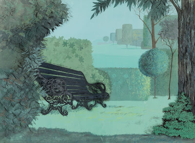
This piece from 101 Dalmatians makes me laugh, because it represents an artistic hangover. The crew had just finished Sleeping Beauty and was gearing up for a new film set in a contemporary style. What they couldn't shake yet were square and round tree shapes. If you take the park bench out of the picture, you'd expect Aurora walking through the scenery talking to birds.
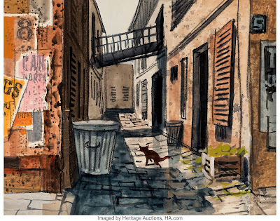
A back alley setting for The Aristocats. My educated guess: this is the work of the great Vance Gerry.
This one is close to home. The Snow Queen was going to be our next animated feature after the 2011 film Winnie the Pooh. Paul Felix had developed extraordinary settings for the project, we could not wait to get started. Bette Middler had been asked to voice the title character... then the shoe dropped. The CG shoe. The film ended up with a one word title...and the rest is history.
Would I have lobbied for the Bette Midler character...of course!!


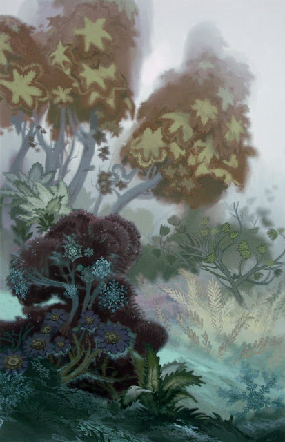
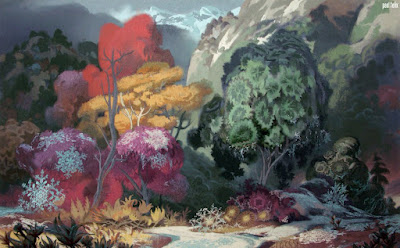
I still have a love-hate relationship with the one-word title film you mention (love being a strong word in this case), but I have a feeling that, as pretty as it looks in its CG version, it would have been one of the most gorgeous-looking traditionally animated films in western animation, even judging solely by the pencil sketches by Jin Kim, and I think these beautiful settings prove me right... I guess we're left wondering what could have been, like with many other projects.
ReplyDeleteBut thanks for sharing this art, it looks amazing.
Do you have more details about "The Snow Queen" that you can share with us, or was it scrapped very early in development and not much is known about it?
ReplyDeleteAlso, since we're on the subject, I suggest everyone check out the Russian animated version of the "Snow Queen" from 1957, it's a classic.
One of the reasons why I dislike the one-word title film was because it felt like a major missed opportunity. The Snow Queen had been considered since the days of Walt, and was even considered during the Renaissance of the 90s, and from what I've seen and heard of the original story, it sounded like it could lead to a lot of creative opportunities. I saw the Russian animated version from 1957, the same one that was an inspiration to Hayao Miyazaki, and really enjoyed it, and I felt it would be interesting to see how Disney would take on this story. Then it went to CGI, re-worked the entire story because of one song, (you know which one,) and was released in a state that, even if it had been traditionally animated as originally planned, was a mess from a writing and directing standpoint that somehow became extremely popular, again, mostly because of that one song.
ReplyDeleteMaybe I seem kinda bitter about it, but it just feels like we missed out a far more interesting movie, and if the concept art is anything to go off of, it would have looked gorgeous. I would certainly love to hear more about the early versions of "The Snow Queen", if you have more info about it that can be shared with us.
I couldn't have said it better myself.
DeleteTsk. Those Paul Felix paintings are a helluva lot prettier than the dead, monotonous tundra that wound up onscreen.
ReplyDeleteTo be clear: They COULD be done justice in CG, but between the fetishization of realism in the animation industry (especially in 2013) and the infamously rushed production that film suffered, I guess they were doomed to be ignored.
DeleteI don't think I've seen any of these paintings before at all, nice!
ReplyDeleteSehr geehrter Herr Deja, danke fürs Hochladen und Teilen der Bilder! :)
ReplyDeleteWie schön ich besonders die beiden letzten Bilder auch finde! Meine Favoriten sind die Entwürfe von „Tanz der Stunden“. Mit den „Stücke aus der Nussknacker-Suite“ habe ich mir diesen Fantasia Kurzfilm mit am meisten angesehen. Und zwar immer und immer wieder! :)
Als ich mir die Arbeiten von M.C. Escher in der großen Buchausgabe von Taschen ansah, stieß ich auf eine Studie, in Herr Escher eine gefüllte Badewanne gezeichnet hatte, in der er die Stadt Atrani als Miniaturausgabe setzte ...
Und dann noch Eschers Doppel- oder sein Flächenplanetoid. :) ...
Städte, die so klein sein können, dass sie wie eine Insel in einer Badewanne schwimmen oder in eine Schnee- oder Glaskugel passen würden. In sich geschlossene Mikrokosmen, die bei einer Vergrößerung spannende Welten mit liebenswerten Charaktere offenbaren. Das wären Settings, die extrem viele Möglichkeiten böten und mich daher echt umhauen würden!!! :) ….
Alleine das Nachdenken darüber macht sehr viel Spaß! Auch wenn eine Kombination zwischen Eschers Mikrokosmen Ideen mit allem, was meine Fantasia Lieblingskurzfilme für mich so besonders machen, nie über die Vorstellung hinausgeht! :)
Just catching up with this. My goodness. I had been hoping for a real adaptation of Snow Queen myself. Frozen is fine. But...
ReplyDeleteThe hand-drawn Snow Queen's metamorphosis into the CG one-word title is one of the biggest animation tragedies of all time. The Snow Queen has always been one of my favorite fairy tales and I was eagerly looking forward to Disney's movie. And then it was scrapped and that other thing came along instead... It still breaks my heart, especially when seeing such gorgeous conceptual art.
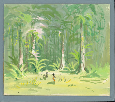
ReplyDeleteHello Andreas, I love the visual development pieces you posted. The Fanstasia watercolors are wonderful....I also love the Jungle Book concept piece as well. You are definitely right that Walt wanted it be bright and light with the artwork. It was a nice surprise to see the Jungle Book concept. It has been a part of my collection for a number of years now. I am really looking forward to the Jungle Book exhibit this summer. Would you like to borrow this concept for the exhibit this summer? Happy to loan it out if you still need some concepts pieces. Just let me know.
ReplyDeleteThanks,
-Sean Monico
Thanks very much for offering, Sean. I wished I had known earlier that you own this piece. At this point the exhibit is full, no more space for additional art.
DeleteThat is okay....no worries. I thought I would offer considering your recent posting. This concept piece was offered a number of years ago at Butterfields in LA and I happened to see it then. It was offered with another piece wide pan concept with the elephants....have you seen the other concept? I might have a photo of this that I can share with you....how can I get in touch with you?
Delete