Wednesday, November 30, 2011

Hans Erni

Did you ever wonder which artists Disney's animators admired ?
From the conversations I had with them, I can tell you that the range was pretty wide. They all knew about the lively drawings of Heinrich Kley, and they appreciated the realism in Norman Rockwell's work. Frank and Ollie liked Edgar Degas very much, Marc and Milt were big fans of Picasso.
During early visits in the 1980ies to their homes, I noticed that both animators, Marc and Milt kept a framed print by a Swiss artist on the wall. 
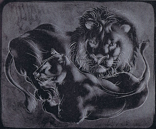
That artist is Hans Erni, who turned 102 this year, and still draws and paints every day at his studio in Switzerland. His life work includes interpretations of classic themes as well as designs for postage stamps and posters.
When I look at his art, I see a drawing style that echoes the Renaissance.
Classically drawn figures within abstract environments. Marc Davis used this approach in some of his own fine art as well.

Here are a few examples of Erni's work, mostly from the 1950ies.


Monday, November 28, 2011

Horned King Pencil Test

This test was the first piece of animation I did after completing the Disney training program under Eric Larson.
Just for fun I  just added my voice to the scene. (30 years later).
Way back we had talked about the Horned King's face always being in the dark, you would only see his eyes. So for the test I didn't bother animating dialogue.
I didn't have a voice track anyway. I remember I acted the scene out in front of a mirror, it helped me with the foreshortening of his hand.
The bulk of the character's actual production scenes were animated by Phil Nibbelink.
For contrast I am showing a Tim Burton sketch of Taran and the pig Hen Wen....
brilliant!


Saturday, November 26, 2011

Early "Black Cauldron"

Here is a blast from the past. 
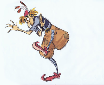
I have been going through my old application portfolio for Disney, and I am taken back to around 1979. There are life drawings, animal sketches and attempts at character designs. (I will post some of that stuff soon.) But even then I was already drawing (potential) Disney characters. I knew the studio was gearing up to produce "The Black Cauldron", based on the books of Lloyd Alexander. So I bought the books, read them, loved them. I started to imagine what characters like Taran , Princess Eilonwy, the Horned King and the witches might look like. 
I had a blast, because I had never done anything like this before.
Later, when I showed my design ideas to Disney, they liked them enough to photograph them and share them with other artists. I was flattered beyond belief.
So this is a small selection of a bunch of art I dreamed up for "Cauldron" before I started at the studio.


Friday, November 25, 2011

Animation's Most Beautiful Squirrel

There are many great squirrel characters in the history of animation.
Tex Avery's hysterical Screwy Squirrel, Chuck Jones' charming squirrel from
"Much Ado about Nutting", and the list goes on.
To me the most beautiful and elegantly designed is the squirrel from "Sleeping Beauty". Based on rough character sketches done by Tom Oreb (first Image), it was Milt Kahl -again- who drew the final design and animated a few important personality scenes. The drawings below are actual animation keys, which were cut out and mounted on to this model sheet.
I purchased a single pose from it (the one on the top right) a few years ago. It had been separated from the sheet and then reproduced for Disney's  "The Art of Animation" exhibit, which toured the world in 1959 to help promote the release of "Sleeping Beauty".
To my absolute delight, the original model sheet (minus that one drawing) was offered to me years later, and I was able to complete it again.

The animation of the character is charming with a lot of spunk. My favorite scene is when the squirrel reacts to Aurora's resignation, that the prince exists only in her dreams. Milt animated the most heartfelt, sympathetic sigh...it's adorable!

Yet when you study these drawings up close, you'll find out that they are much more than adorable. There is a graphic perfection, a conviction that this is the best and ONLY way to draw this squirrel. And yet it doesn't come across as cold, calculated precision.
On the contrary, these drawings are so alive because Milt thought about appeal,charm and personality when he was doing them.

A little character with a small role, but a high point in the career of Milt Kahl.


Tuesday, November 22, 2011

Madam Mim

Of all Disney animated classics, "The Sword in the Stone" was the last one I saw way back, in a re release in theaters. I was already an art student by then and appreciated beautiful design and animation.
When Madam Mim appeared on the screen I was blown away. There is great sophistication in her design, and her acting is fresh and full of life.
Walt Disney assigned Milt Kahl and Frank Thomas to this character, knowing that if you combine their creative forces, nothing but great stuff would come out.
Milt had perfected the way he drew hands in his animated scenes. The fingertips are squared off, and the fingernails are placed with realistic perspective. 
To give the design contrast, her body is kept short and chubby, her arms and legs are very thin and boney.
Both animators just loved working on Mim, and they agreed that there should have been more of her in the movie.
Milt's animation is full of inventive moves, like funky dance steps and hops. When Mim turns into a "beautiful" witch, her moves are almost risque.
Frank had a lot of fun with her dialogue scenes. His acting is eccentric, too, but it feels very believable and grounded.
Here is the first part of her intro in pencil test form.


These are a few of Milt's rough key drawings, beautiful and perfect.


Here you can see how Milt helped out with Mim drawings for a few Frank Thomas scenes. In doing this, graphic continuity was guaranteed.


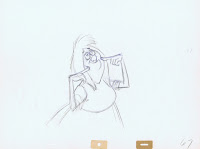
These scans show you how Frank handled Madame Mim. His drawings are a mix of caricature, subtlety and realism. I have almost all rough drawings from this scene, where she comes up with her own rules for the Wizard's Duel (One of my all time favorites). 
I will add a few missing inbetweens myself and show the whole pencil test at a future post.


A gorgeous cel set up from the opening scene.