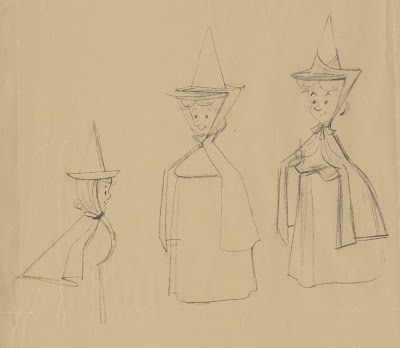
These 1950s xeroxes come from Ollie Johnston's estate. He labelled them:
Don DaGradi character designs. I am not sure that these are by DaGradi, they look more like Tom Oreb sketches to me.
In any case, you can see that right from the beginning, during the character design phase, the crew was going for a style they had not done in feature films. Strong, graphic shapes that still needed to reveal distinct personalities. Frank and Ollie, who animated all personality scenes with the Fairies, were able to maintain the stylized designs in their work. But according to them, it wasn't easy to get used to. The idea of drawing your characters by applying flat shapes, while moving them dimensionally presented a challenge that was foreign to many animators.
My favorite sequence featuring the Fairies is when we see them inside a jewelry box, as they try to come up with a plan to counter Maleficent's curse. Every one of those scenes is worth studying closely. The acting is nuanced and believable, and the overall animation is fluid and graceful.
More on the Three Good Fairies here:
http://andreasdeja.blogspot.com/2011/06/faries-combo-blogmov.html
http://andreasdeja.blogspot.com/2017/03/i-havent-posted-vintage-disney-pencil.html
http://andreasdeja.blogspot.com/2012/01/frank-and-ollie-animated-most-of.html
http://andreasdeja.blogspot.com/2013/06/pierre-lamberts-sleeping-beauty.html


