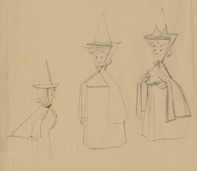
These 1950s xeroxes come from Ollie Johnston's estate. He labelled them:
Don DaGradi character designs. I am not sure that these are by DaGradi, they look more like Tom Oreb sketches to me.
In any case, you can see that right from the beginning, during the character design phase, the crew was going for a style they had not done in feature films. Strong, graphic shapes that still needed to reveal distinct personalities. Frank and Ollie, who animated all personality scenes with the Fairies, were able to maintain the stylized designs in their work. But according to them, it wasn't easy to get used to. The idea of drawing your characters by applying flat shapes, while moving them dimensionally presented a challenge that was foreign to many animators.
My favorite sequence featuring the Fairies is when we see them inside a jewelry box, as they try to come up with a plan to counter Maleficent's curse. Every one of those scenes is worth studying closely. The acting is nuanced and believable, and the overall animation is fluid and graceful.
More on the Three Good Fairies here:
http://andreasdeja.blogspot.com/2011/06/faries-combo-blogmov.html
http://andreasdeja.blogspot.com/2017/03/i-havent-posted-vintage-disney-pencil.html
http://andreasdeja.blogspot.com/2012/01/frank-and-ollie-animated-most-of.html
http://andreasdeja.blogspot.com/2013/06/pierre-lamberts-sleeping-beauty.html


Hi Andreas, Great posts! I love looking at early/developmental drawings of characters and themes, and learning more about the movies I grew up with! I'm no animator, but it's great to see the thought process, through drawings, as the personality and style of these characters evolved.
ReplyDeleteI host a podcast, Beauty and the Beastly Minute, and found your blog while doing research for upcoming episodes. In each episode we talk about one minute of Beauty and the Beast (1991), and we'd love to have you on as a guest to talk about your work.
If you are interested email me at bobby@growlermedia(dot)com and I'll get you more info. If not, keep up the great work on the blog!
These are looking like Tom Oreb's drawings to me as well.
ReplyDeleteReally great to see these drawings and see what Frank and Ollie had to work with. Lots of the solutions were figured out already. Thanks for posting these.
To be fair, I couldn't wrap my head around how that style works, either
ReplyDeleteThe design is very pleasing to the eyes. Especially on first seeing it. I'm a big fan of stylistic animation, when done well it can be incredible like the designs for Sleeping Beauty. Also a big fan of Marc Davis so that doesn't hurt.
ReplyDeleteThanks for sharing, as always :)
This comment has been removed by the author.
ReplyDeleteThis comment has been removed by the author.
Delete