Tuesday, January 31, 2012

Ollie's Three Fairies

Frank and Ollie animated most of the personality scenes with the Three Fairies in "Sleeping Beauty".
Ollie said that originally Walt wanted them to have the same personality, like Donald Duck's nephews. 
"That wouldn't have been too much fun", Ollie remembered, "so Frank and I suggested they'd have different personalities". 
And the picture is much richer because of the contrast between the three. But it goes to show you that Walt took his top animators suggestions seriously.

Here are three rough animation set ups, it's just that these beautiful drawings by Ollie aren't that rough. But then again everybody drew a bit cleaner on "Sleeping Beauty" in order to control the sophisticated design concepts.

The first image, which was drawn on there different levels, shows them reacting to Maleficent in the opening sequence of the movie.
In the second one Flora and Fauna push Merryweather forward and encourage her to grant her wish for the princess, which might counter Maleficent's spell. They are on one level here.
In the third set up, drawn on there sheets, we see the fairies in a sorrowful mood after Aurora left in frustration, when told "she is never to see that young man again".

Even though the designs are graphic, I see a great sense for perspective and depth here. When dealing with three characters in one scene clear staging and composition is so important.
Ollie loved animating these three ladies, and it shows in his drawings and in his animation.


Saturday, January 28, 2012

The Pongo Muzzle Issue

Story artist Bill Peet boarded all of "101 Dalmatians" by himself.
He had definite ideas about the construction and flow of the story, but Bill also had strong opinions for what the characters should look like on the screen.
Ever since "Song of the South" (which Peet also boarded) it had been established that Milt Kahl would take a look at Bill Peet's story drawings, and from there he would polish the look of the characters for animation.
Most often this process worked swimmingly. Peet provided the overall concept, and Kahl refined it with outstanding design and draughtsmanship.
Yet when it came to finding the final design for Pongo both artist found themselves butting heads.
Milt had finished a few drawings showing Pongo next to Perdita, but Bill Peet was not impressed. "Pongo's muzzle is too large, that doesn't look like a Dalmatian, that's a Great Dane" he argued. I am sure Milt responded with a few angry choice words, defending Pongo's muzzle size to better contrast Perdita's.
In the end though Milt gave in and adjusted his design. 
I wonder if Walt himself helped to settle the matter.


Bill Peet 


Bill Peet                                    Milt Kahl


Milt Kahl


One of my favorite scenes with Pongo shows the final design.

Friday, January 27, 2012

Dalmatians


It is always interesting to see what kind of research was done before classic Disney characters were finalized. 
All these drawings were made before animation began on "101 Dalmatians".
(Yes, you guessed it, this is post #101).
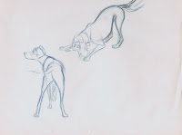
The animators were familiar with the anatomy of a variety of dogs. "Lady and the Tramp" had been produced just a few years before "Dalmatians".
So here four of the supervising animators sketch and find out what is unique about a dalmatian (other than the obvious spots). Some of these poses were drawn from dogs that were brought to the studio, others from live action film footage.
You can identify different drawing styles and approaches to anatomy.
Marc Davis is the only artist  who did not work on any scenes with the dogs. As you know he ended up animating Cruella de Vil, every single scene of that character.


Ollie Johnston


Frank Thomas


Marc Davis


Milt Kahl


Tuesday, January 24, 2012

Post #100, Old Portfolio Stuff

100 posts, how times fly.
It feels like I just started blogging, a sign that I am having fun, I guess.

I want to clarify a couple of things:
I do apologize for not having accepted any invitations to join some of you on a variety of social networks. Absolutely nothing personal, but I just don't have the time right now. Maybe in the future some time.
Also, just because I showcase the work of Disney's great animators as well as some of my own stuff from time to time does not mean that I put my work on to their level. These guys were in a class by themselves, and that's that!
But since a lot of you are students and probably grew up with some of the films 
I worked on, having the occasional "Behind the Scenes" post and talking about those movies might be of interest to some of you.
For the classical Disney animation purist, rest assured, there will be plenty more
"Nine Old Men" gold coming this way.

I selected these drawings from my Disney application portfolio.
They date back to 1978/79.
Life drawings, animal sketches, motion studies from Super-8 film and cartoon experiments, where I tried out different styles. (Second to the last)
I keep hearing my life drawing teacher from way back saying: " If you get too confident with your drawing, try sketching with your other hand (to keep learning)."
That sounded funny at first, but it makes sense. What he meant was: don't show off with what you think you know, keep observing and improving instead.

I think if you know how to draw well,  you own something treasured. It shows that you put quality time into observing and trying to understand things.
And it doesn't matter if you are a pencil animator or if you work in CG, good drawing will help you to visualize so much better, and you will be ahead of the game.
In other words, you will know a bad pose from a good one. You will be able to say:
this hand looks awful, but that one looks great. And combined with your acting sensibilities: this is entertaining, that isn't!
This journey to become a good draughtsman is a lot of fun, but of course you never arrive. Hopefully you'll just keep on learning.

My five cents worth of wisdom for the day, here are a bunch of oooold drawings.


Saturday, January 21, 2012

Berlioz

Here again are a couple of character doodle sheets. They explore ideas for entertaining poses and situations as the kitten Berlioz from "The Aristocats"
plays the piano.
The first sheet is by Ken Anderson, the second one by Milt Kahl.
Ken is drawing the character with a Beethoven hairdo, Milt did not incorporate that idea. Neither did he animate any of those scenes for the film, perhaps at one point he was was supposed to.
I love all of these drawings. Ken seems to have endless ideas for this situation, and Milt gives Berlioz a lot of appeal by maintaining a cuddly  softness in his anatomy.


Friday, January 20, 2012

Marc Davis "Song of the South" Doodles

Here are a couple of sheets showing design and personality explorations by Marc Davis for Brer Fox and Brer Bear.
Marc is defining the overall structure of these anthropomorphic animals. At the same time he is thinking about shapes that are character specific and entertaining.
My favorite is the doodle of the fox's head on the upper left. The way the hat sits on the head, and you only see the nose and some cheek hair. Yet it's already a personality. Brilliant stuff!
The final two images are copies of Marc's animation roughs for the fox.


Tuesday, January 17, 2012

Jungle Girl

As story artist Floyd Norman can testify, finding a proper ending for "The Jungle Book" proved very difficult for the crew.
They had created all these entertaining sequences full of rich characters, but how do you wrap it all up? How DOES Mowgli end up at the man village?
Finally, in a meeting Walt Disney himself suggested that a young girl would  lure Mowgli away from the jungle toward the village.
Guess what, the animators hated the idea. Milt Kahl blurred out: "Yeah, and we'll call it 'The Lure of the Tame' "!  
"Walt was NOT amused", Milt recalled years later in an interview "He just gave me a look."
Even Ollie Johnston thought, this would be a tacked on ending. Nevertheless he ended up with the assignment of animating the sequence. "The more I thought about it, the more I liked it" Ollie said. 
The challenge for this situation was to find the right balance between innocence and sexy for the two characters. They are both still very young, and this needed to be handled very carefully, or the sequence would be laughable.
Of course Ollie was the perfect choice to animate it, the end result feels genuine and sincere.

The first color sketches are by Ken Anderson and Vance Gerry, the second one seems to be inspired by painter Paul Gauguin.  


These are more specific character  sketches by Ken Anderson. You can compare them  directly to the following more nuanced versions by Milt Kahl.
I am completely in awe of those drawings, there is an absolute beauty and charm 
to them. Milt just had a way of creating the ultimate appeal for Disney characters.
Disney's Michaelangelo? You bet!


This blue animation rough by Ollie shows that he was able to utilize beautifully what Milt had prepared for him. 
The last sketch by Ken Anderson suggests a somewhat different tone for the final sequence in "The Jungle Book".