Tuesday, April 30, 2013

Joe Rinaldi


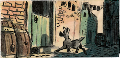
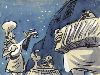
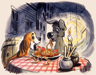
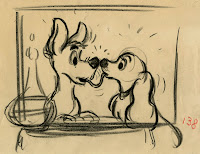
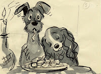
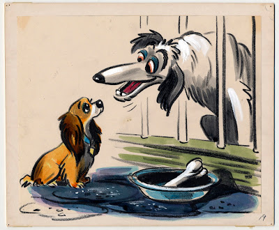
Joe Rinaldi was one of Disney's great story artists. He was a very gifted draughtsman, too, and his boards are a pleasure to study. As I mentioned before, because of the appeal and those confident lines his work often gets mistaken for Bill Peet's.
Rinaldi's first Disney story credit was for Dumbo. He worked on many short films and features up until Sleeping Beauty. 
Born in 1914 he unfortunately lived a short life, he died in 1974 at the age of sixty.

Frank Thomas said once that Joe had a lot to do with what was great about Lady & the Tramp.
So here is a sampling of Joe Rinaldi's story work from that film.


Sunday, April 28, 2013

Robin Hood as a Stork


Ken Anderson drew this terrific concept sketch of Maid Marian and Robin Hood, disguised as a stork. I love the difference in hight between the characters, it makes the staging more interesting than what you see in the film, where the Stork is drawn a lot shorter.
Maybe the taller version made it too difficult to have him communicate with Maid Marian, Prince John and the other characters.

Milt Kahl tried to figure out how this costume would actually fit on the fox' body. He is showing how the stork legs could be manipulated, and how the wings are attached to Robin's arms. 
It's a realistic and logical approach on how to handle the outfit, but in the movie the Stork is animated more freely without analysis of the costume's mechanics.


When the beak opens Robin's jaw is exposed inside.


Most of the Stork's character animation was done by Frank Thomas who focused on how Robin Hood would act in this disguise.

Friday, April 26, 2013

Beauty and the Beast Outtakes


I was looking through my files and found these design drawings I did way back for the early version of "Beauty and the Beast". The scans are xeroxes colored with markers.
At that time we had Maurice's sister in the story. She was part of the household and insisted that Belle marry the wealthy Gaston, so the whole family -especially herself- would benefit from the marriage.
It created an interesting dynamic, but everybody felt that a selfish, cruel character like her would draw parallels to Cinderella's stepmother.


This design was based on a sketch by Jean Gillmore.


Various ideas for Maurice.


I was asked to base one design on the actor Jack Lemmon.


Gaston was already vain and full of himself, but not like the outdoorsy type from the final film.
This guy lived the good life. He wore expensive clothes, had servants and never worked a day in his life.
He sort of looks like a young Marlon Brando, which was unintentional.


I don't think these are particularly good drawings, but they show you that we went into different directions at the beginning of production.

Wednesday, April 24, 2013

Ken O'Connor on Cheating Perspective


This is an interesting mini lecture by Disney layout artist and art director Ken O'Connor on how to cheat perspective effectively.
Ken worked on many of the Disney classics and shorts for a period of over thirty years.
I had the chance to meet him on a couple of occasions when he gave talks at Disney Animation.
The man knew what he was talking about. He was extremely skilled and enjoyed problem solving when planning layouts for animation. 
Born in Australia in 1908, Ken moved with his family to the US in 1930. He started at Disney in 1935 and before retiring in 1978 he taught at CalArts. He passed away in 1998. Ken was an artistic giant within the Disney organization.


Sunday, April 21, 2013

Wartime Short Films


Many of you know that the Disney Studios produced a number of propaganda animated shorts during WWII.
In "The Winged Scourge" the Seven Dwarfs demonstrate how to fight the spread of mosquito born malaria.
The sketches above by Milt Kahl show a rough layout for Dopey and Happy. 
The kid on the same sheet is from "Education For Death", him and his classmates are being brainwashed in Nazi philosophy.

Years ago Charles Solomon and myself conducted a few interviews with some of Walt's animators, and Frank Thomas recalled this episode in regards to this short film:
"The worst one of all was "Education For Death"…oh, lordy! 
Now Kimball got the good part of that, he got the Goerring and Hitler and Brunhilde, he had the fun stuff to work on, while Milt and I got these awful scenes of real kids, and drew them like real kids and make them look convincing. And they're talking German, and on our readings it had all German. Try to animate it, embarrassing.
Milt and I were going upstairs for some reason, and we were standing at the elevator. Milt said "We ought to kick Walt right in the ass for doing this type of thing", and all of a sudden the doors opened, and there was Walt. So I couldn't resist, so I said, "Here he is, go ahead!" 

Here are a few rough Milt Kahl drawings for another wartime short called "Reason and Emotion". It is an extremely clever and effective film that sends a warning of when emotional and reasonable impulses go unbalanced.


Friday, April 19, 2013

Dalmatian Art


The more I think about it, the stronger I feel that "101 Dalmatians" is the most modern of all Disney animated features.  Artistically this is the peak, right here. A film which embraces modernism and a gutsy graphic style never attempted before or since. 
It is almost surreal to remember that this movie is over 50 years old! So why hasn't Disney Animation advanced even further in the decades following Dalmatians? I think part of the reason is the fact that Walt Disney himself did not care for this "artsy" look. He probably thought the film looked rough and too unpolished.
To me the beauty of it is that it makes a statement which challenges the audience:
Look, this is a sketch, but it is alive and real at the same time.

And of course audiences completely bought into this concept and embraced the movie.
Come to think of it, Disney experienced another breakthrough not so long ago:
Mike Gabriel's short film "Lorenzo", which took pencil animation to the next level.
More on that in an upcoming post.

Above and below, concept art by Ken Anderson, inspired by Ronald Searle.
The anatomically correct Pongo caught me by surprise.


Story sketches by the one and only Bill Peet.


Avant-garde Vis Dev by the one and only Walt Peregoy.


Final frames from the film reveal the sheer joy of experimentation for an animated film.


Tuesday, April 16, 2013

Archery Tournament Characters


These wonderful character studies for the movie Robin Hood were drawn by Milt Kahl.
Ken Anderson again provided rough sketches first, and Milt refined the designs.
To me these are among the best looking characters for any Disney film from the Xerox era.
The draughtsmanship and charm in these knock me out.
Every one of these personalities has star qualities, something I call magnetism. You can't take your eyes off them. And the way Milt is able to draw wings, pigs' feet or dogs' paws functioning as human hands is astonishing. 
In the words of Ken Anderson: 
"Every one of Milt's drawings is a triumph of brain power".