Sunday, June 29, 2014

Contract Negotiations


Director John Musker came up with this hilarious cartoon panel featuring Jeffrey Katzenberg and myself.
After I had completed my work on Roger Rabbit I returned from London back to the Burbank Studio.
At that time management decided to put key animation personal under contract. But I was seriously considering to return to Europe to work in animation over there. 
To my bewilderment and surprise I started receiving gifts from Jeffrey’s office, usually with a note that asked me to stay on and sign a contract. The truth is that I did take my time to decide my future, but before I finally opted for continuing work at Disney I was not offered Milt Kahl scenes from the archives.
Instead I had asked for Milt’s animation desk. The deal was that I could have it, IF I could find it around the studio. Well, with the help of old studio photographs I did locate the desk (at least the upper half). The photos showed Milt working on that desk during the 1950s and 1960s. 

It really hasn’t helped me to become a better animator…but it is a very cool thing to own.

Friday, June 27, 2014

Ward visits Fred


In this rare photo of Ward Kimball and Fred Moore, taken sometime in 1941, Ward is showing Fred some kind of gag drawing. It looks like Moore is working on Mickey and the Beanstalk, which later became part of the film Fun and Fancy Free. According to the model sheets the project at that time didn’t have a title yet, it was simply called “Mickey Feature”.
In the end the film’s running time was only 29 minutes. After many story treatments the crew just wasn’t able to stretch the material into a full length feature. Fun and Fancy Free, which didn’t get released until 1947, also included a featurette called Bongo.
(The photo was shown during a brief program about Disney history on CBS.)

Here are the two model sheets from Fred’s desk.


Tuesday, June 24, 2014

Milt Kahl's Tigers

If there is one animal that presents a true challenge to an animator, it would have to be a tiger. Moving a large cat around is difficult enough, wether the design is cartoony or realistic. But to have to keep track of all those stripes adds another level of complexity to the assignment. 
The good thing is that when placed correctly over the animal’s body, the stripes can help define perspective and volume to the anatomy. But for twenty-four frames per second they need to accurately follow the tiger’s outer surface. And that requires a great effort from not only the animator, but also from the assistant, who needs to deal with a hodgepodge of lines when looking at two key drawings on top of each other on the animation desk.
Over the years Milt Kahl had the opportunity to develop three distinctively different tiger personalities.
The first one appeared with Goofy in the 1945 short Tiger trouble. Story artist Bill Peet created this model sheet showing the eccentric character in a variety of expressive poses. (I don’t know why an off model chubby tiger was added to the sheet, on top of the tree. Maybe a colleague told Peet, he is drawing the tiger too skinny).
Milt saw that Peet’s design was ready to go for animation, not requiring any changes at all.
When interviewed about this character years later, Milt recalled that the story called for a screwy tiger who gave Goofy a hard time…nothing special, just baggy pants comedy.


I love Peet’s elephant sketches just as much.
The model sheet below was made up of some of Milt’s poses and served as reference for the 1950 Donald Duck short Lion Around.


Over twenty years after Tiger Trouble Milt animated the villain in the 1967 film The Jungle Book, a very different assignment. Cool, smooth and subtle animation defined this groundbreaking character, who’s role in the film was relatively short, but utterly impressive as a design and performance. Shere Khan was one of the last characters Walt approved for an animated film.


Tigger first showed up in the 1968 featurette Winnie the Pooh and the Blustery Day. He represents a mixture of real tiger, stuffed toy and a Picasso-esque drawing style. His high energy contrasts the other low key personalities beautifully. When I look at these drawings I realize that Tigger was created to entertain kids, but at the same time his design and motion reach the animation stratosphere. 


Here is a clip reel with all three tigers. Entirely different from each other, they all show Milt’s mastery of the medium of animation.


As far as Mushka, the tiger I am currently working on, after a lot of research into real tiger behavior and anatomy I feel ready for production animation. Story work is coming to an end, I am pretty psyched. 

Friday, June 20, 2014

How They felt about each other's Work

Back from France, where I had a blast visiting friends. Didn’t go to Annecy, just hanging out around Paris, which to me is the most beautiful city in the world.
I will be without tech help for a few more days, so here is another post without images.

Since I knew seven of the Nine Old Men (Les Clark and Lounsbery had already passed away when I started at Disney) it was always interesting -though sometimes a little awkward- to hear their comments and opinions about the other ones’ work.
Frank and Ollie often brought up the subject of Milt Kahl’s superb draughtsmanship, but they both felt that Milt had shortcomings as an animator because drawing and design were Milt’s main concern. Not the inner feelings of the character. Frank thought there was a time (during the late 1930s through the 1940s) when Milt was just perfect for the studio. His designs and animation took the Freddy Moore approach to a more refined level, and other animators were able to follow his lead, graphically.
Later Frank also said this about Milt’s animation: “Milt is right about 90 percent of the time, but when he is wrong…boy, is he ever wrong!”
To me, this is actually a huge compliment from one master animator to another. The following statement by Frank is not. “Milt Kahl is an animator who used animation principles very intelligently.”
That’s basically saying, Milt was more of a technician than an artist.
Ollie stated one time that Milt only did what was required in the story boards.

Frank and Ollie thought that Lounsbery had the chops to be a great animator, but that he didn’t work hard enough.

As far as Marc Davis, they thought that he used live action reference too literally. They placed Marc between their own approach to animation and that of Milt Kahl. Milt being too absorbed by perfection in drawing, and their animation being driven by the characters’ inner emotions.

Frank stated that in his opinion Ward Kimball’s only sincere character was Jiminy Cricket. After that Ward started experimenting for experimentation’s sake.

Frank and Ollie liked Woolie Reitherman’s action sequences, but they occasionally questioned his judgement as a director. Robin Hood was the film Frank enjoyed the least working on.

As you can imagine, Milt had strong opinions as well, when it came to looking at his colleague’s work.
He thought that Frank and Ollie could do about anything in animation, but their work was handicapped because of poor drawing. On his last film The Rescuers Milt got so upset with the lack of quality in Frank and Ollie’s work (as well as the work of other animators) he literally blew a fuse. He felt that Bernard and Bianca moved like humans and not like mice.

About his friend Marc Davis, Milt said that Marc was the better draughtsman, but he was the better animator. “When Marc designs a character he starts out by making great drawings right from the start, while I struggle with a lot of bad sketches before I arrive at something I like.”

Milt on Lounsbery:” You had to give him the broad characters, he would do well on those. But he was limited, because he couldn’t handle characters like Peter Pan or Wendy.”
Milt judged Ward Kimball in a similar way, but admitted that Ward would often come up with character situations he himself could never do, like Lucifer the cat looking for a mouse under the tea cups.
Milt thought that was just brilliant.

Milt wasn’t overly enthusiastic about Eric Larson’s animation, but felt that the best thing in Lady and the Tramp was the character of Peg.

Marc Davis’ favorite animator was Milt Kahl. “You never know how Milt is going to animate a scene, he always surprises you.” Among Marc’s favorite Kahl characters were the dancing Llama in Lake Titicaca, and Tigger. 
He talked about animator casting for Peter Pan, and felt that Milt should have gotten Captain Hook  to animate. “In the film Frank’s acting is ok, but the drawing is subpar.”

Eric Larson was complimentary about all of his colleagues. When talking about Milt Kahl he mentioned: "We all learned from Milt, but I did disagree with him on more than one occasion.”

I am not sure how Kimball felt about the others’ work. He was generally concerned about too much realism coming into the Disney features. One time he gave Milt Kahl, who often handled realistic characters, a “compliment” : “Boy, you are so good with that boring stuff!”
Sometime in the late 1970s the studio screened the film Dumbo for newcomers in the training program. One of the trainees ran into Kimball afterwards and said: ” Ward, Frank Thomas just mentioned that he thinks there isn’t one scene in Dumbo that doesn’t need improvement.” Ward’s answer was:” Frank said that because he didn’t work on the picture.”

According to someone who knew John Lounsbery, during what must have been a down day for him, John stated:” Let’s face it, there is Milt Kahl and the rest of us are just a bunch of amateurs.”
We all know that nothing could be further from the truth.
These guys were ALL phenomenal artists, and with that comes the occasional insecurity, professional jealousy and even a little bit of arrogance. But go and try to name another group of artists who not only changed the medium of film, but changed the lives of so many people.

Monday, June 9, 2014

Blog Break

I will be in Europe for a short while, so I thought I might offer these links to previous posts, that could be worth revisiting. 

These close up pencil tests of Tramp by Frank Thomas and Milt Kahl are pretty amazing:

A spectacular Captain Hook pencil test by Frank Thomas:

Character designs for Robin Hood by Milt Kahl, a celebration of the art form:

Inspiring Fred Moore goodness:

Animal sketching as good as it gets by Bernard Garbutt:

By the way, this blog is now three years old!!  I almost don’t remember, not posting. It’s been fun.

Thursday, June 5, 2014

Rabbits


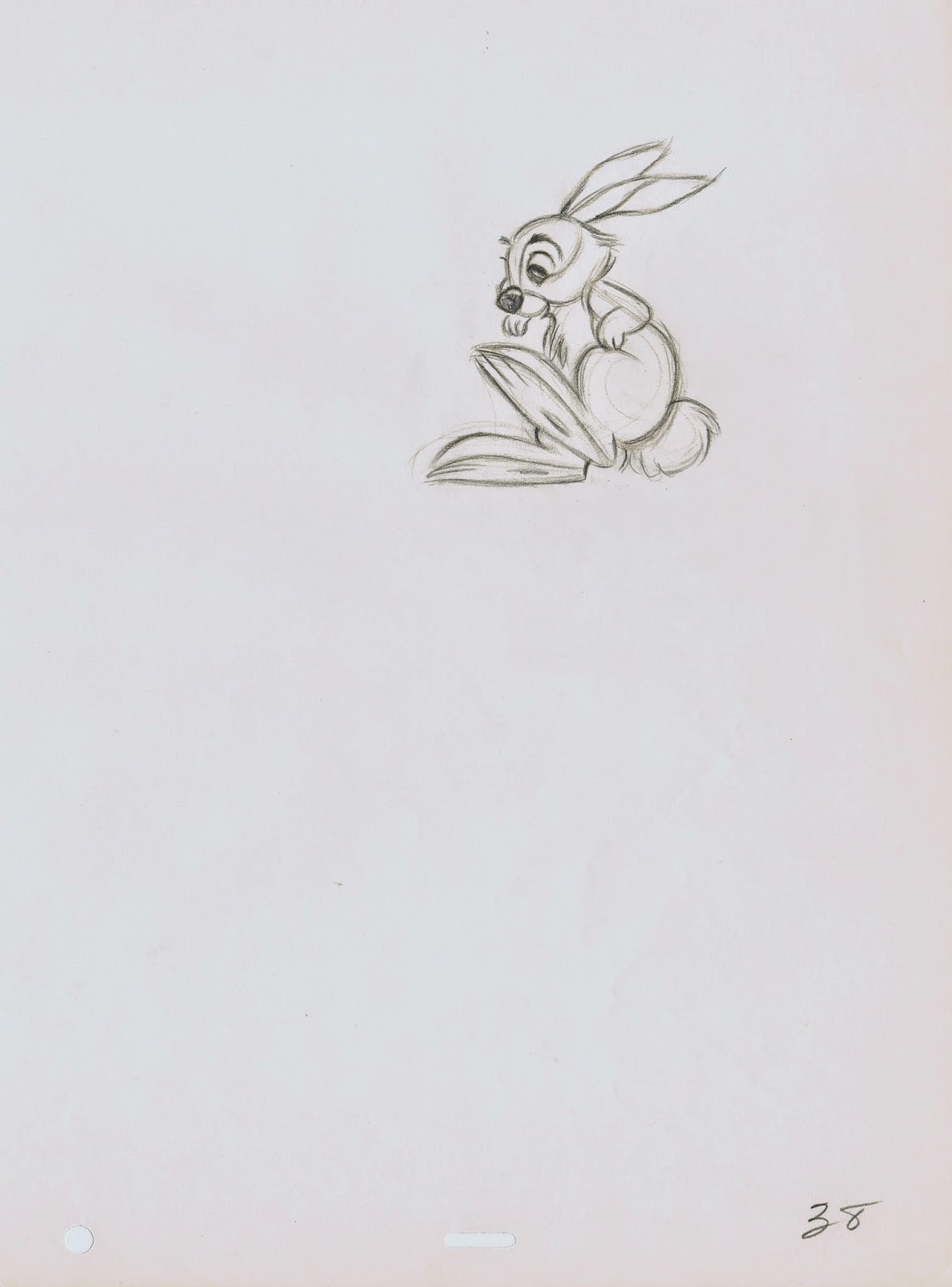
The development of Sleeping Beauty’s animals followed a certain path, from one artist to another. Character stylist Tom Oreb started out by defining these characters with definite, clear shapes.
As you can see in these rabbit drawings, the triangle seems to be the one shape that dominates the designs. Beautiful modern graphics that have very little to do with the round, chubby look of Thumper from Bambi.

Milt Kahl maintained Oreb’s shape language and translated the rabbits into a linear design, that could be animated. The sharp edges of these shapes remind me of sophisticated paper cut outs.


John Lounsbery animated most scenes that involved the rabbits. He was able to follow the strict design style, but he also added a personal touch of charm to his drawings.

Here one of the rabbits performs a perspective jump into one of Prince Philipp’s boots.


Wednesday, June 4, 2014

Heinrich Kley was crazy...

…in the best sense of the word! He was a compulsive draughtsman, and it seems that any white blank surface, however small, called out to him to be drawn on.
His wife Fanny had a a collection of books. At that time it was common to have a sticker on the book’s front page that would read: Ex Libris (from the books - of-). You would add your name, so in case the book is loaned to someone, the original owner is easily identified.
But Kley instead created beautiful, little ink illustrations before before writing her name on the page.
Here are a few examples.


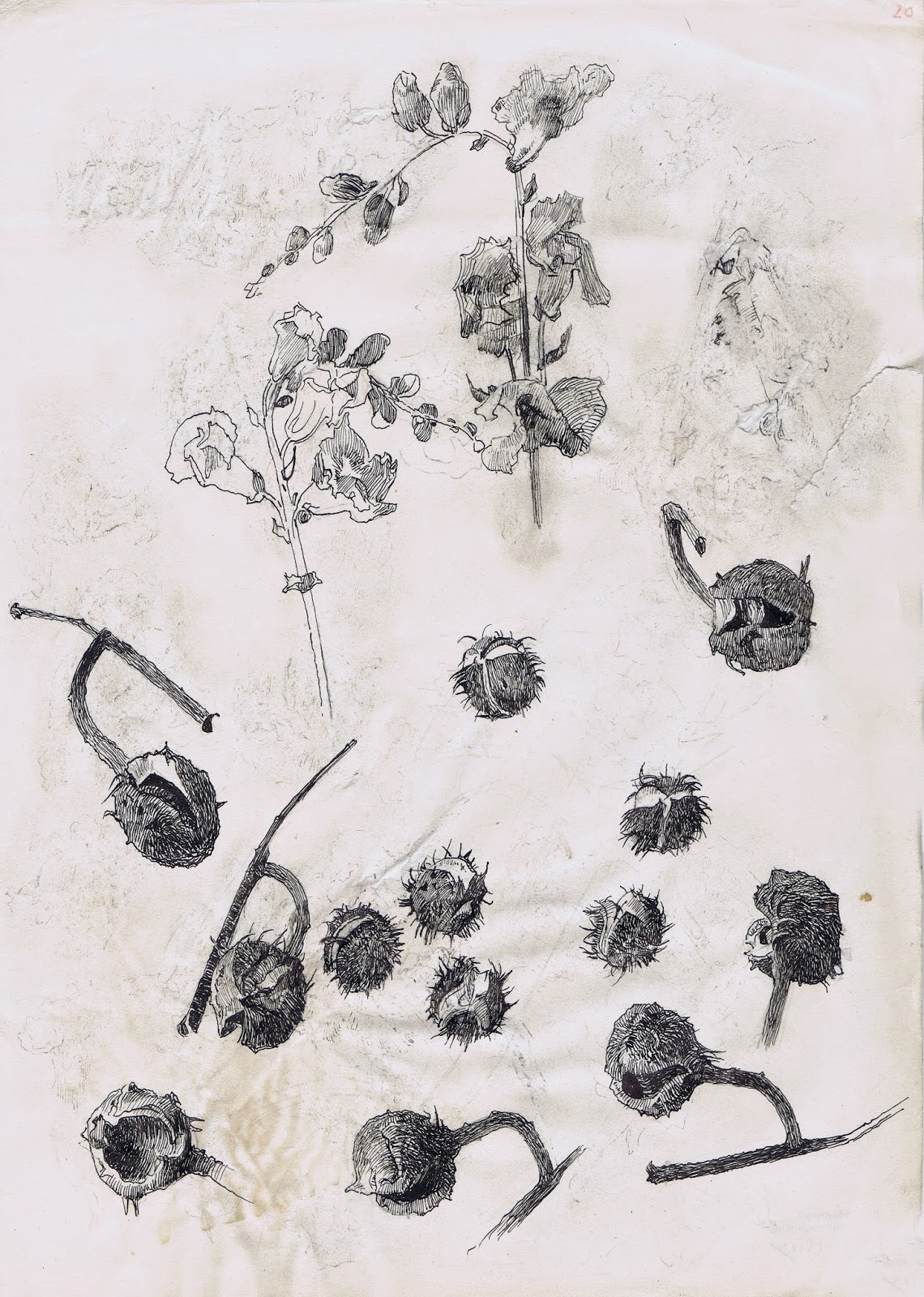
Throughout his professional career Kley continued to draw from nature like this page of chestnut studies. They show a sincere curiosity of organic life forms, Kley found beauty in almost everything. There is also something anthropomorphic about these chestnuts. They look like monsters with their mouth open.


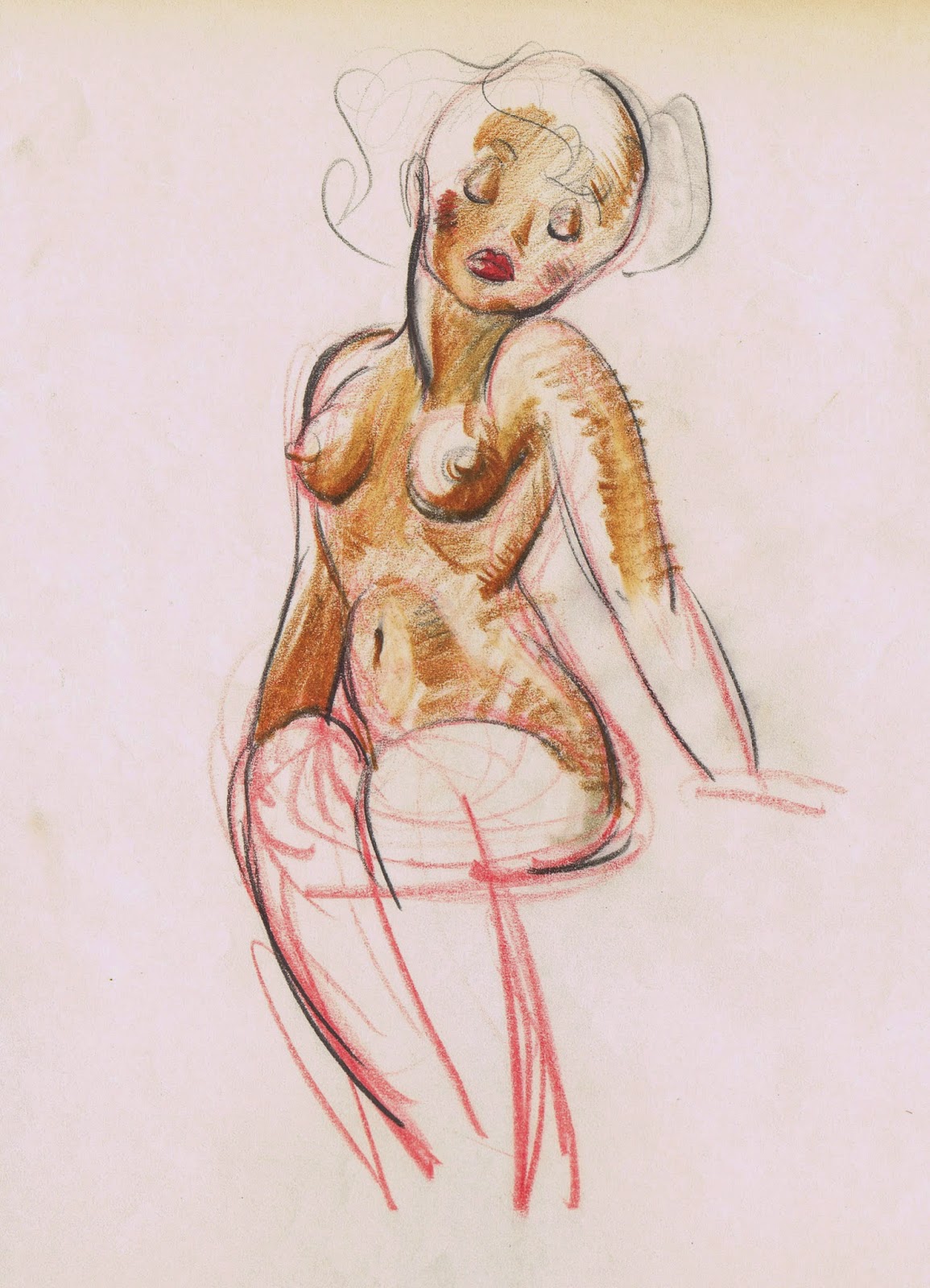
A lovely sketch of a dancer that would be incorporated into a final illustration.


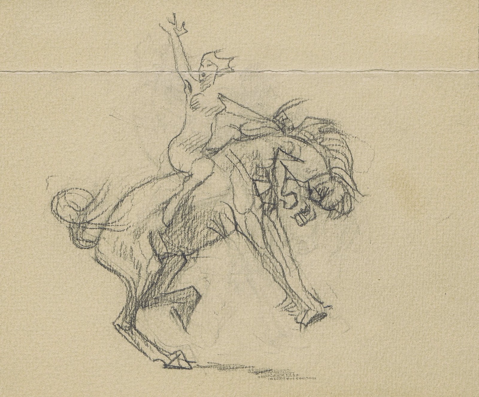
A loose pencil sketch with a woman riding on the back of a centaur. 
Kley’s draughtsmanship and his sense of motion still inspires animation students and professionals, one hundred years later.


Sunday, June 1, 2014

More Freddie Girls


…to get your week started. Charming, attractive and sometimes naughty, but always beautifully drawn. Fluid lines on paper by a young artist whose talents peaked so soon. Unfortunately he was unable to develop his great natural skills further, but we are grateful for the stunning and important work he did during Disney’s Golden Age.