Monday, October 31, 2016
Sunday, October 30, 2016
The Old Inspires the New
The connection between these images might prove to be utterly coincidental. But I couldn't help but wondering, if a couple of story sketches from Fantasia inspired certain gags in later Disney films.
Remember in Jungle Book when King Louie becomes annoyed at the little monkey mimicking his musical antics? That's what's happening in the Fantasia sketch between the old and the young satyr.
A beautiful sketch by Sylvia Holland reminds us of a situation in The Fox And the Hound.
I doubt there is a connection between the old and the new, but who knows? Perhaps Disney story artists from the modern era found inspiration from discarded artwork decades earlier.
Story sketches Van Eaton Galleries
Thursday, October 27, 2016
Pinocchio Art III
More art from Pinocchio that explains why many people regard this film as the best animated feature ever made.
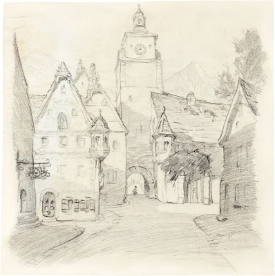
The thoughtful planing for each scene is evident in Gustaf Tenggren's layout painting from the film's opening. A stunning piece of art that suggests mood, color and camera mechanics. Tenggren also did this village study based on architecture from the Southern German town of Rothenburg.
An early Geppetto rough animation drawing, probably by Art Babbitt.
A rough key and in-between drawing from another Babbitt production scene. Staging and acting are all there, but clean up artists had their hands full when adding detail and solid volumes.
A great cel with two of the film'a villains (Pinocchio has more villains than any other film that I can recall). This might be a color model cel, there is no dry-brush on the characters' cheek hair.
An early version of Lampwick, before Fred Moore got his hands on the character.
Story sketches suggested inspired staging and motion, and the animators took full advantage of this material.
A clean up drawing from a Bill Tytla scene. You can tell how much the animator internalized the character's emotions by the choice of facial expressions like the one here. This artist is totally expressing himself.
Production cels and backgrounds show an enormous amount of artistic integrity and passion for the art form.
Images Van Eaton Galleries and Heritage Auctions
Don't miss out on the once in a lifetime Pinocchio exhibition still running at the spectacular Walt Disney Family Museum:
http://waltdisney.org/exhibitions/wish-upon-star-art-pinocchio
Monday, October 24, 2016
More Ferdinand
A couple of years ago I posted about Disney's 1938 Academy Award winning short film Ferdinand the Bull. Here is more visual material from this groundbreaking film. This article is from LIFE magazine. The idea of the unwillful hero would be repeated a few years later in The Reluctant Dragon. A bull and a dragon who don't want to fight. One prefers to smell flowers, the other much rather write poetry. Today it seems easy to categorize these two characters' nature, but I bet in those days that wasn't given much thought. After all both projects were based in literary stories.
Story sketches reflect a more realistic approach to the styling of the characters.
1930s Disney.
Here is the link to my first post on Ferdinand:
http://andreasdeja.blogspot.com/2014/04/ferdinand.html
Saturday, October 22, 2016
Heinrich Kley Originals
A few originals by Heinrich Kley, offered at various auctions. The last image recently at Heritage. If I had my pick, I'd choose the first one, it looks like a master animation drawing. So effortlessly scribbled down. As I pointed out earlier, the Disney animators didn't have such knowledge of anatomy when working on the centaurs for Fantasia's Pastoral sequence.
Today Kley's work is still the standard when it comes to depicting fantasy characters with realism.
Wednesday, October 19, 2016
The Milt Kahl Book
I have talked before about my proposed idea for a series of books, each volume would celebrate the art of a particular Disney animator (not only the Nine Old Men). I had meetings about the book series when I was still at Disney. At that time the studio was working on the Disney Archives series, and I was told that these individual animator books would be too similar.
You might agree when I say that the time has come to re-visit that idea. The other day I had lunch at the Disney commissary with a small group of people, one of them was no other than Fred Moore's granddaughter. I had met her before way back in 2002 over at Ollie Johnston's house.
Anyway, it was great to find out that another member of the lunch group is working on a book on Fred Moore!!
So I here declare that after I finish my film Mushka, one of my main projects will be to publish a coffee table sized book on the art of Milt Kahl. I still have a lot of artwork by Milt that didn't make it into my Nine Old Men book. That art needs to be out there to inspire!
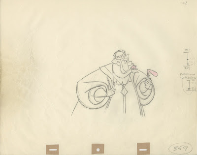
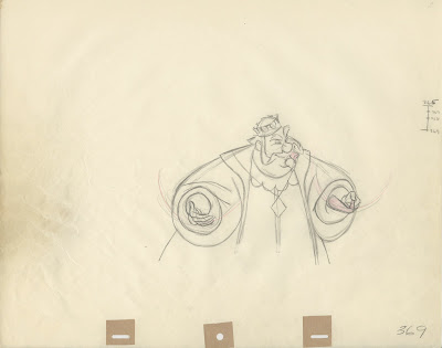
To give you an example: This gorgeous partial scene of King Hubert from Sleeping Beauty.
In the previous scene we see King Stefan looking out the window, sighing: "No sign of her yet, Hubert."
Scene 5 from seq. 13 follows. The Disney draft says: King Hubert at table, gorging greedily on food, talks to o.s. King Stefan. "'Course not, ha! Good half hour 'till sunset, ha. Ah. excellent bird! Ah, come on man, buck up! Battle's over...(girl's good as here!)"
Look at how Milt added overlapping action (in red pencil) on Hubert's sleeves in some of the last rough drawings. (Yes, this is rough animation, before clean up!)
All keys from this scene might end up in the Milt Kahl book.
Tuesday, October 18, 2016
Watercolor Backgrounds
Most painters will tell you that watercolor is the most difficult medium to work in. You pretty much have to finish the painting while it is still wet. Once dry, no corrections can be made. Oil or acrylic paints are much more forgiving. You can make changes whenever you want.
It is astonishing to see the background artistry of early Disney features and shorts, all painted in watercolor. Just look at the piece above. A background from the 1940 short Tugboat Mickey. The lighting and subtle use of color is just incredible.
The next piece is from the unproduced Mickey Mouse short film.
This one is from the Goofy short Baggage Busters, 1941.
Polar Trappers, 1938. What I like about Disney films is the fact that often the sky doesn't have to be blue or white. The painters used a color that fits the mood of the scene.
A great original Tom & Jerry set up, even though, I think the colors have faded a bit over time.
When we started production on Lilo & Stitch, it was decided that the film would benefit if presented in a vintage watercolor technique. The problem was that most background painters at that time weren't capable of painting that way. It took a lot of practice, trial and error and above all valuable lessons from Maurice Noble, who had painted backgrounds for Snow White. I was told his advice was incredibly important for re-capturing the magic of watercolor painting. From Snow White to Lilo & Stitch, what a legacy.
I believe these two paintings are pre-production. Beautiful!
Images Heritage Auctions
Subscribe to:
Comments (Atom)


