Tuesday, February 28, 2017

Drawn Water


It is beyond me how Disney effects animators controlled all that massive line work from drawing to drawing when it came to animating water. Imagine looking at two of these drawings from Pinocchio on your animation disc, and then trying to create an in-between.
Yet they did it with stunning results. Scenes like these might look realistic to you, but in reality there are no graphic lines in the ocean. These moving drawings are imaginatively designed and timed to give you the illusion of water.


Beautiful art deco ripples appear as the crane takes a drink. From Fantasia's removed sequence
Clair de Lune. This short appeared years later in Make Mine Music with different music.


Bambi has incredible effects animation throughout, including water.


When I started at Disney way back, a friend asked me: Will we ever see water again like in Fantasia?
These effects artists were experimenting feverishly.


The Disney xerox films shared similar design ideas for water. Simple, economical, but still beautiful.


I believe the water's transparency was achieved through double exposure, I don't think they used transparent paint at that time.


We had some great looking water for Lilo & Stitch. The roundness of the character design is reflected in the wave patterns. And that's how it should be, special effects need to be specific to the overall design of the film.
Did I mention that this film was a ton of fun to work on?


Drawings, Heritage Auctions.

Saturday, February 25, 2017

Aristocats Mix


A few images from behind the scenes of Disney's 1970 animated film The Aristocats.
Here story artist Vance Gerry is presenting his storyboard of the "boy meets girl" sequence to director Woolie Reitherman and animator Frank Thomas. Frank animated the beginning of this section, Ollie Johnston did the second half, and Milt Kahl drew a few scenes in the middle.
You can see the sequence in pencil test form here:

http://andreasdeja.blogspot.com/2011/08/aristocats.html


A sketch of Madame Bonfamille and her cats from a deleted song sequence. I believe Vance Gerry drew this one.


A vis dev piece by Ken Anderson. He created an enormous amount of character as well as environment visuals for the film.


Milt Kahl ended up animating Mme Bonfamille. In this scene she discovers that her cats have disappeared. It's a nice scene, beautifully drawn, but...lightening is going to strike me...her hands are a bit too large.


A couple of press photos showing the characters of Napoleon and Lafayette, along with their voice actors Pat Buttram and George Lindsey.
Frank Thomas and Eric Cleworth animated these guys. I love the feeling of loose skin on these dogs.


The Bonfamille household used to have a butler and a maid, but she didn't make the cut.
Drawings by Ken Anderson.


Another story sketch by Vance Gerry, followed by the final film frame. Ollie Johnston animated this sequence, and as soon as I locate his staging/thumbnail sketches in my inventory I will post them.


Thursday, February 23, 2017

Nottingham Wolves


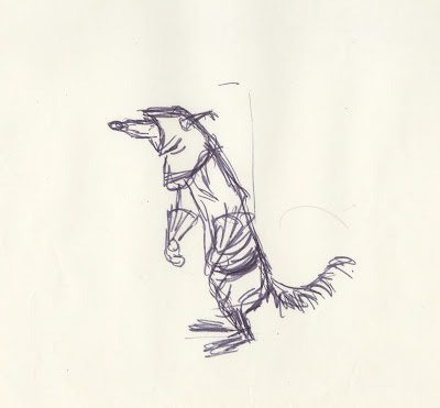
A while ago I posted a few sheets with rough drawings by John Lounsbery showing his early design approach for the henchmen wolves from Robin Hood. 
As always Milt Kahl came up with the final refined designs, shown here. I think they look terrific. The way their hoods often obscure the eyes makes them look dangerous, but a little dumb at the same time.
When you break up the proportions from the hood, then the torso to the skirt part, they are all different lengths. Milt knew instinctively that even proportions result in boring, uninteresting designs.
This philosophy is evident in any of his character designs.
Great drawings!


Here is the link to Lounsbery's earlier versions of the wolves:

http://andreasdeja.blogspot.com/2016/07/lounsbery-wolves.html


Tuesday, February 21, 2017

A Ken O'Brien Scene


There is very little information about animator Ken O'Brien online or in books. This is a screen grab from a short 1986 interview, which was posted on youtube by Jerry Beck. Here is the link:

https://www.youtube.com/watch?v=9jIGKFbl0Zw

What strikes me is that Ken in his demeanor and speech reminds me so much of Marc Davis.
Kind of serious, confident, with the occasional chuckle during his answers.
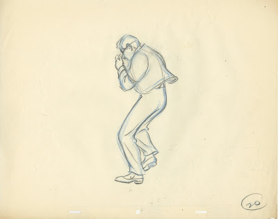
He mentions working with Fred Moore (among others), and I can clearly see that influence in terms of clarity and fluidity applied to key poses for this scene depicting Jim Dear from Lady and the Tramp.
At the end of the film Jim Dear takes a photograph of the new dog family. The old fashioned flash light explodes, resulting in smoke filling the room. Here he makes a run for the window, before opening it in order to clear the air.
O'Brien is in full control of animating this realistic design convincingly. The overall body rhythm reads simply and clearly. There was live action reference involved, but O'Brien always altered his animation drawings to get more dynamic results.


A final frame with effects from the scene.


Check out this previous post on Ken O'Brien:

http://andreasdeja.blogspot.com/2015/02/ken-obrien.html

Saturday, February 18, 2017

The Genius of Hans Bacher


Hans Bacher knows what he is talking about. He is an avid student and admirer of classic animation as well as modern art. Hans knows color like nobody's business. He is an expert at composition, staging and mood. His work on Mulan elevated that film into one of the two most beautiful Disney films from the modern era. (The other one being Aladdin. Richard Vander Wende was responsible for the look of that film.)
Here are a few pages from Hans' Mulan style guide. Extraordinary!


Thursday, February 16, 2017

Disneytoon

I had almost forgotten that I animated this logo for Disneytoon Studios a while back.
I remember sketching out about five different versions for the spot, and this is the one they picked.


Here is the YouTube link:

https://www.youtube.com/watch?v=NnMeRgbpARM


Wednesday, February 15, 2017

The Martins and the Coys


Here is another rough animation drawing by Milt Kahl that was discarded. This sheet comes from the estate of Disney animator Ken O'Brian. It shows the two lead characters from the short The Martins and the Coys, which was part of the 1946 feature Make Mine Music. 
Grace Martin and Henry Coy are dancing energetically on their wedding night. For fast action like this, the animator most likely did all of the drawings (on ones) to ensure fluidity and readability of motion. This is a young Milt Kahl, who knew how to combine his knowledge of human anatomy with  cartoony drawing and motion. This single frame from the dance is a JOY to behold!
I would say that the overall character styling is still influenced by Fred Moore. But Milt takes it a step further, because he knew so much about the human figure, composition and action analysis.

The full sheet is pictured below. As you can see, once discarded, Milt used it as a surface to sharpen his pencil. There are notes, calculations ($ 3000 ?) and what looks like telephone doodles.
I am glad that Ken O'Brian saved this gem for all of us to enjoy more than a half century later!!


More stunning sketches from this sequence in this earlier post:

http://andreasdeja.blogspot.com/2012/10/animated-energy.html


Saturday, February 11, 2017

Alice on Trial


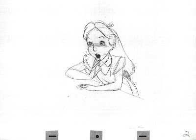
Milt Kahl animated all scenes with Alice as she is hopelessly defending herself against the Queen of Hearts at the trial. Look at this beautiful, unused rough drawing that somebody must have gotten from Milt's trash bin. Parts of the line work is so delicate, such as her face and hands.
But when something needs to be worked out like Alice's dress, Milt goes at it forcefully.

Below are copies of the cleaned up key drawings. In the scene Alice reacts to the sudden appearance of the Cheshire Cat on the Queen's head.
Dialogue: "Your Majesty..."


Many more of Milt's Alice rough drawings here: