Wednesday, February 29, 2012

Kahl's Version of Captain Hook


This photo taken during production of "Peter Pan" is interesting to me.
You see Frank Thomas working on the scene with Captain Hook, when he is anxiously waiting for Tinker Bell to reveal the hiding place of Peter Pan. 
I don't know who the visitor is, but she seems to be admiring the Hook model sheet.
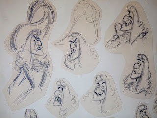
The drawings on that sheet are by fellow animator Milt Kahl, who had lobbied hard for the assignment to animate Hook. But Walt Disney wanted Milt to supervise the title character as well as Wendy, and it was Frank who ended up with the villain.
He remembered screening his first test scene for Walt and the crew. Milt was very displeased with the result, "That's a nothing scene" he touted. 
Frank was relieved when he heard Walt's comment, "No, there's something there, I want Frank to play with the character a bit more, he'll get it."

When you look at Milt's drawings below, you can detect his typical graphic abstractions. 
The jaw line is an almost inconsistent design, but it still works.
We'll never find out how Milt would have handled Hook in animation.

It doesn't matter, Frank Thomas did some of his best animation on Captain Hook.
The way he interacts with Smee or Tinker Bell feels to me like animated "acting fireworks".
A phenomenal character.




Monday, February 27, 2012

Disney is looking.....

Eric Larson sent me this terrific brochure in the late seventies, while I was still studying Graphic Design in Germany.
My jaw dropped, and my eyes popped out of my head when I browsed through the pages.
This was Disney NOW, people working on a variety of projects and looking toward the future of Disney animation. There was no way I was not going to try to be part of this…whatever it would take.
I was dead serious about this. I remember being a little intimidated by the sample sketchbook pages toward the end. They looked pretty awesome to me. I don't think I draw THAT well, was my thinking.
Mel Shaw's artwork for "The Hero from Otherwhere" and "The Black Cauldron" blew me away.
I had always been excited about Disney, but this brochure set me on fire.

I won't write captions for every photo, but you find talented folks like effects animator Ted Kierscey, story man Pete Young, animator Gary Goldman, Glen Keane, writer Steve Hulett, Disney CEO Ron Miller, Tad Stones, director/animator Don Bluth, Lorna Cook, Ed Gombert, John Pomeroy, Emily Juliano, Dave Spafford, Don Griffith (couldn't do a bad layout to save his life) with Dan Hansen, Eric Larson with Rebecca Reese, Frank Thomas with Ron Husband and a few others.

It takes my breath away just remembering and writing about this.


Saturday, February 25, 2012

Bernard Garbutt


Bernard Garbutt  was an animator during the Golden Age at Disney, where he also taught animal drawing.
I found this info about him online:
Bernard Garbutt (1900-1975) Born: Ontario, CA; Bernard Garbutt was born in Southern California and grew up in the Los Angeles area. After finishing high school he was hired as a staff artist for the Los Angeles Times to cover country fairs, horse races and farming events to produce drawings for the Sunday supplements.
Bernard Garbutt was an extremely versatile artist. He wrote and illustrated a number of children’s books, Including Timothy the Deer. The Walt Disney Studio hired him to work on the animated film productions of Snow White and the Seven Dwarfs and Bambi. During WWII he was an artist for Screen Gems Productions in Hollywood and during the 1950s and 1960s, he taught at the Chouinard Art Institute.

Garbutt was no expert in personality animation, but he animated realistic and believable animal locomotion beautifully.
His draughtsmanship is top notch. The following pages show that he was able to sketch complex animal poses with great ease. Frank and Ollie said that his Vis. Dev. work on "Bambi" was invaluable for everybody.
The last three images are examples of how he handled deer anatomy and motion for that film. 
With a touch of poetry, if you ask me.


Thursday, February 23, 2012

Medusa and Penny

Here is another insight into Milt Kahl's working method.
He would look at the storyboard and then fine tune the staging for a particular scene, trying to plus it as he went along. During the first pass, done with a felt pen small scale, Milt also worked out the continuity for several scenes.
By the time it got to animation, he drew rough layouts in pencil of the characters in their environments.
In this scene Medusa is forcing Penny to go down the hole to find a diamond.
The staging is beautiful, a lot of the line work points down toward the hole to emphasize the story point.
Yet a few things actually look better in the first version, like Penny's head angle or Medusa's lean toward the girl. I remember Milt saying:" I often have the hardest time capturing the life of my thumbnail drawings into the large animation sketches."
Still…Milt's drawings never fail to amaze you.


Sunday, February 19, 2012

Bambi in Wire


A few years ago, after I had finished work on "Bambi 2", I did a wire sculpture of that character and gave it to animation director/story artist extraordinaire Brian Pimental as a thank you gesture for having me be a part of the production.
From all the wire sculptures I have done this one is the most unsteady and wobbly.
I tried to use as little wire as possible, I wanted to get to a certain simplicity and elegance.
Maybe one of my better ones.


Merryweather's Wardrobe Malfunction

In "Sleeping Beauty" when it came time to create a wedding dress for Aurora, it was Flora who insisted on taking on this challenge. She only needed Merryweather as a model.
We all know how well that turned out. I love the dialogue between the two.
Merryweather: "It looks awful!" Flora: "That's because it's on you, dear."

Marc Davis came up with a couple of different "fashion" designs for the situation, and they look great. Ollie Johnston combined ideas from both sketches and created the final version, as you can see in the last image.


Wednesday, February 15, 2012

Pinocchio by Frank Thomas

Frank animated Pinocchio brilliantly in the song sequence "I've got no strings on me".
There is a character defining section of the film. Pinocchio tries very hard to be an actor, and even when little accidents happen during his first performance, he carries on the best he can.
I had the chance to listen to a short Frank Thomas lecture on how to animate Pinocchio, which was recorded during production…when Frank was still a kid!!
The interesting thing he pointed out was that you shouldn't use the usual squash and stretch on him because he is made out of solid wood. So when his head hits the floor, it bounces, but without any deformation of the head mass.
Here are a few drawings from that sequence. Eric Larson did the beautiful animation of the puppets.
They move and perform, but without life.


Monday, February 13, 2012

Masterful Doodles

When Ollie Johnston showed me his collection of Disney drawings years ago, he came across these two small sheets (8 1/4 x 6") showing design sketches of the character Georges Hautecourt from "The Aristocats". 
"Are these Ronald Searle drawings?" I asked Ollie. "No, these are Milt's", he responded.
As I examined them closer it became obvious that Ollie was right. But I had never seen Kahl drawings that resembled Searle's style to this degree. 
Then again Milt shared Searle's sensibility for a sophisticated balance of strong straight lines against curves. And when the drawing is rough and loose, the lines remain thin and delicate.

I don't know why Milt used such small sheets of paper for these character studies, he normally drew design work on large 16 field animation paper. Perhaps there were done during a story meeting, and only small sheets were around.
In any case, even in this size there is great detail in the definition of bony hands and loose facial skin. Just beautiful!


Friday, February 10, 2012

Mistress Masham's Repose

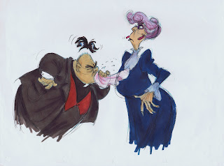
Way back toward the end of production of "The Black Cauldron" there were a few new animated projects in development at Disney. One of them was "Mistress Masham's Repose", based on a 1946 book by T.H.White (the guy who also wrote "The Sword in the Stone").

This info is from Wikipedia:
Mistress Masham's Repose (1946) is a novel by T. H. White that describes the adventures of a girl who discovers a group of Lilliputians, a race of tiny people from Jonathan Swift's satirical classic Gulliver's Travels. The story is set in Northamptonshire, England, during or just after the Second World War.

Plot:
Maria, a ten-year-old orphaned girl, lives on a derelict estate, her only companions a loving family Cook and a retired Professor of Ancient Latin. These are often unable to protect Maria from her tall, fat, strict Governess, Miss Brown. The Governess makes the child's life miserable. She takes her cue from Maria's guardian, a Vicar named Mr. Hater, the reason why Maria is poor and abandoned. The little girl does not go to school. In church, she has to walk all the way to her seat in over-sized boots which make a great deal of noise. She is shy, lonely, and starved for affection. Meeting the Lilliputians, and being tempted both to fear and to bullying, she must save her friends and herself.

I forget now how long I worked in pre production on the project, but I did enjoy doing this early character development. I even sent copies to Milt Kahl for possible input. He said he liked them ok as far as early concept art goes, but he feared that the studio would probably reuse some of the mice business from "Cinderella" for situations with the Lilliputians. He obviously still felt burnt because of all the reused animation during the 1960ies and 70ies.
As far as style goes, I had Ronald Searle and Milt Kahl in my head, and I think you can tell, for better or for worse.