

The process of visual development for a Disney character during the 1970ies involved only a few steps compared to much earlier Disney films.
For productions like Snow White, Pinocchio and Fantasia many artists, who were part of Joe Grant's Model Department, contributed endless designs, sculptures and rough model sheets that eventually led to the final look of the characters.
After the completion of Sleeping Beauty a lot of artistic personal was let go in order to streamline future productions and to save money. By the time the 70ies came around, the animation staff had gotten even smaller. There were only FOUR supervising animators, who carried a lot of weight and responsibility.
Ken Anderson would start out with rough character designs such as these marker sketches above and below.

Once a certain personality type emerged, Ken's drawings went straight to Milt Kahl's desk.
Milt then polished the design 'to make it animatable" as he put it. Putting his own personal stamp on to the look of the character didn't make things easy for other animators, because nobody could draw like he did.
Model sheets were made up of drawings from Kahl's early animated scenes…and that was it.
No construction sheets, no head or body turn arounds like in the old days.
The Sheriff of Nottingham has always been a sort of enigma to me.
I love the way he moves and acts, and his personality is interesting….it's just that he doesn't resemble a wolf, he looks like a huge rat. His soldiers are caricatured wolves, but not the sheriff.
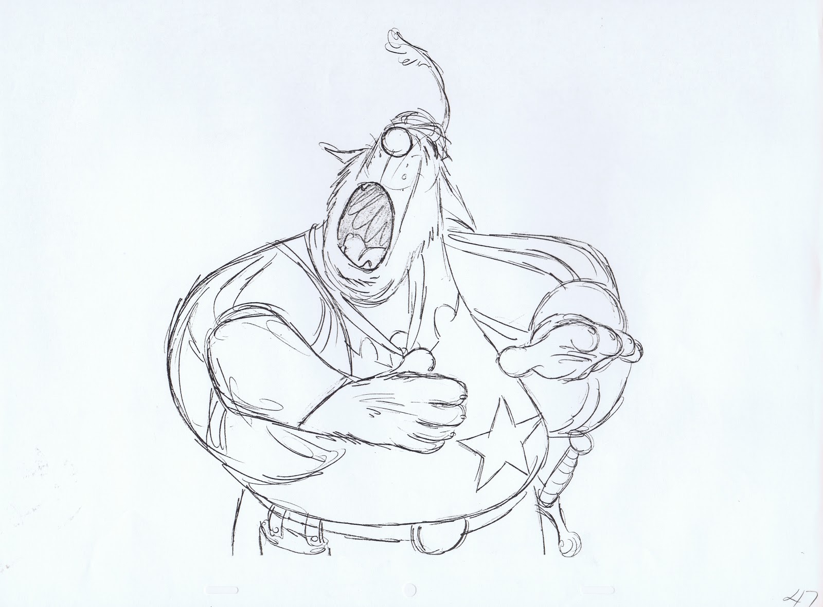
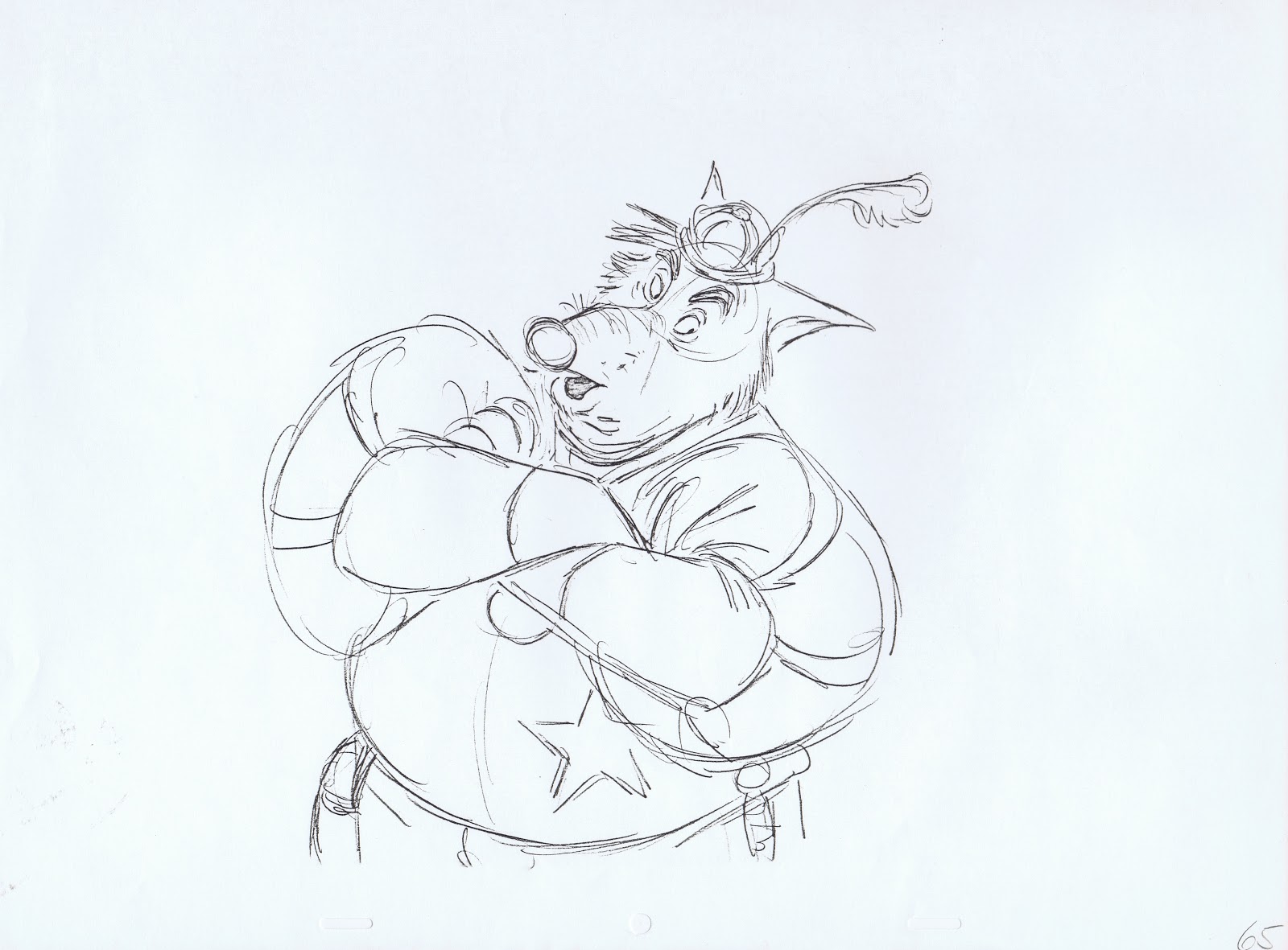
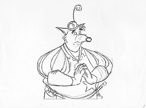
These Milt Kahl sketches show how he developed the character based on Ken's work.


A few roughs from a scene in which the Sheriff argues with Friar Tuck.
"Now take it easy, Friar. I'm just doing my duty."
Beautiful stuff!


Bre Melvin created this pencil test:
http://25.media.tumblr.com/9bc3a5830d537c16f6d4edb8f66c9e62/tumblr_mgmkv01NSa1qdbhwwo1_r1_500.gif
I think in The Illusion Of Life there's a story sketch of the sheriff as a goat highway patrolman. I wonder whether the whole movie was at some point planned to have a modern day setting.
ReplyDeleteWhen I first saw the English version, I was slightly taken aback by some characters' Southern accents; I've always wondered whether that might have been a remnant of a modern day setting concept. Anyway, I really like how Robin Hood turned out, especially the fact that Peter Ustinov played Prince John in both the English and the German dub.
I believe Ustinov did other language dubs as well.
DeleteHe spoke French, Russian and who knows how many other languages.
I always thought the Southern accent was a joke on the "sheriff" part of the character, like that big star he wears on his big belly.
DeleteWonderful! So, did Mr. Kahl animated all the characters in order to test the development of them? Did he also designed Prince John and Sir Hiss?
ReplyDeleteMilt did help with the design of Prince John and Sir Hiss.
DeleteIf you blog search them you will find some material.
He did not do any animation on them though, he was quite happy with the way Ollie Johnston was handling these characters.
Amazing post Andreas!
ReplyDeleteWhat a great post, tanks!
ReplyDeleteYeah that is really interesting, the Sheriff does not look like a wolf, he really does look like a giant rat. I bet Don Bluth borrowed some of that character for the Rats of Nimh, he really reminds me of that. But amazing sketches by Milt, I wonder is that his first pass at it, his first rough sketches or are those cleaned up a little?
ReplyDeleteI noticed that too Paul. There's just something in the fact that reminded me of NIMH too!
DeleteThose are Milt's animation roughs. His assistant would just erase a few extraneous lines, and then send the scene off to be xeroxed and painted.
DeleteThat is amazing for rough work, wow, I was watching Glen Keanes method and he seems to work from thumbnails first, he wont start the scene until hes confident the thumbnails are right. After that he blows up the thumbnails and works right over them. But maybe Milt did that too, I do remember seeing some very beautiful thumbnails so alive by Kahl.
DeleteChris yeah, I remember Don Bluth saying that his method to character design is to borrow peaces from other characters and combine them. I think he did that here. Actually Eric Goldberg and Bluth also raved about Milt Kahl saying he was the best out there, they loved his designs. One of the characters in Sword in the Stone is actually Dirk the Daring in Dragons Lair. I think the dragon in dragons lair is a mixture between the dragon in Sleeping Beauty and Pete's Dragon.
Thanks for posting this stuff Andreas great blog, love all your work too, the way you make characters act is really amazing, when you watch Scar or Jafar its like there real actors putting on a performance not just animation.
Made a gif of the keys http://25.media.tumblr.com/9bc3a5830d537c16f6d4edb8f66c9e62/tumblr_mgmkv01NSa1qdbhwwo1_r1_500.gif
ReplyDeleteIt's interesting to read how the Disney studio worked behind the scenes (literally). Your descriptions of this are as interesting as the images you are posting. Don't spare the words Andreas!
ReplyDeleteI suppose the sheriff looks more like a rat partially because you never see fat wolves. They're always illustrated as lean and mean. This sheriff is mean, but hidden behind a cordial and polite demeanor, sort of like a corrupt politician. Wonderful subtlety. I love Disney's Robin Hood particularly because Ken Anderson was not afraid to explore his choices of and acting of animals. What a fun movie!
ReplyDeleteJust curious. Did Milt ever illustrate any of the goat versions of Anderson's sheriff?
ReplyDeleteI don't believe so.
DeleteA while back when we were doing research for the Ward Kimball bio, Amid and I had a discussion about mouth shapes, and how Ward's mouths would usually always be these graphic oblong shapes a lot of the time, like with the Indian Chief in Peter Pan. And I remember going frame by frame on this scene with him and pointing out those wide open mouths when he's saying "TAKE" and "I'M". I loved how graphic Milt would get with his drawings at times, and even then they still have some level of dimension and perspective on those faces.
ReplyDeleteGreat post as always, Andreas. Thanks for sharing your thoughts and insight!
Awesome...
ReplyDeleteLoved this post. Actually, I spend hours just on this blog. I think it was this blog (and Mike Peraza's) that made me get more interested in animation enough to be on a animation class today.
ReplyDeleteOnly 4 supervising animators? Wow. Andreas, do you know what their workweek was like back then? Was it a stressful 60-70 hours-a-week type of thing, or did they keep normal hours?
ReplyDeleteI agree that the Sheriff doesn't look very wolfie. His eyes and ears have it, but that round nose wrecks it for me. Maybe Kahl was looking at Pat Buttram's round nose and that threw him off.
I think it's the was the snout tapers, and kind of droops at the end, especially coming down off that 'roman' bridge. Compare it to - if you'll forgive the CGI reference - the rat characters in Ratatouille, which I thought were decent caricatures of real rats*, if a little muppetey. The snout in John's yellow-shirt sketch is much straighter and just a little squarer, more like real wolves.
Delete* Themselves compared to the usual sharp-nosed, fang-mouthed, red-eyed depiction of cartoon rats. One other exception being NIMH, as per Paul Pascucci's comments above. Though, ironically, I don't know if it's the influence of Robin Hood on Don Bluth or my own perception, but I thought some of the rats in that looked a little too canine!
As Milt mentioned in the posted interview, during the 70ies they averaged one animated feature every 3-4 years. That is a casual schedule compared to today.
ReplyDeleteThese were Monday to Friday 8 hour days, but with no or very few interruptions. Phone calls were screened by a secretary who sat in the front of their animation wing. They were informed later who called, unless it was urgent.
During these hours these guys stayed at their desks, focusing, concentrating, animating a lot of great footage.
Thanks for the background info, Andreas!
DeleteI have always loved this character and found him really funny. Thanks for your continuous education of the art of animation!
ReplyDeleteHis nose sure changed, I would think they would decide on a look before drawing all those drawings.
ReplyDeleteI worked on this guy back in the seventies when I returned to Disney's animation department. If I recall, the character was animated by John Lounsbery. Milt of course, was redesigning all the characters anyway. This meant we had to go back over a lot of stuff that Kahl had revised.
ReplyDeleteThe seventies proved to be a depressing time at Disney and I even managed to get myself sacked off the movie. It was just as well. I always felt the film sucked anyway.
Milt certainly made the character 10x more appealing then he was in the Larson sketches. In the early Milt sketches he certainly looked more wolf. I prefer the early look to the "mole like" appearance of the final design but the character worked either way.
ReplyDelete