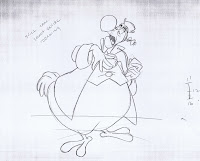
This character from "Alice in Wonderland" is beautifully designed, sometimes gorgeously animated, but with a completely underdeveloped personality.
There is way too little screen footage of him to get any real sense of who he is and why he would be important to the story.
The Dodo is a very handsome design though, and it's fun to trace back his visual development.
This rough model sheet, probably drawn by Joe Rinaldi, is somewhat based on John Tenniel's illustrations for the original book by Lewis Carroll.
Milt Kahl left the wonderfully contrasting design intact, as you can see in this clean up model sheet.
It is made up of tied down animation keys from a couple of his scenes.
Two of Milt's rough animation drawings of the Dodo. It's the character's unique proportions that make him stand out. A huge lower body with a relatively small chest.
The Dodo advises the White Rabbit what to do with the oversized Alice, who is filling up a whole house: "Pull it out of the chimney!"
White Rabbit: "Yes, yes…go on, go on!"
Dodo: "Who me? Don't be ridiculous! What we need is a …."
Here are a few key drawings from that scene.
Beautifully drawn and acted, the character shows believable weight in the animation. The strong squash and stretch adds a sense of flamboyancy.
It is interesting to compare the way Milt is treating the hands compared to later bird characters.
These are very human like, while Allan-a-Dale and Lady Kluck from "Robin Hood" maintain wings, capable of articulating human gestures.


I'm a Carrollian and I've never quite understood why Disney's Alice gets so much disdain from many sides. I think it's a valid interpretation. It's not as verbally intricate and with as many hidden layers as the original texts (I recommend Martin Gardner's The Annotated Alice to everyone), but it pays great hommage to the visual medium that animation is.
ReplyDeleteI guess many see it as a sort of disjointed narrative, but the book itself is mostly that, too - witty little episodes of nonsense with hidden plays on mathemetaical logic. What I particularly love about the Disney movie is how great a stage it offers to Ward Kimball's surreal inventiveness. The Walrus and the Carpenter is a piece I watch over and over. I love that little scene in which Tweeldedum (or Dee?) starts singing "The sun was shining on the sea" with his body being in completely nonsensical motion that just - works somehow.
If Disney ever did a hand-drawn feature based on Through The Looking-Glass (yeah, fat chance of that, I know), I'd go to see that, oh, I dunno - five times in a theatre?
Milt must have been pretty relieved to animate this guy when he wasn't working on Alice! Great stuff.
ReplyDeleteMilt was also supposed to animate the Caterpillar, Boy, I wished he had!
ReplyDeleteHi Andreas!
ReplyDeleteI am a huge fan of yours and I am actually going to school for animation starting in the fall and I have a question for you. I got into The School of Visual Arts in NYC and I have to decide whether to major in 2d or 3d animation. I like both mediums but I like 2d better. My ultimate career goal is to work at Disney and it seems like they are focusing more on the 3d animation, along with Pixar, Dreamworks and basically everyone else in the big budget film industry. You are a traditional animator and I was wondering what you do when Disney is working on only computer animated films. Do you think it would be better if I went into 2d or 3d? Thanks for your opinion :)
Looking forward to your next blog post,
Ryan
Hi Ryan,
DeleteI've been asked your question before in the past.
In what medium do you think you could express yourself personally?
Sure, the jobs will be with CG in the future, but if hand drawn animation holds that special magic for you (as it does for me), then there really is no choice.
Why don't you get started and get some experience in 2D first? When it comes to finding a job later and there are only CG offerings, your 2D knowledge will totally apply toward computer animation. Not only that, you will be ahead of the game, because
any CG program can be learned quickly.
Whatever you decide, don't question your choice...just go for it!
While the Dodo's basic design may have been derived from the Tenniel illustrations, I wonder what the reason was for dressing him in the Colonial costume. I like it, and it gives him more visual interest and anthropomorphic appeal, but it always confused me as to why that particular choice of costume. Did it just add to his implied British pomposity in the eyes of American audiences? Do you know, Andreas?
ReplyDeleteA Dodo is a bird from the past, extinct, so perhaps putting him in
Deletea vintage Colonial costume makes a reference to that point.
But your guess is good one, Pete, it might be as simple as that.
Deja sir,I can give you write an email to contact you?
ReplyDeleteIf you leave your email address here, I will answer you back.
DeleteOK,my email major7404@gmail.com thanks!
DeleteThe Dodo is such an interesting looking character. It really would have been great if he had more screen time or was fleshed out a bit more.
ReplyDeleteGreat expressions on the model sheets.
ReplyDeleteIt's interesting how Kahl got the short end of the stick on this movie. As nice of a design as the Dodo is, I honestly think Kahl's animation of the character of Alice is more memorable.
ReplyDeleteI'd be interested in seeing more drawings from this film, especially any characters/scenes that Ward Kimball was involved in. I've been revisiting this film lately, and Ward's animation work on this film stands out in particular.
Love this character! Really beautifully designed, and has so many hilarious moments. Thanks so much for this post!
ReplyDelete