Friday, May 31, 2013

Hockey Homicide


There have been quite a few great Disney animators who brought the character of Goofy to life.
Art Babbitt developed him during the mid 1930ies as a type who thought long and hard about something, and then did it wrong (Art's own words).
Other animators followed, John Sibley did outstanding work on shorts like Olympic Champ, and Woolie Reitherman's performances in Saludos Amigos are incredible.
In 1945 Milt Kahl worked on a couple of Goofy shorts, the hilarious Tiger Trouble and the wacky Hockey Homicide. The latter one presented a world in which hockey players as well as audiences were drawn as Goofy type designs. Milt had particularly fun animating the referee, who occasionally lost his balance on the ice. Those scenes are as fluid and elegant in their own way as ballet dancing.
Here are a few of Milt's rough drawings of that character. Beautiful expressive hands, and extreme (but appealing) squash and stretch.


You can watch the short here:

Wednesday, May 29, 2013

Cruella in Curlers


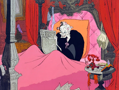
What an incredible visual development piece from 101 Dalmatians.
Cruella de Vil is reading the papers about the dognapping. This experimental cel set up shows her in a round bed with a snake motif. Red, mauve and black are the only colors used here.
I love the "real" lace curtain! The Disney artists were trying anything to achieve a new revolutionary look for this film.
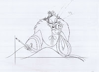
Marc Davis animated every single scene of Cruella. The one I am showing here is from that bedroom sequence. The ringing of the phone has just interrupted her gleeful mood, but she fakes a smile when answering: "Hello." After realizing who is calling, her expression changes again.
"Jasper!" she pauses in anger, then "Jasper, you idiot!"
Everything is top notch here, her body composition, wonderful grotesque expressions -those cheekbones are priceless- and of course subtle, controlled animation.
Modern animation as good as it gets.


An actual frame from a scene preceding the one above.
The risks Disney artists were taking with this new style were enormous. This is not playing safe and giving audiences what they want. This movie surprised everybody by showing something nobody had seen before. 
Risks are fun, and there is no reason today's feature animation can't take bold risks again.


Tuesday, May 28, 2013

Behind the Scenes of "Pinocchio"


How about a little time travel to the late 1930ies? 
The Disney artists are finishing up their work on Disney's second animated feature Pinocchio.
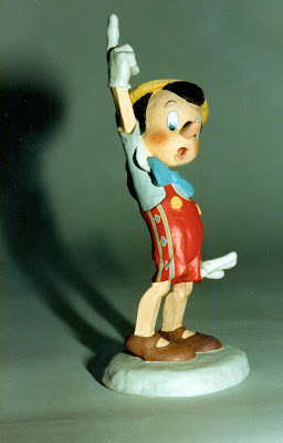
Joe Grant's character model department produced small sculptures like the one above for the title character.
Sequence director T.Hee is being filmed acting out scenes as the villain Stromboli.
Animator Bill Tytla will take this footage and go to town with it.


The layout department is busy with a sequence which takes place inside Monstro, the whale. I don't know who the artist in the picture is, but look at the photographic reference he is using.


Over in the effects department a lecture is taking place on animating water bubbles.
I only recognize a young Jack Boyd, on the top left. He was still doing effects for The Fox & the Hound before retiring.


In the Ink & Paint building across the street masterpieces on cels are being produced.
I doubt this inker knew that the cel she is finishing up would be worth around $ 10.000 some day.


A story sketch from the sequence where Pinocchio, still with donkey ears, reunites with Geppetto and Figaro.


Animator Milt Kahl is staging that scene for animation. Look at the flow in these drawings. Pure love on paper! 


Here is an article published in the magazine Popular Mechanics from 1940, more photos from behind the scenes. (I apologize for a few missing lines of text.)
What a great time for animation, and what a great medium!!


Saturday, May 25, 2013

Vance Gerry & Ollie Johnston


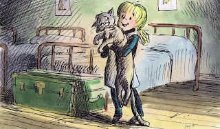
Story artist Vance Gerry came up with these beautiful sketches in which he explored the bond between Penny and Rufus from The Rescuers. Vance always drew from the insight out, meaning that what motivated him were things like atmosphere, personality relationships and clear staging within storytelling. 
A sentimental sequence like this one where Rufus tries to cheer Penny up could become saccharine very easily if in the hands of lesser artists. 


It is interesting to see how animator Ollie Johnston applied Vance's staging to his animation. 
The poses on the bed at the beginning are practically identical. When the story artist, who has given the situation a lot of thought, offers sketches so well worked out, why not use them?
Penny's dialogue is: "Gee, we better hurry, or we'll be late for supper."  Ollie synced his animation beautifully with the two accents  HURRY and SUPPER. Penny lifts up the cat on HURRY, and then she makes her first step forward on SUPPER.
I love the weight of the cat, Rufus almost falls through Penny's arms when she adjusts her grip. Then when she moves screen left the cat's body moves screen right for counter balance.
And it's nice to see Ollie's rough lines under the clean up. 
Wonderful stuff!


If you print out these sheets and flip through them you will learn a lot, I promise.

You can watch the scene at the end of this youtube clip: