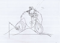
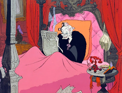
What an incredible visual development piece from 101 Dalmatians.
Cruella de Vil is reading the papers about the dognapping. This experimental cel set up shows her in a round bed with a snake motif. Red, mauve and black are the only colors used here.
I love the "real" lace curtain! The Disney artists were trying anything to achieve a new revolutionary look for this film.
Marc Davis animated every single scene of Cruella. The one I am showing here is from that bedroom sequence. The ringing of the phone has just interrupted her gleeful mood, but she fakes a smile when answering: "Hello." After realizing who is calling, her expression changes again.
"Jasper!" she pauses in anger, then "Jasper, you idiot!"
Everything is top notch here, her body composition, wonderful grotesque expressions -those cheekbones are priceless- and of course subtle, controlled animation.
Modern animation as good as it gets.
An actual frame from a scene preceding the one above.
The risks Disney artists were taking with this new style were enormous. This is not playing safe and giving audiences what they want. This movie surprised everybody by showing something nobody had seen before.
Risks are fun, and there is no reason today's feature animation can't take bold risks again.


I would have to agree with your comment about large studios not taking enough risks these days. Maybe it's just because of all the layoffs in the animation industry right now, so people feel they have to 'play it safe' or simply that franchises are guaranteed to sell. More and more often, I find myself watching independent or foreign animated films because of this.
ReplyDeleteThese are gorgeous drawings by the way. Curella's expressions were absolutely priceless in this scene. Marc Davis was indeed a genius.
I can't even begin to tell you how much I get out of these..Thanks so much for posting such great magic. Truly learning a lot with every drawing. Cheers
ReplyDeleteThis comment has been removed by the author.
ReplyDeleteThese are wonderful! It’s my understanding that Walt was not thrilled with the look. Odd, considering he was such an innovator.
ReplyDeleteWhat a great way to start the day! Thanks so much for sharing these. I shall be annoying my co-workers with flipping sounds all day!! Props to Homer Jonas for Cruella's bedroom layouts!
ReplyDeleteThat first image, with those colors and lace, is so bold! :D And I agree about the risks as well; we really should see more of the unexplored.
ReplyDeleteThe cel setup at the top just made my day! I can't recall ever seeing that before I'm ashamed to admit considering the amount of time I have spent researching and analyzing this movie.
ReplyDeleteThe background colors behind the xeroxed layout look a lot like this was one of Walt Peregoy's original paintings. Do you by any chance know, who painted this background?
Mr. Deja thank you for the insight about the bold move 101 Dalmatians was. You are right there is no reason today's feature animation can't take these bold risks again. I feel that feature animation hasn't been the artistic medium it once was but rather a long commercial for the merchandise you pass as you exit the gift shop.
ReplyDeleteJust a curiosity, Andreas. When Marc Davis began working for Imagineering, was that pretty much the end of his career specifically as an animator? Do you know if he had any regrets not working directly on some of the later films as an animator?
ReplyDelete"Modern animation as good as it gets."
ReplyDelete"Risks are fun, and there is no reason today's feature animation can't take bold risks again."
How wonderful for me to read such words after having just watched a couple of second rate cgi features. Thank you.
"Modern animation." I love that phrase and have to think about it.
I know, it's strange to call a 50 year+ old animated film modern.
DeleteIt's just that there hasn't been much artistic progress since then.
Amid Amidi wrote greatly on Cartoon Brew, that example Tex Avery and Monty Python made classic stuff because they got freedom to do that.
DeleteWas there samekind of freedom on artist at Disney in old days, whould that be one reason?
http://www.cartoonbrew.com/ideas-commentary/frank-zappa-explains-why-cartoons-today-suck-10513.html
http://www.cartoonbrew.com/ideas-commentary/what-frank-zappa-tex-avery-and-monty-python-have-in-common-10640.html
Absolutely love the art from this film. Also Marc Davis's animation on Cruella is something else... One of the best animated performances ever.
ReplyDeleteI tried out a .gif of the keys. I love these so much!
ReplyDelete(http://imgur.com/ygEYWRr)