
What a challenge this must have been. How do you design interesting looking mice for a new Disney animated feature, produced in the mid seventies?
Over the years animation studios had used an endless variety of mouse characters, so to come up with new concepts for these rodents wasn't easy.
Newcomer and story artist Fred Lucky had spent some time developing The Rescuers as an animated film, and these are some of his design suggestions.
They might not show a lot of appeal yet, but at least they are different.


For more info on Fred Lucky go to this link:
Here is a look at how Milt Kahl, Frank Thomas and Ollie Johnston approached these two characters.
Milt Kahl tried to incorporate some of Fred's ideas into his own design research.
Milt is definitely trying something new here, these sketches almost look like he drew them left handedly.


Proportions and volumes look a bit more solid in these pages.


Just an awesome sketch, period!

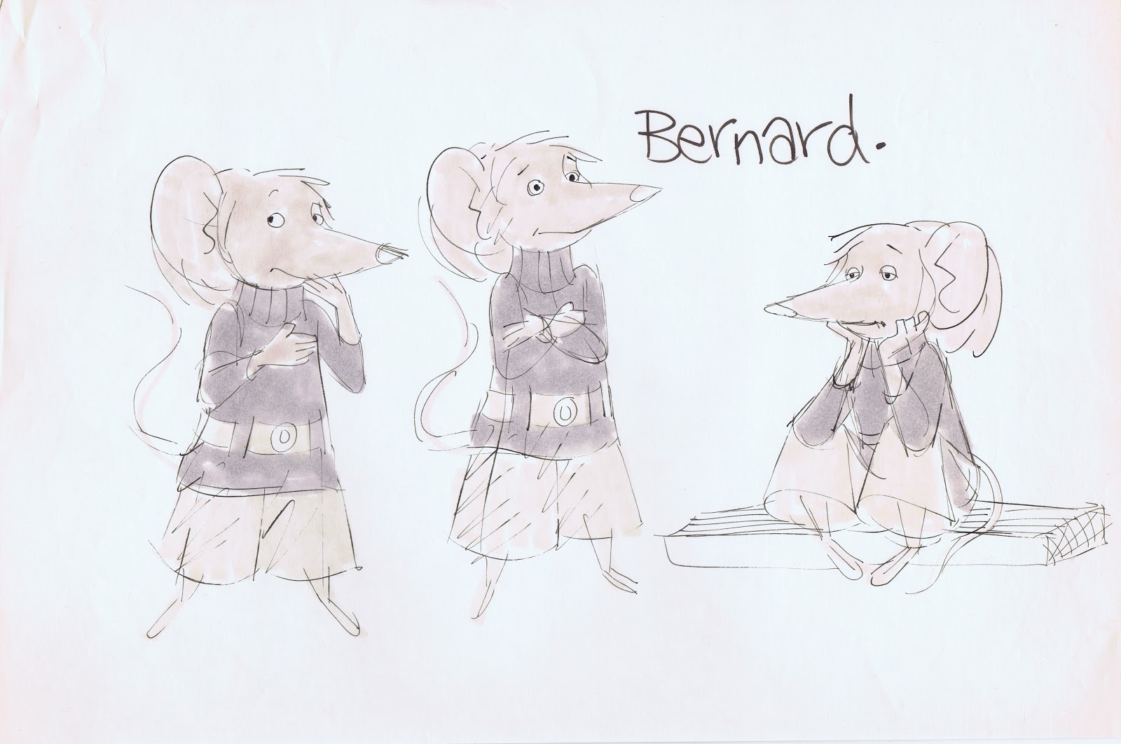
Still a long nose, but chubbier than earlier versions. I do like this Bernard quite a bit.

The idea here is to treat the eyes like real mice, just large black dots.
It limits the range of expression somewhat, and tends to look kind of spooky.

Milt then applies what I call the Robin Hood formula, only the ears and the tail remind you that these are mice.


After the noses got shortened these versions were approved as final designs.


Frank Thomas explores early design concepts.


These pages show how Frank stages the situation in which Bernard and Bianca meet for the first time. Simple scribbles that reveal acting possibilities.


A few charming Thomas key drawings from an actual production scene.


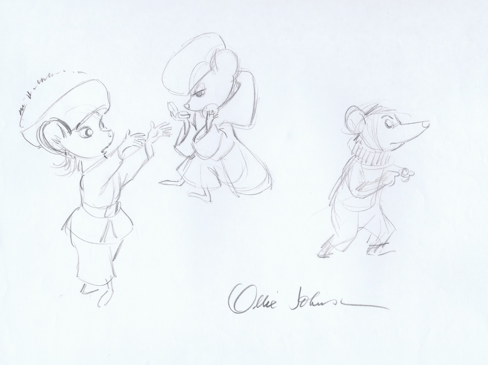
Ollie Johnston tries out various proportions for anthropomorphic mice.

And this is his take based on Fred Lucky's sketches.

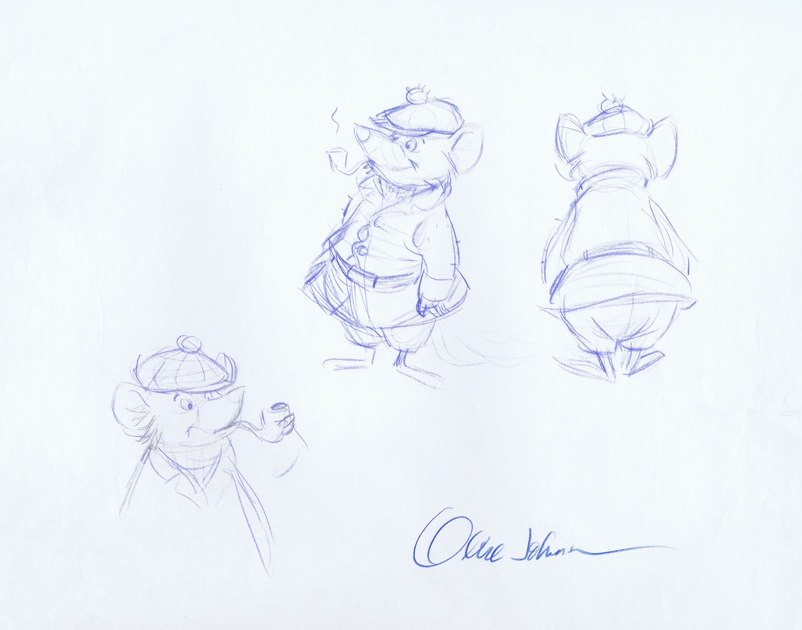
Then Ollie explores a concept that for some reason resembles Basil of Baker Street, a character that would make it to the screen quite a few years later.


Bianca in 1970ies outfits.

Ollie's chubby, long nosed version.
Again, these huge black pupils wouldn't have worked.

Bernard as he appears in the film. Beautiful solid sketches.


A rough production drawing.

It is interesting from a psychological point of view that people are freaking out when they see real mice, but ever since Mickey Mouse audiences don't seem to get enough of them when they are animated.
The ones with large black eyes almost look like anime characters!
ReplyDeleteGreat post, thanks. Big pupils definitely makes them look like they´re hypnotized or something. That awesome wintercostume sketch gives ideas for stories right away.
ReplyDeleteThanks for posting this, Andreas! Though I think the pudgy Bernard design best suits his character, I'm very drawn to the earlier designs. It is extremely interesting to see the challenges Fred Lucky's proportion choices posed to Milt, as well as the loose, intimate inkwork he used when addressing that challenge.
ReplyDeleteHello! Milt drew dwarves from the film SNOW WHITE AND THE SEVEN DWARFS. What is the name of this TV show. Maybe you have a file about the case. Maybe just the name of the show you know? Thank you.
ReplyDeleteSasha Dorogov animation class student. My name is Ruslan. oblokomobloko@gmail.com
Hi Rusian,
DeleteMilt Kahl did a few scenes with the seven dwarfs for a WWII
educational film, called "The Winged Scourge". I don't know if that film ever ran on TV.
I talked about this short film in my post: Wartime Short Films
Hi, Andreas! "The Winged Scourge"-that what I was looking for. Thank you. I am very grateful. And greetings from Sasha.
DeleteWow, Lovely drawings, I kept staring for 5 minutes at Bernard's drawing holding his hat, so powerfull, it's curious how clothes sometimes push the pose and sometimes interferes a little, (his arm pushing down the hat fits so cool but you can't see it on the final drawing, at least you can feel it)
ReplyDeleteIt's true, we love this characters and then we get scared about real mice lol, but do you imagine an antropomorphic mouse in real live? I don't know if that would be lovely or even scarier.
Great post. Very interesting to see the development.
ReplyDeleteIt seems to me that a lot of the key animators had a say in how a character might look. You can see the animators thinking "in the round" with the animatable shapes. In the end, I think the design choices were correct. At WDFA, Do you know if the remaining 2d animators have the option to transition to vis dev if they want to do character development like this? It seems to me to be the next best thing to do if you are not 2d animating.I'd be interested in your thoughts on the subject.
ReplyDeleteUnfortunately, most of the remaining 2D animators were let go recently. I suppose that animators who have a range of drawing styles, know color and can illustrate environments could switch over to Vis Dev. It's just that normally learning the craft of pencil animation with its acting challenges is a lot to master. Most animators express themselves in that field alone.
DeleteI would disagree on that final statement. With Ratatouille, both my wife and mother-in-law freaked out, specially with the rat crowd scenes. Animated and all, but they felt that was too life-like to be tolerable.
ReplyDeleteI've always thought mice are pretty adorable, even in real life. RATS on the other hand... something about the bigger size and thicker tail that makes them so much grosser.
DeleteSo cool to see how these designs changed as they were handed from person to person. Thank you for the post, Andreas - inspiring as always!
Is it just me or do these early refinement drawings of Bernard that Milt Kahl did look a heck of a lot like "Roquefort" from the Aristocats?
ReplyDeleteThanks for posting this, Andreas! Can you explain why Miss Bianca's whiskers disappeared in The Rescuers Down Under? I always wondered what were the reasons for redesigning the character in 1990.
ReplyDeleteI don't know for sure, I didn't work on Down Under. I suppose
Deletethey felt that Bianca looks more feminine without whiskers.
Speaking of Basil, have you got anything relating to my favourite character, Basil of Baker Street? I'd love to see whatever you could dig up. Thanks.
ReplyDeleteThey did use those large pupil designs on the church mice in Robin Hood and while having the benefit of Bernard and Bianca without them makes it impossible to imagine them otherwise I didn't feel any disconnect with the church mice for having the large black eyes.
ReplyDelete