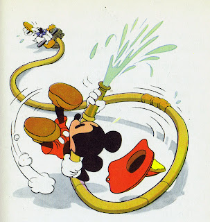
There was a time, around the late 1930s to the early 1940s, when the Classic Disney characters peaked in terms of their design, animation and things like book illustrations.
They had reached a level of appeal that was very unique to that time.
The last short films in which Mickey was drawn with solid black eyes up to the first films that introduced him with pupils within an eye unit define that period.
During the decades that followed, these iconic movie personalities still performed and entertained, but that special touch faded somewhat with time. One of the reasons for this development was the studio's main focus on its animated features, another reason proved to be economical circumstances. Theaters slowly realized that they could sell a feature length movie just as well without the typical opening of an animated short. So Disney and other studios spent less money and attention on characters that had defined the medium of animation not so long ago.
But that Golden age of Disney short films had a huge impact on regular audiences as well as on a number of graphic artists. American childrens' book illustrator Maurice Sendak once mentioned that, as a kid, he was so mesmerized by the Mickey Mouse films he saw, he felt like taking a big bite out of the screen.
That pretty much sums it up.
Let's start with this stunning magazine illustration that helped announce Disney's move from Los Feliz to Burbank in 1940. Everything looks appealing, even Minnie's shoes.
Incredible Book illustrations that somehow capture the innocence and wonder of childhood.
The characters jump off the pages, they seem alive and real.


Lovely stuff. I quite like the solid-eyed Mickey that you see in shorts like the Brave Little Tailor. I also really love the Mickey in this bumper http://www.youtube.com/watch?v=nSj8ipug2bQ That apparently you animated! I think it's one of the best-looking Mickey bits I've seen
ReplyDeleteDo you know if the black and white images are Freddie Moore's? So amazing!
ReplyDeleteThat Minnie with the umbrella is cute as a button!
ReplyDeleteThe images Firefly mentions are most likely the work of Hank Porter, who headed up Disney's publicity art department back then. In my opinion, Hank was the equal of Freddie Moore in his ability to portray the characters with maximum appeal in their posing and construction. In fact, that's the thing that strikes me most about these drawings, is how beautifully the characters are constructed. Though a couple of the pieces feature some tonal modelling, they really don't need it, as the rounded form is already well conveyed through the well-constructed drawing, with the sculptural outline itself holding that form. That's what I miss the most in much of today's animated cartoon design - the illusion of round, dimensional form. It's a type of craftsmanship that is considered passé in this era of digitally drawn animation, sadly.
ReplyDeleteAndreas, do you know what is behind Goofy and the Big Bad wolf in the second and third B&W photos? something to keep their posture?lol
ReplyDeleteYeah both tend to bend their needs outward the way they stand so I can see why.
DeleteI'd really like to know who these are by. :D
ReplyDeleteThank you Andreas. These are so wonderful and informative. You're truly an animation saint.
ReplyDelete