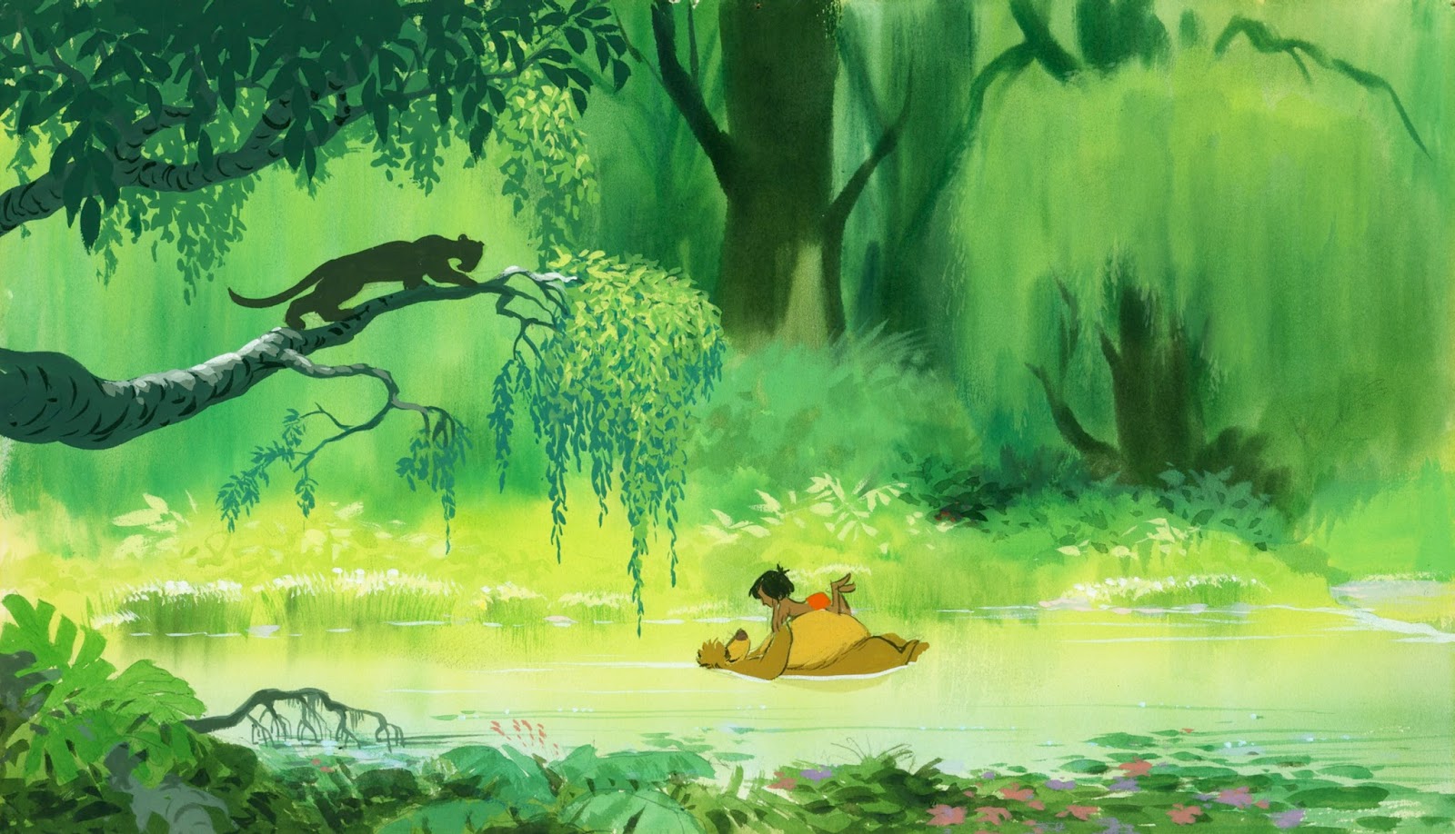
Ken Anderson and background painter Al Dempster had something to do with these color studies for the Jungle Book. The beautiful cel above of Mowgli and Bagheera is a Milt Kahl drawing.
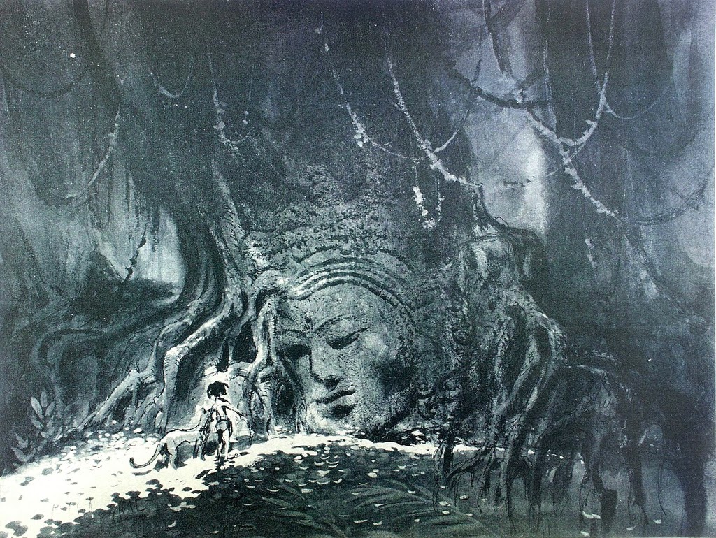
There are endless ways to portray the Indian Jungle, including this early version by color stylist Walt Peregoy:
As you know, Walt Disney opted for a light, airy jungle, since the story included mostly comedic sequences. Dark, mysterious backgrounds would have worked for a more dramatic story treatment.


Thanks again for sharing all of these gems! I have always found the history surrounding the making of these films fascinating. Do you by chance have any other images of the earlier, darker version of The Jungle Book?
ReplyDeleteI do have one more Jungle Book Peregoy piece, which I'll post soon.
DeleteHello andreas this is patrick,i have some drawings from runaway brain you gave me perhaps you will be interrested by..i can send you some scan.hope you re doing well...
Deletewow, I LOVE the compositions... and the color palettes! my favorite is the one with the bamboos in the foreground, the amount of detail is incredible plus how simple the background is just blows me away! so inspiring! thanks for the post!
ReplyDeleteThese are amazing! I've always loved Jungle Book's style with its characters and the beautiful backgrounds. That said, I'd love to read the original treatments script someday. Have you read it by any chance, Andreas?
ReplyDeleteThe greenery is just wonderful! :D
ReplyDeleteI echo what Kate has said, thanks so much for all your endless posts. Jungle Book is certainly my favourite Disney film. the animation, artwork and story are unsurpassed. I'd love a print of the second image down on the wall of my lounge. Are they from your private collection?, if so you're a lucky guy
ReplyDeleteI was always so glad that the "light, airy jungle" version was selected (Walt Disney's final magic touch), darker colours would have never helped to evolve the harmony of the film. This sort of "harmony" was present in Lion King as well, and this one of the many factors which helped both films to became legendary, in my opinion.
ReplyDeleteThank you for sharing!
Thanks again for sharing all this wonderful art, Mr. Deja; I think they all are beautiful, I especially like the sense of light in the last two concept pieces.
ReplyDeleteI am a film student from Sao Paulo, Brazil and I am begginig to direct animated short films. Your Blog is a great inspiration. Today, I read once more what you wrote about 101 dalmatians, one of my favorites feature films of disney. Great post. Agree with you. Great artwork. Continue doing the inspiring work you do.
ReplyDelete