Saturday, May 31, 2014

Squirrel in Wire

I did this wire sculpture a while ago, it is based on the design of Sleeping Beauty’s Squirrel. 
This time I tried to be very simple and economical with the line work. I pictured the moment in the movie when the squirrel expresses sadness but also sympathy for Aurora, who dreams of falling in love. The sculpt (or 3D drawing) is just over 5,5” tall.
Disney characters lend themselves to wire sculpting, because their design is always linear. It's fun to leave out as much as possible, so your eye adds volume and detail. You want to challenge the viewer a little.

Now I need to return the squirrel to its rightful owner. So, Dan, if you are reading this, I’ll drop it off at the studio next week. Sorry it took me so long to get it back to you.

For those who are new to the blog, here are a couple of links to other Disney characters in wire:


Wednesday, May 28, 2014

"Listen well, All of You...!"


Remember that commanding voice, that sent chills down your spine?
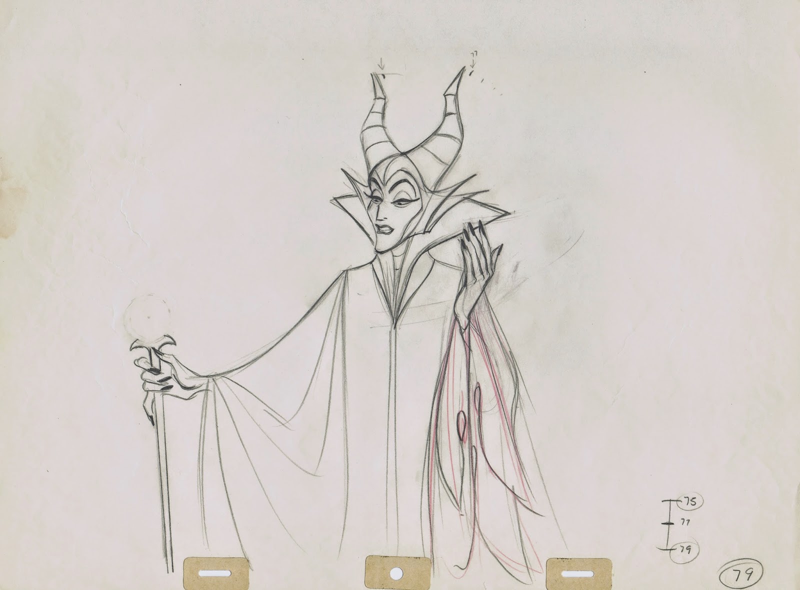
Eleanor Audley’s vocal recordings gave Maleficent a scary, bigger than life and unworldly quality. Combined with Marc Davis’ masterfully restraint animation the character became a villain for the ages. 
With Disney’s life action film “Maleficent” coming to a theatre near you, this is as good a time as any to talk about this powerful mistress of all evil.
Many years ago, when I had the pleasure of meeting and getting to know Eleanor Audley, I asked her to sign this German lobby card from the film Sleeping Beauty. Marc had just put his name on it a few days earlier. 
I need to get this image framed, so much history behind it.
Miss Audley remembered that soon after Sleeping Beauty finished production the studio arranged a screening of the film…just for her. She said, she was the only one in the theatre watching this big screen spectacle. “I felt privileged and I adored the film.”

I found this clip on youtube from the TV sitcom The Beverly Hillbillies. More of Eleanor Audley’s performances. 
Incidentally, the young lady in the clip is my friend Lisa Davis, who would soon after voice the character of Anita in 101 Dalmatians.


So here are the two artists who were mainly responsible for developing Maleficent.


A few rough key drawings of Maleficent as she creates a vision in front of Prince Phillip in the dungeon. “Behold….!” Amazing drawings.
Here's the link to a previous post on the remarkable Eleanor Audley:

http://andreasdeja.blogspot.com/2011/08/miss-audley.html


Oh, by the way, I just attended a screening of “Maleficent”. Wow, what a magnificent film!!! Really!

Monday, May 26, 2014

Peregoy's Sword in the Stone


This is one of many gorgeous paintings Walt Peregoy produced to help set the style for the 1963 Disney film The Sword in the Stone. Walt was the color stylist on the previous movie 101 Dalmatians, where he had  established a modernist approach toward scene settings. Here you can see how he he continued experimenting with shapes, textures and colors. For a vis dev piece this painting is unusually large, 25 x 11”. 
I am stunned to realize just how much richness Walt gets into this image, using only various shades of green and blue.
The scene has enough realism to work as a backdrop for an animated film, but it is also highly abstract. Can’t take my eyes of it.


This pencil concept sketch (which Walt might have used as a basis for his painting) is probably the work of Ken Anderson, who was the art director on the film, and one of the artists Peregoy actually got along with (!!)
Beautiful piece, too, showing Wart as he is about to go into the dangerous forest. I love how the top branch points directly into the dark woods, almost encouraging the kid to enter.


Saturday, May 24, 2014

Baloo and Mowgli


Here are rough animation drawings from a couple of Milt Kahl scenes from The Jungle Book.
The first one precedes this shot from a recent post:

Baloo pushes Bagheera away from him and starts talking about King Louie’s monkey’s: “They ambushed me!…”
Milt always gets amazing mouth shapes in any of his dialogue scenes, whether it is a human character or an animal. He knows the configuration of the mouth unit so well that he is able to believably draw any shape that a specific sound calls for.


Earlier in the film Mowgli received a friendly smack from Baloo, which resulted in a cartwheel that came to a stop at a dead tree trunk. Mowgli finds himself in the most awkward upside down position, before trying to straighten himself out.
Milt comes up with a great solution for turning the boy upright again. It required a few potentially complicated drawings, but because of his insane knowledge of anatomy he makes it look easy and beautiful. 


Thursday, May 22, 2014

Studying Francois Boucher


Years ago I became fascinated with painters and sculptures from the Baroque and Rococo period.
In those times the human figure was depicted in dynamic poses, and in motion. 
Francois Boucher (1703 - 1770) was one of the artists whose work I started to take a closer look at.
Here’s what Wikipedia says about him:
Boucher was a French painter in the Rococo Style. He is known for his idyllic and voluptuous paintings on classical themes, decorative allegories, and pastoral scenes. He was perhaps the most decorative artist of the 18th century.

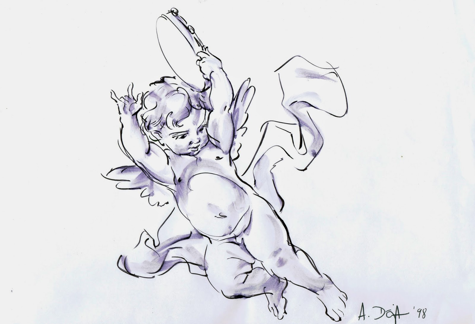
I just enjoyed analyzing his lively compositions of mostly women and cupids. And I think I learned a little about how to twist parts of the human body to avoid rigid poses, and to make figures look alive.

The sketch above of a cupid is a detail study from this painting, called The Muse Euterpe.


I have a coffee table book on Boucher’s art and life, and going through the pages I tried to imagine what a sketch might have looked like in preparation for certain paintings. So I decided to use his “Birth of Venus” to work backwards, and create a drawn study based on the image.
To start out I bought two oversized thick, white watercolor panels and decided to age them. I took them outside and poured coffee and tea on them, then I beat them up a little with garden tools.
It was fun to see how the white paper turned brown, with strains all over it. I think it’s what you call antiquing.
Then I sketched the composition with brown charcoal, before adding dark and light washes to give the figures some form. In the end I touched up a few lines with a brown brush pen.

Here’s what I came up with, a Boucher broken in two. Each panel is 5' x 3', 4"


The actual painting.


Tuesday, May 20, 2014

Xerox


When you study Disney cels from the Xerox years, from 1960 until The Rescuers, it’s amazing to see how much of the animator’s rough drawing was left untouched and made it to the screen. Particularly scenes by Milt Kahl, but also some by Frank, Ollie, Eric Larson and Lounsbery maintained that wonderful unfinished, sketchy look. Some people in the audience might find these loose drawings less pleasant to look at than the previous inked cels, but I am not one of them. The rougher the better!
It’s like seeing the animator’s personal handwriting in motion. Even though Disney had the best clean up artists as well as inkers in the business, when replacing a sketchy line with one thin contour, you are bound to loose some of the drawing’s liveliness. 
Milt said:” It’s too bad that Xerox happened so late in life. I was talking to Walt on Peter Pan and said, why don’t we just reproduce the animators’ roughs. But he responded, no, no, you want that nice, fine line around the characters. He eventually changed his mind though.” 
I believe Walt had no choice but to accept the Xerox process, since inking contributed to the ever growing production budgets. Moviegoers in those days embraced the new look and accepted the idea that rough drawings could become engaging characters and tell a compelling story.

When the studio produced The Rescuers, it was Milt again who championed the use of a Xerox line, this time in grey, which softened the drawings somewhat. 
I still prefer a black loose line around the characters though. If the drawing is good, why not commit to it and be bold with it?!

The cel above was signed by Milt during my first get together with him. 
The other ones are from his scenes as well ,and show his wonderful uncompromised line work.


Sunday, May 18, 2014

Deer Development


This post focuses on the different stages that were involved in the design of deer characters for animation, particularly young adult Bambi. To get the artists ready for a film that featured characters with unprecedented realism in drawing and movement, special anatomy classes were held, so the animators would get to know the body of deer inside and out.
In the photo above you can spot story artist Mel Shaw in the middle of the back row, and on the left are animators Retta Scott and Frank Thomas.
After many thorough studies of the animals, it took a while to come up with animatable designs that could communicate true animal behavior as well as human feelings. 
It seems that three artists were responsible for this successful evolution.

Bernard Garbutt had a way of simplifying the appearance of deer and discover natural and dynamic poses. His animals don’t talk, but they present a terrific base to build personalities on.


Marc Davis studied graceful realistic movement, before adding human expressions while storyboarding particular sequences for the film.


Milt Kahl gave the final look to all deer characters, including adolescent Bambi. He ended up animating most of his personality scenes, including the section where Bambi meets Feline as an adult. As usual, the anatomy in his drawings feels rock solid while offering possibilities for unrealistic, even cartoony animation. Milt’s animation of Bambi following Feline through the clouds has nothing to do with realistic deer motion, but it interprets instead the dreamlike state of falling in love. 


A great doodle sheet, Milt explores proper animation anatomy in detail.


Thursday, May 15, 2014

Scar in Entertainment Weekly


What a pleasant surprise! I was recently going through the pages of the magazine Entertainment Weekly when I came across this article on animated villains. The write up referres to the upcoming release of Disney’s live action film “Maleficent”. Cruella takes center stage, as she should.
I have to tell you, it feels mighty good that a character I animated years ago still seems relevant to audiences and critics. And he is written about among such distinguished company!
Made my “entertainment” week.

I found these throw-away ruffs in my inventory, most of them from the sequence when Scar sets up young Simba before the wildebeast stampede.

I still remember listening to Jeremy Iron’s voice recordings, thinking: Wow…this is gold! I better not screw this up.