Tuesday, September 30, 2014

Jiří Trnka


Jiří Trnka (1912-1969) was a Czech puppet animator/director, children book illustrator and fine artist. Some people called him the Walt Disney of Eastern Europe, even though the content of their films differed greatly. Trnka’s work often deals with social-political themes and therefor goes beyond entertainment.
I am absolutely in awe of this artist. Everything he did was an intense labor of love, but also a reflection of post WW II in Eastern Europe.
Michael Sporn, who is so terribly missed within the animation community, has posted a lot of great material on Trnka’s life and work:
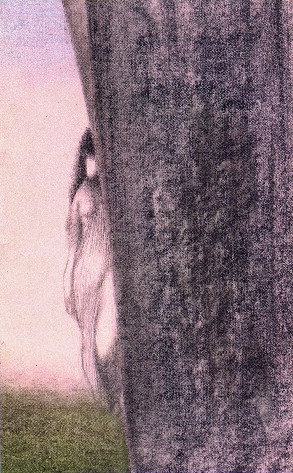
I will have more on Trnka in the future, today I just want to show a few of his incredible book illustrations. These images take you to different worlds, full of wonder and surprise.


What a masterpiece!!!


Trnka, genius, one of a kind!

Saturday, September 27, 2014

Fritz Hug- Animals from the Bible


More awesome drawings from Swiss animal artist Fritz Hug. This 1970 book edition, loosely translated from German, is titled:
Animals from the Bible, Part 1 , All kinds of Birds and other Creatures (I don’t think Hug ever did a Part 2)

These color illustration are such a delight to study. Hug is perfectly capable of capturing an animal through simple line work, but here his loose brush adds beautiful color and texture to his subjects. There is realism but also caricature. This man LOVED animals.


Go here for my first post on Fritz Hug:
http://andreasdeja.blogspot.com/2011/11/fritz-hug.html

Thursday, September 25, 2014

That Staircase


In the film Cinderella I have always loved the way the staircase was portrayed, dark and scary like real Hitchcock setting. These eerie steps represent the passageway between Cinderella’s living quarters and the rest of the house, inhabited by the stepmother and -sisters.
Mary Blair painted this moody color sketch. Her use of black horizontal, vertical and diagonal lines give the feeling of imprisonment. So great!

A final production background maintains the foreboding atmosphere. The image actually reminds me of an M.C. Escher drawing.


A dramatic downshot was used later in the film, signaling only one thing:
Trouble is on the way!


Wednesday, September 24, 2014

Say Cheese!


That would be a loose translation of the German phrase: Bitte recht freundlich!
This Heinrich Kley ink sketch portrays an energetic photographer trying to position a male model for a perfect picture. The man being photographed is covering his private parts with a hat, and he is tied to some sort of measuring contraption. And there are nails going through his feet…
It’s difficult figure out if there is a specific meaning to this illustration, or if Kley is just playing around.
In any case, it’s fun to compare the two contrasting poses. 

I never get tired of Kley’s definition of anatomy. The guy remains relevant to any serious animation student. 

Sunday, September 21, 2014

A Hidden Gem Sequence...


…in the movie Robin Hood is the puppet show during the song number “The Phony King of England”.
Overall this is a fairly weak section, it contains tons of re-used animation from Jungle Book, The Aristocats and even Snow White. And when the animation is new, it is subpar. 
But…. the little puppet performance, which mocks Prince John and Sir Hiss is brilliant.

To help us go back to Disney during the early 1970s, the photo above is a nice snapshot with some of the key players from this production, Milt Kahl, songwriter/singer Roger Miller, Frank Thomas, screenwriter Larry Clemmons and director Woolie Reitherman. 

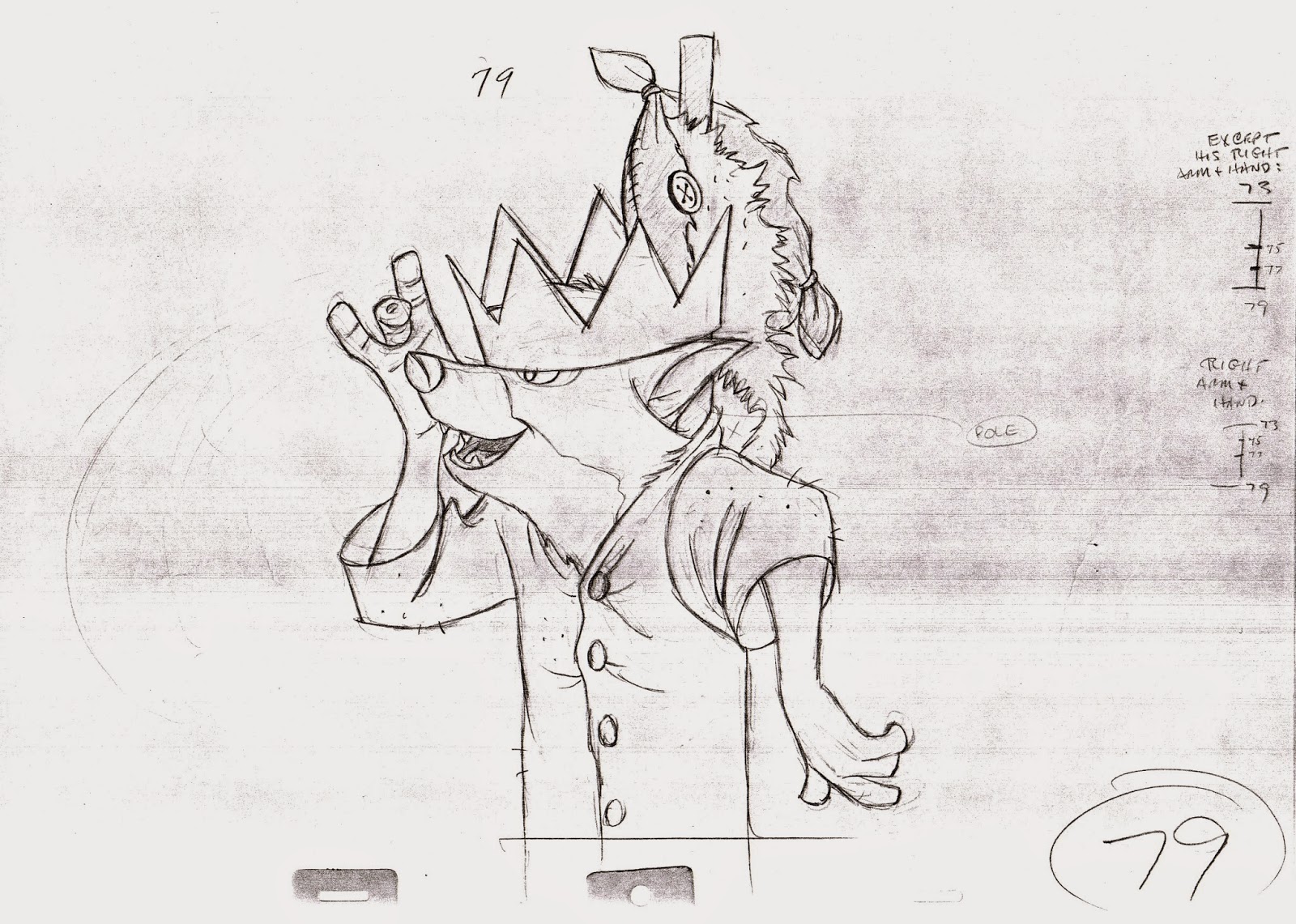
Milt got to animate the puppet show, which is surprising, since you might consider this little performance of secondary importance, story wise. But as I mentioned before, when it came to finish a movie, Milt would do whatever was left to do, crowd- or simple continuity scenes. And he would do them darn well. Just look at the feeling of weight he gets into the animation with different sorts of fabric.
The loose shirt bouncing as it hangs on a couple of sticks. Prince John’s head, which is made up of cloth, stuffed with some kind of soft material. The crown is hard and solid, and reacts properly to the movement. The character of Otto is manipulating a green sock, mimicking Sir Hiss beautifully.
Honestly, this is a mini animation masterpiece! So believable and enjoyable!
I also love the staging when Friar Tuck and Otto come up into frame. This could have been a very complicated scene to communicate. They both share a small space in this hollow tree, and they are holding various contraptions. Again…Milt makes it look sooo easy! 

Here is an edited clip, just showing the puppet show:


The final scene shows Robin emerging through the Prince John puppet. Look at how beautifully the shirt reacts as he comes up. Then the heavy crown lands on his head before he takes a little bow. 


Thursday, September 18, 2014

Designing Cinderella


After my presentation on Marc Davis last Saturday at the Walt Disney Family Museum, his art is still on my mind. Beside animation Marc was involved in many aspects during a film's pre-production phase. He often helped out with story work as well as character, costume and color designs. 
In these drawings Marc simplified the human figure in order to effectively show how a variety of outfits would look on Cinderella. 


Mary Blair's stylized concepts focus on strong graphic shapes and contrasting colors.


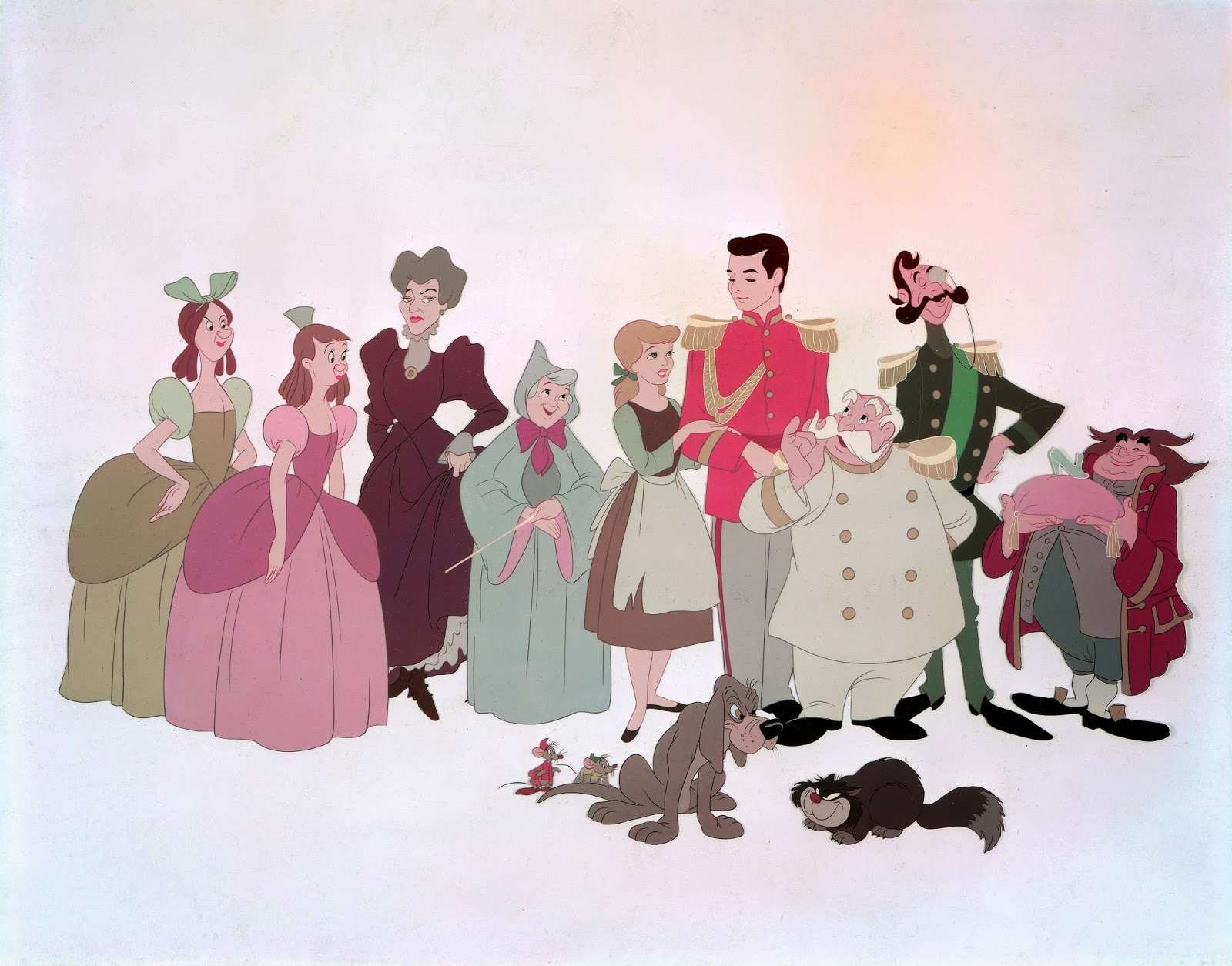
An early color model cel showing most of the film's cast. The somewhat unsure line work indicates that more work needs to be done to give the characters a more refined and polished look, worthy of a Disney production. Cinderella is a little short, and the King's Lackey would go through a complete design change.


Tuesday, September 16, 2014

Albert Uderzo


It must have been in spring of 1995 when I met the legendary Uderzo in Paris. I was working at the time at the French Disney Animation Studio on the Mickey short Runaway Brain. My friend Didier Ghez was able to arrange a visit to Uderzo’s office near the Arc de Triomphe. He seemed to be pleased to meet a Disney animator from a new generation, and I was practically besides myself to come face to face with the artist, whose work had enriched my life in profound ways. 
I remember a few of his rough design drawings framed on a wall of his office. My thoughts were…this is the work of a genius, on par with masters from the Renaissance. I was stunned. We talked for a little while before his daughter and a business associate joined us. (My French was good enough as to not embarrass myself, since I had just spent six months in Paris.) We all walked to a restaurant nearby for lunch, where my French got even better after Uderzo ordered champagne for everybody. He told me how much he enjoyed the movie Aladdin, he especially liked the Genie…”completement fou”!
One of his dreams had always been that Disney would animate an Asterix film. I passed the idea on to Roy Disney, but as you all know, the studio has always come up with its own ideas for animated films. There was one significant thing that came out of this lunch, though. Uderzo had never visited Disneyland Paris (Parc Asterix had been in competition with the American rival), so an official visit was arranged.
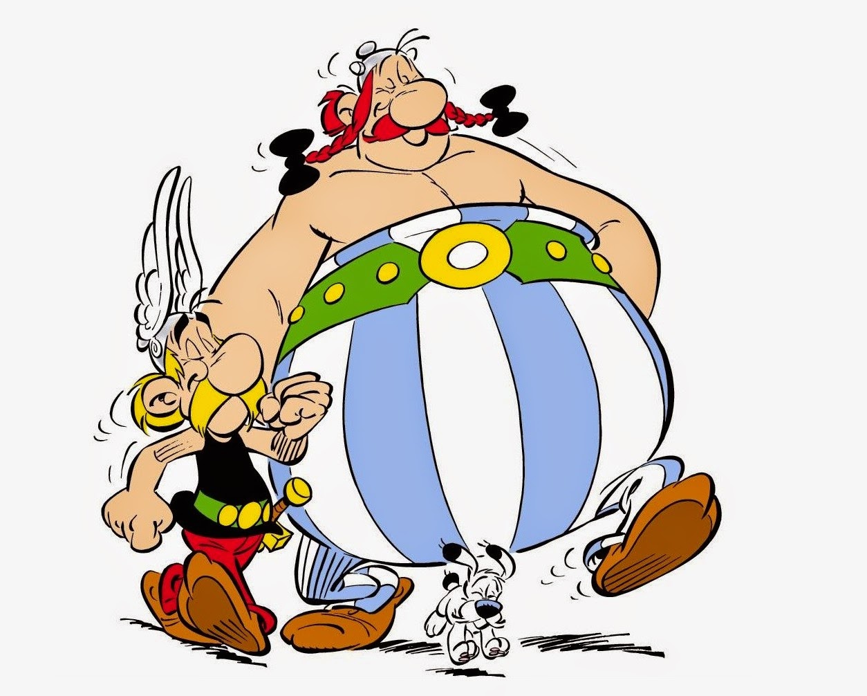
I LOVE Uderzo’s work. I grew up with Asterix and Obelix comics long before I saw my my first Disney movie. His drawings are masterful, rich with personality. He is a stickler for detail and historical accuracy. This man drew MY childhood!


A line-up of Uderzo’s characters from the second half of the last century.


Uderzo and his writing partner Rene Goscinny, who passed away in 1977.

Another one of his great strips, Oumpah-Pah. At its core is the friendship of an American Indian and a French officer, called Brussels Sprout, during the eighteenth century.
The master during a drawing demonstration.
All artwork © 2014 LES ÉDITIONS ALBERT RENÉ