Saturday, February 27, 2016

Horse and Jockey in Wire


I made this wire sculpture quite a few years ago. It was inspired by one of Heinrich Kley ink drawings. I loved the action in his sketch, and wondered if could get this sense of motion onto a sculpture. I also wanted to try and have it free standing, despite the out of balance poses. It turned out to be a fun challenge.


Once I find the time I would like to do a Madame Mim in wire to go with this Merlin:

http://andreasdeja.blogspot.com/2012/05/merlin-in-wire.html

By the way I mostly use thin steel wire, which costs almost nothing at places like Home Depot.
I bend the wire with  my fingers, no other tools, except for tightening the knots with pliers at the end to stabilize the sculpture.

Thursday, February 25, 2016

Hollywood Animation 25 Years Ago


I can still hear the chuckle in Marc Davis' voice when he told me over the phone:
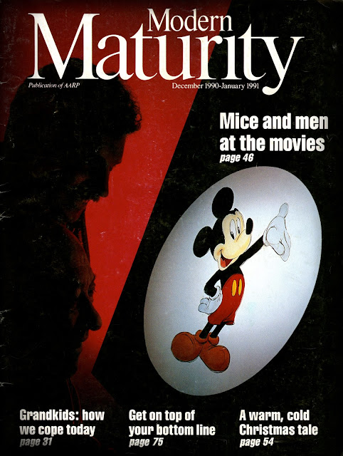
"We made the cover of MODERN MATERNITY magazine."
 Charles Solomon's article on the state of animated films at the end of 1990 had just been published in MODERN MATURITY magazine. I was flattered beyond belief to be included in the cover with Marc. I remember the photo shoot like it was yesterday. Feature animation at that time was still in Glendale on Flower Street. Marc and I were led into a specially darkened room with a red light washing the back wall. There was a spotlight aimed at a Mickey Mouse drawing I had prepared. 
The photographer asked us to hold still during the long exposure, which seemed to take f-o-r-e-v-e-r!
I think it was somewhere around three minutes, and all I could think about was that poor Marc had to stare at my drawing, probably finding all kinds of flaws with it.

Who framed Roger Rabbit as well as The Little Mermaid had been released, and Disney's animation crew was riding high on the success of these films. But we had NO CLUE what was to come in the future. The Prince and The Pauper combined with The Rescuers Down Under as theatrical releases proved to be a bump in the road toward unimaginably successful projects that followed. Then a few years later the company would gradually loose interest in its signature type of animation, before abandoning Disney animation, as we know it, altogether.
I count myself lucky to have been a part of the resurgence of feature animation. And to find out that our films and characters still resonate with students and audiences to this day is simply extraordinary. As I continue to present my lecture on the Nine Old Men in regards to my book, people tell me during the signing session that movies like Aladdin or Lion King made them want to become animators. 
It is the kind of satisfaction I really can't describe in words.

It is very humbling to find myself among all of the distinguished animation artists who presented insightful comments in this article.


Tuesday, February 23, 2016

Mr. Toad


Disney's version of Kenneth Grahame's book The Wind in the Willows is one of those few productions that I would label as a good film, but not a great one. First conceived as a full feature film, before being cut down to featurette length, the trouble the story guys had with getting a hold of the material is evident to me. The whimsical quality of the original book never made it to the screen.
(Many years later Winnie the Pooh succeeded more on that level).
You get to know Toad, Rat and Mole only to a point, perhaps this should have been a full length feature to allow for deeper character development.
That being said...I love watching the film , because there are many animated highlights. Milt Kahl's Angus McBadger, Frank's Toad animation and the trial sequence are just terrific. Well worth studying frame by frame.
The overall character designs are pretty nifty as well, with the exception of bartender Winkie, who looks like a stock character.

Here are early character suggestions by Ray Jacobs (?).


Great sketch by story artist Homer Brightman.


A comparative size sheet drawn by Frank Thomas.


And a clean up model sheet using poses from Frank's animation. Milt had something to do with the way hands, clothing and facial expressions are drawn.


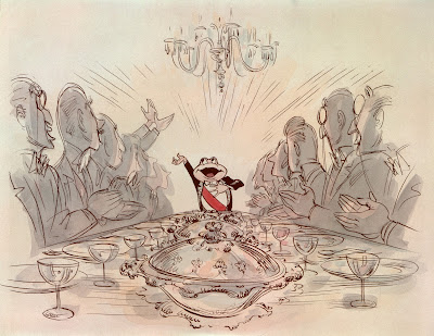
What a beautiful sketch from the film's prologue. That's what I call great staging.


A Life Magazine article, published around the time of the film's 1949 release.


Sunday, February 21, 2016

Roger Rabbit Scenes II


"Pasword!" "Walt sent me".
The writers of Who Framed Roger Rabbit had a field day as they came up with all kinds of inuendos that referenced the golden age of Hollywood animation.
I remember animating this little scene, it was a little tricky to lock the gorilla's partial face into the subtle camera move.
A reminder, this film's animation was still painted on cels. The red shading in the gorilla's eye was rendered with a color grease pencil right on to the cels. (As were Jessica's lips.)

This was supposed to be the bouncer of all bouncers, absolutely huge.
Bob Hoskins knew this when filming the scene, he looked up way high as he imagined this oversized gorilla.


This was a tricky scene as well. Hoskins was filmed hanging on wires as he approaches the camera fast. It turned out that a believable throw needed to be faster though, so the live action footage was sped up by skipping a few frames. I liked the challenge of animating the gorilla as he is holding on to Hoskins before throwing him forward.


This was my first eye popping Tex Avery take. I animated Roger's eyes coming forward during a stagger, but my first test didn't show a perfect eye contact between human and toon. So Dick Williams made me change Roger's eye direction in order to follow Hoskin's movements.
It was a good call. Made the scene much more believable.


Oh boy, here is a scene that I thought was un-doable. Both characters argue for a while before Roger jumps on the bed in order to get his point across, being closer to Hoskins. The camera moved in on them EVER so slowly. The photostats I had to work with didn't show the wrinkles in the bed sheet, so how was I to register Roger's feet during the camera truck in?   
Again, Dick Williams came to the rescue. He said, the rabbit is agitated anyway, so don't animate his feet planted on the bed the whole time. Instead have him do little nervous steps, so the contact is only for a short while each time. 
My animation is not technically perfect in this scene, but apparently good enough. I didn't get fired.
Roger's acting is ok though, I think.


The reason Roger is holding his right hand way up high at this moment is because Hoskins is looking in that direction. So in many cases as an animator you needed to be clever to come up with gestures that accommodated the actors' eye line.


After all these years KUDOS to Bob Hoskins, who should have won an Academy Award for this role. He was absolutely BRILLIANT!


A Pecos Bill Myth


Ward Kimball and Milt Kahl both animated personalty scenes of Pecos Bill from the 1948 Disney movie Melody Times. This was outstanding casting, Ward brought zaniness to the character, while Milt added believable (yet often hilarious) character animation.
I do remember Ward talking in lectures and interviews about one specific scene. When Slue Foot Sue embraces Pecos before planting a big kiss, his pistols go off by themselves to show...excitement.
Ward took credit for animating the scene, and was almost giddy about the fact that Walt Disney never caught on to the real meaning of the scene...Pecos is getting his rocks off (Ward's own words).

Well, Ward didn't animate that scene, it was one of Milt's. I don't have to check with the animation  draft (even though I did) to realize that drawing and staging is pure Milt Kahl.

I don't know if Ward had anything to do with the idea for the scene, but this episode makes for good story telling.


A clean up model sheet made up of Milt's key drawings, including the scene in question.


Thursday, February 18, 2016

Dwarfs


I have had color xeroxes of these beautiful rough animation drawings on 12 field paper for a while. They feature a few of Snow White's dwarfs drawn by three animators at the time of production.
The first batch is unmistakably the work of the ridiculously gifted Fred Moore, who was in his mid 20s when he worked on the movie. I call him a terrific freak of nature. Even before Snow White Fred had helped transform the early rubber hose Disney style into a medium that presented flesh and blood, living, breathing characters.
Ollie Johnston stated that Walt Disney gave Fred tons of notes during sweatbox sessions. Walt knew that this kid was just right to head up the "Dwarfs unit", but he wanted to see acting and entertainment on a superior level. So with Walt's input Fred ended up with animation that was overflowing with personality...and charm.


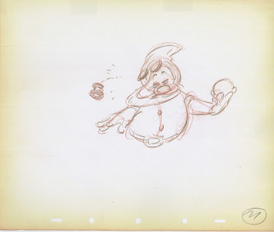
In this pose Dopey is anticipating a kiss from Snow White. Perfect staging!


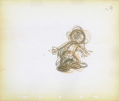
Occasionally Fred worked on a pose intensely to get a result that felt right to him. Sure, most of the time his drawings have a light touch, but when a scene required to dig deeper in order to carve out the right emotion, he was perfectly capable of scribbling intently until the character's personality communicated clearly.


What a master at distortion, when it comes to broad motion. Tytla, too, animated loose, fleshy skin on  Grumpy, and later on Stromboli.


These are among the roughest drawings by Fred Moore I have seen. This is tough brain work, but at the same time there is confidence and fearlessness.


Many of Bill Tytla's drawings, like these two featuring Grumpy, are not as "pretty" as Fred's work. His pencil strokes are short, and the poses seem less solid. But when seen in motion the power of a super animator surfaces. A single drawing meant very little to him, he knew that only a series of sketches will bring something to life. And in his case in the most vigorous way.


Ward Kimball's soup eating sequence was cut from the final film, but not because of his outstanding character animation. Kimball took Moore's appealing draughtsmanship and applied it to his own way of character acting. He made every dwarf slurp down the soup in a distinctive and inventive manner.
Another child genius.


Tuesday, February 16, 2016

Ollie Johnston...20 Questions


I don't know who asked Ollie to answer these questions, but this questionnaire is currently available on ebay. Other artists from the field of entertainment did the same, such as Jane Russell and Carol Burnett.
This sheet seems trivial at first, but you do find out about Ollie's hobbies, his favorite TV show and his favorite animators.
It is actually a little puzzle piece in trying to figure out what made one of Disney's greatest animators tick.


Monday, February 15, 2016

More Busch Circus Sketches


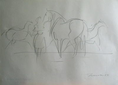
These beautiful, spontaneous sketches by Wilhelm M. Busch date back to 1984.
 Drawing from life really doesn't get any better than this. Within seconds Busch scribbles down characteristic poses of animals, and his overall compositions are equally impressive.
The power of great draughtsmanship!
I love the last two drawings with the lion and lion tamer. There is a real relationship that comes through in just a few pencil lines.


For more on Busch's circus sketches go here:

http://andreasdeja.blogspot.com/2014/12/busch-circus-elephant-sketches.html