Sunday, July 30, 2017

A Weekend Treat


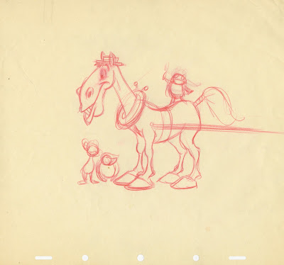
One of those tossed drawings that Milt Kahl actually used to sharpen his brown pencil on.
And God knows who saved it from his trash bin a little while later. What an amazing sketch, full of life and elegance.
I don't know if this is a pose from his own animation, or if it was done for someone else' scene.

Friday, July 28, 2017

Tex Avery Animals


I love these stylized animal designs from Tex Avery's 1954 short film The Farm of Tomorrow.
I don't know who in Avery's unit came up with the designs, but they are terrific caricatures and graphically solid as a rock.
This is what Wikipedia says about the film's plot:

A series of gags showing how much more productive farms would be if farmers started crossbreeding their animals to create weird (but very useful) hybrids. A number of items include,
  • a chicken slot machine
  • sheep with long underwear-like wool
  • corn jumping like Mexican jumping beans
  • cow with a beaver tail

In other words...what's possible today!


Wednesday, July 26, 2017

Busch Lithographs


These are Wilhelm M. Busch lithographs which are currently being offered on Ebay. The first two images are observations during Busch's life drawing classes. Boy, what would I give to have been one of his students way back. If any German reader had that experience, please leave us a comment on what that was like!
I do prefer this approach to drawing the human figure over the popular US style that is being taught in many art schools, which layers flashy shadows and highlights over the body like a special effect.
With Busch (as well as with Kley) the economy of the line rules. 
Being a 2D animator my preference shouldn't surprise you.


This sketch had to be inspired by Heinrich Kley, because of the fantasy aspect. 
A farmer on a wagon that's pulled by a donkey making his way through the the legs of a giant nude woman. I leave any sexual innuendo for you to interpret.


Sunday, July 23, 2017

Many years ago...


Another blast from the past. Here I am still working in the original Disney Animation Studio in Burbank. And what I am holding is an early design for the Horned King from The Black Cauldron.
Below is the rough model sheet that was approved by a whole group of people, including myself. (I drew all of these poses, and they kind of hold up after all these years. But they don't reveal any personality, other than this guy being mean...and that's not enough for portraying an interesting villain.) The model sheet is dated March of 1981.

You know, these books by Lloyd Alexander are terrific. Here is one live action re-make I would love to see.


More of my early Cauldron stuff here:
https://andreasdeja.blogspot.com/2011/11/early-black-cauldron.html


Saturday, July 22, 2017

Animation takes Time


This is an early Comparative Size sketch by Frank Thomas for the Mr. Toad project. At that time this story was planed as a feature length film.  Frank signed off on the final sheet below on June 17, 1941. Then WW II happened, and quite a few Disney projects were put on the back burner. Mr Toad didn't reach movie screens until October of 1949, as a featurette, combined with The Adventures of Ichabod Crane.
I love the film which is set in a world where humans and anthropomorphic animals co-exist. All based on the stories by Kenneth Grahame, in a book called The Wind in the Willows, dating back to 1908.
Frank animated brilliantly the confrontation between Toad and Cyril, the horse, and Rat and Mole.
Beautiful, funny, character rich acting.
I remember when Frank called me on the phone, because he had found out that a few of his animation drawings from this film were up for sale, and he knew I was collecting vintage animation art. But they turned out to be clean up drawings, which are less interesting to me. Anyway, compare the two images, I think Frank's final sketch is quite an improvement over the first one.


Thursday, July 20, 2017

An Oprah Story


Look who I was hanging out with at the recent D23 Legends lunch!
I actually had met Oprah before, way back in 1995. Disney had just purchased ABC, when management called me to let me know that Oprah would be stopping by my office. All of a sudden I found myself trying to make small talk with one of the most famous people in the world. There were also Disney management folks present as well as a few members from Oprah's team.
So this is how the visit went:
Oprah right away notices the maquette of Scar on my book shelf. "Did you draw Scar?" she asks me.
I said:"Yes."  "Tell me, all my gay friends say that Scar is gay...is he gay?"
O-k-a-a-y-y-y, how do I answer that, I thought for a split second. Well...truthfully of course.
I remember saying something like this:"I can see why people might assume that, but I never thought of Scar being gay. In an early version of The Lion King we had a lengthy sequence in which Scar is coming on to Nala, and offers her to rule the kingdom with him. She refuses and scratches his cheek."

There you have it, Scar is straight. And while I am at it, so are Gaston and Jafar...at least as far as I know.

Tuesday, July 18, 2017

Sullivant influences Disney

Here are a couple of examples that show the graphic influence T.S. Sullivant had on the design of certain Disney animal characters. 
The first one is the brown cow from the 1950 short film The Brave Engineer. The train had to come to a sudden and abrupt stop because the cow happened to stand on the railroad tracks. With a nonchalant attitude she turns away and moves on. Milt Kahl animated this scene with all the comedy you can get out of a Sullivant design. Oversized muzzle, and hip bones that stick out for days.


This sketch by story artist James Bodrero depicts a young  Gauchito on a horse. The final 1945 short film The Flying Gauchito includes a flying donkey instead.
There is a certain size and shape Sullivant applies to a horse's head, and you can clearly see the influence when compared to Bodrero's beautiful sketch.


Most artists working in the animation industry during its golden age just loved Sullivant's work. 
There really is nobody like him.
Now who is going to publish that coffee table book on his work?!


Sunday, July 16, 2017

Eyvind Earle at the Walt Disney Family Museum


Don't miss this massive exhibition at the W. Disney Family Museum. The image above is the cover of the exhibit's catalogue. It is actually an art book featuring many of Earle's original works for Disney, but also personal art like his many stunning Christmas cards illustrations. There are also sculptures, early student drawings as well as gallery art.
More infos about this gorgeous exhibition here:

http://waltdisney.com/exhibitions/awaking-beauty-art-eyvind-earle


My own exhibit is still at the Museum until October 4.


Thursday, July 13, 2017

Stepsisters


Another example of how Milt Kahl had his hand in the designs of almost all Disney characters.
Even the ones he didn't animate. Below are four drawings that Milt did over Ollie Johnston's key poses of the stepsisters from the film Cinderella. They appear on the rough model sheet along with many more of Milt's sketches,drawn over Ollie's.
It's interesting to see that the sisters' hands are depicted fairly realistically, while the feet look very cartoony and oversized. They had to be, because of Cinderella' glas slipper. There is no way that the slipper would fit on those clumsy things.


This previous post Milt shows Milt's early designs for the Stepmother, who was animated by Frank Thomas:
http://andreasdeja.blogspot.com/2012/10/the-stepmother.html


Tuesday, July 11, 2017

Whose Pinocchio is this?


There have been a lot of drawings up for auction lately featuring drawings from an early Pinocchio scene. This is what the character looked like before Walt Disney voiced his displeasure over his design. Then, of course, Milt Kahl came on board and re-drew Pinocchio for the final appearance in the film.
These four drawings are from a very long scene (hundreds of frames). Unfortunately the whole scene was broken up (which breaks my heart) into small groupings before being sold. How great it would have been to scan all drawings in order to create a pencil test!! But with multipole owners now, that won't happen.
I have been messing with the question of who the animator might have been. Either Frank Thomas or Ollie Johnston. After taking a closer look I am now sure that this is Frank's work. The overall line quality is vintage F. Thomas. The way he drew hands and feet reminds me of his animation of Mickey Mouse in shorts like The Brave Little Taylor and The Pointer.

Here is the link to a rough Thomas Mickey drawing from The Pointer:

https://blogger.googleusercontent.com/img/b/R29vZ2xl/AVvXsEjvyoVhmaaGtgRwNR7B-Dlh86tAW5vOKVDzOubNICK2wkf198nqboz6Eeb68VjDTv20MZ0keJ3zb5tnTk7mLWGyRf3KeCRQU8ZvL3RIANp7Ol1CWAxuDI7NYEie8Z1izwlLkG5zCh6Yujc/s1600/F_4.jpg

Images Heritage Auctions

Sunday, July 9, 2017

Ollie's Come Back

Ollie Johnston fell ill after finishing animation on 101 Dalmatians. It was one of those childhood diseases that can be life threatening when an adult catches it. I remember Ollie telling me how grateful he was to Walt Disney, who kept paying his regular salary during Ollie's lengthy hospital stay.
When I watch The Sword in the Stone I can't help but realize that Ollie's work on that film seems somewhat unsteady. He animated many scenes with Merlin (including his introduction), as well as scenes with Wart and Archimedes, the owl. A master animator not on top of his game, due to his recovery. 
But Mary Poppins already shows that Ollie got his groove back. His penguins (animated by him and Frank Thomas) are beautiful. His scenes are full of fluid motion and personality.
And by the time Jungle Book came around, Ollie was back in action. He animated the first encounter between Mowgli and Baloo  (Frank Thomas did the boxing scenes). All of The Bare Necessities sequence is Ollie's work, and how spectacular it is. Full of musical rhythm and top character animation. I consider his work on that film a career highlight. 

Here are a few of Ollie's thumbnail sketches followed by final frames.


Thursday, July 6, 2017

Three Pigs


These two Fred Moore drawings were recently auctioned off at Heritage Auctions. In them you can actually study four different stages of Fred's drawing approach.
In the upper sketch the orange lines were the first ones he put down. They are rough and spontaneous, and show how he begins to define staging and expressions for the characters. Note that the pig on the left was originally placed further to the side.
Moore's black pencil pass on top is still rough and loose, but it clarifies the main volumes in greater detail. Practical Pig's index finger was changed for better silhouette.

I am sure that the second sheet was placed over the first one on Fred's animation desk in order to tie down the pigs' composition even more. He used a red pencil to select the lines that actually matter for the final presentation. The thin graphite pencil on top is almost a clean up drawing. But even at this last stage he makes subtle changes like adjusting the tilt of Practical Pig's hat. He also adds a tail to
Fiddler Pig.

The drawing is most likely a publicity illustration, since all of the characters were drawn on the same sheet. This would not happen in an animated scene, since due to the pigs' individual timing, they would be drawn on separate sheets.

The liveliest version of the two is the upper one. Each time you reduce your instinctive scribbles down to thin fine lines, some of the drawing's life is lost. But...this is the classic Disney style, thin, distinctive outlines and flat color shapes.


Tuesday, July 4, 2017

Barrie versus Disney


An amusing article from a UK publication, which compares J. M. Barrie's original play of Peter Pan to the Disney animated film. The writer seems to defend the Disney version, but often can't decide which adaption he prefers. 
It's a fun read that deals with the Americanization of English folklore.