Monday, July 30, 2018

Busch Magazine Covers


For this post I am borrowing illustrations by Wilhelm M. Busch from Hans Bacher's blog:

https://one1more2time3.wordpress.com

I think they are magnificent. Sternchen (Little Star) was for a while a supplement children's magazine within Stern, a leading weekly German publication still operating today.
These illustrations helped visualize stories that were included in each issue.
Staging, composition, draughtsmanship...there is so much to admire here. Busch (1908 - 1987) was a fantastic storyteller, and I wished I could hire him for one of my upcoming projects.


Friday, July 27, 2018

More Bernard & Bianca Sketches


These photocopies of Milt Kahl's character designs for the mice leads in The Rescuers are currently offered by Heritage Auctions. Milt is exploring various outfits, but he is mainly trying to come up with new design concepts for animated mice. Not an easy task.
Bernard's nose eventually shrank to a more conventional, smaller size.
I do like the sketch in the the upper right corner, even though this looks like a British character.

Here is the link to my previous post on designing Bernard & Bianca:

https://andreasdeja.blogspot.com/2013/05/bernard-bianca.html


Thursday, July 19, 2018

Jungle Book / Weekly Animation Productivity


This is a true "behind the scenes" document, detailing the animators' animation output during the last week of 1966. Walt had died just two weeks prior to year's end. So the mood in the animation department was somber, to say the least. Most of the animators took the time off between Christmas and New Year's.
It is interesting to see what the average output was up to that point in production by each animator.
Ollie did just over 15 feet a week. That is about 10 seconds.
Hal king was pretty prolific, too, with 10-03 Feet.
Milt Kahl just short of 9 feet, average. (Of course, according to him, he could have been much faster, if he didn't have to do so many drawings for other animators.)

Funny, it looks like they were 10 frames ahead of schedule for total output.


Monday, July 9, 2018

Woolie's Student Life Drawings


I am always thrilled to do a post on Woolie Reitherman, because there isn't a whole lot of his art available, at auctions or elsewhere. 
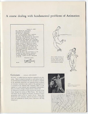
Years before he animated Timothy, the mouse in Disney's Dumbo, Woolie attended art classes at Chouinard Art Institute in Los Angeles in 1932 and 1933. (He was hired by Disney on July 31, 1933).

Here are a few samples of his life drawings from that time. I see a student who is in search of anatomy, form and motion, but also in search of a personal style.
A great start to a legendary career in animation.


In 1937 Walt Disney became involved with Chouinard by offering classes in animation, taught by top talent from the studio. In later years Ward Kimball and Marc Davis would join the faculty.


In 1961 Chouinard and the Los Angeles Conservatory of Music merged into the then brand new California Institute of the Arts (Cal Arts), located in Valencia, north of Los Angeles.

Drawings/Bob Reitherman, brochure pages/Howard Lowery.

Thursday, July 5, 2018

Ken's Shere Khan


There are MANY posts on this blog regarding Shere Khan from The Jungle Book, and there is a reason for it. I believe that this character represents a late breakthrough in Disney character animation. Ken Anderson came up with an "above it all" villain, at a time when the rest of the animation crew was scrambling to develop a unique approach to this tiger. It could have gone in so many different directions.
A physically overbearing, threatening, vicious villain would be the most obvious way to go.
But once director Woolie Reitherman saw Anderson's sketches, the idea of hiring actor George Sanders for the voice came to mind. And the rest is history.
Milt Kahl was completely on board with the concept of a tiger, who is suave and acts in a restraint manner.
The final result is a villain for the ages. Designed with graphic sophistication and animated with just the right amount of realism.

https://andreasdeja.blogspot.com/2014/03/kens-and-milts-shere-khan.html


Images courtesy of the Reitherman family, with many thanks.

Monday, July 2, 2018

Magic Mickey


A beautiful rough drawing by Fred Moore from Fantasia's Sorcerer's Apprentice, just recently offered by Heritage Auctions. Moore was animation supervisor on this short film, I don't think he animated much himself while working on it.
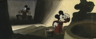
What's interesting here is to observe that Mickey is portrayed with his vintage black oval eyes. You can see it in the pre-production color sketch as well. So sometime during production the idea was discussed to give Disney's superstar eyes WITH small pupils.


And this is what he ended up looking in Fantasia, and pretty much from that time on, as far as eyes are concerned.


The story source material for The Sorcerer's Apprentice was as beautiful as the final film.


A finished cel set up from the film, though it might have been produced for publicity purposes.


A dramatic cel image for a final scene. Sometimes I wonder, what is it about Disney character colors?
They are stunning, just by themselves, without a painted background.
The Disney Color Model department really was the best in the world!