Tuesday, September 25, 2018

Peter Pan Mix


Peter Pan remains one of my favorite animated films. Right from the opening scenes (above) you find yourself in a dream-like world. The lighting in these background paintings is phenomenal. There is cool moonlight and then a single street lantern emitting a little bit of warm light.
You look at these paintings, and you want to go there, you want to be involved. I have been lucky enough to have seen some of these BG paintings up close at Disney. They literally take your breath away.

The children's books associated with Peter Pan effectively captured that dream-like quality.


One of Mary Blair's countless little color sketches for the film, each in itself a masterpiece.
I will always remember Marc Davis stating that Mary Blair knew color better than Henri Matisse.


A magazine article that helped promote the release of the film in 1953. The first image is a publicity cel which somehow depicts Peter Pan as a manga character. Go figure!


Friday, September 21, 2018

The Moore That Got Away


In 1996, while bidding on these two drawings at auction, I had to realize how popular and revered Fred Moore had become. These character design sketches depicting Grace Martin from the 1946 short film The Martins and the Coys sold for a small fortune to a lucky collector.
I am just glad these drawings survived at all and that I can show them here as scans from the catalogue.

Monday, September 17, 2018

Fantasia


I love a lot of the artwork produced to promote Fantasia. Look at the cover illustration of this book, published around the release date of the film in 1940. Classy and elegant, capturing the essence if the film.
The poster below is from Denmark. Probably for a later release.


This one definitely has the color vibe from a re-release, perhaps during the 1950s or 1960s.


Fantasia had plenty of product tie ins. This ad aiming toward brides with good taste and slim budget is from 1941.


More products created for several re-releases of the film.


The man who got movie going audiences interested in classical music. Myself included!


Wednesday, September 12, 2018

Something is Missing


The character of course. I was told by a Disney background painter, who worked on most of the classics, that a BG should look like an empty stage set. Waiting for the character to enter and give a performance. Therefor the BG should look "unfinished" in order to make room for one more element, the animated actor(s).
The first image is a color study by Mel Shaw for The Fox & the Hound.


The Little Whirlwind


Pinocchio


Robin Hood


Sleeping Beauty


101 Dalmatians


Sunday, September 9, 2018

Distortions


Distorting parts of a character is an old staple in pencil animation. It was perfected by Disney artists as well as other studios during the mid 1930s. During fast character movement a particular problem arises when trying to achieve smooth looking motion. How do you create quick moving animation without making it look rigid?
When studying live action films you'll discover a "blur" during a fast head turn, for example.


Since conventional animation cels always had sharp outlines and flat color, without distorting, the animation would look stiff during fast movements.
The first image above is from a scene with Grumpy by Bill Tytla. He occasionally went to extremes in order to get smooth looking action. He is not afraid to drag Grumpy's nose to a point where the character becomes almost unrecognizable. The idea is for the viewer to feel the fast motion, and not actually register it by single drawings. And...this drawing is seen on the screen for one frame only. If exposed for two frames the illusion of smooth, quick motion would be ruined. 
Study Tytla's Stromboli frame by frame. His distorted drawings during the character's speedy, erratic moves are spot on. And legendary!

The next drawing is from an Art Babbit scene with Goofy. The short film is Mickey's Amateurs from 1937. Goofy is playing multiple musical instruments at the same time. Here Babbit has the character turn screen left while the muzzle and harmonica are way behind on screen right, to eventually catch up with the head's motion. You get a sensation of loose moving flesh. 
Fred Moore also helped pioneer this principle, though in more subtle ways.


A drawing from Society Dog Show, 1939. Pluto's extreme open jaw is not in motion here, yet it is very distorted, far from what a real dog's jaw could do.


None of this is possible when animating a character like Cinderella, whose design is realistic and believable at the same time. The challenge here was to work with live action reference while trying to make the scene look "animated", not rotoscoped. Its all about subtleties.


At MGM animators had a blast coming up with ways to make fast action "look easy on the eyes" of the viewer. Partial multiple imaging plus dry brushed speed lines. What amazing images!


Even stop motion animators who originally photographed their models one crisp frame at a time, now tend to add motion blur to their work. This certainly adds realism when viewed on the screen.


CG animation is full of motion blur. 


Cartoon Brew


My own most distorted animation would be for Who Framed Roger Rabbit. It was a thrill to work so loosely on the characters. And having had this experience of using basic animation principles in such a broad manner sure helped me with my future assignments.


Tuesday, September 4, 2018

Roger Does Chaplin


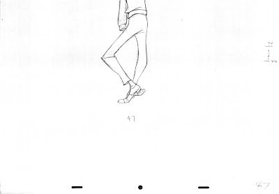
At least that's what it looks like to me, as Roger Radcliff hops toward Anita while finishing a verse which denounces Cruella De Vil. "This vampire bat, this inhuman beast. She ought to be locked up and never released!"
That last part is sung during this scene. Milt Kahl animated most of the footage involving Anita and Roger Radcliff, quite a few of them based on live action reference. But not here.
The leg motion follows the beat of the song and has a loose, freewheeling feel to it. This tells me that it came directly from Milt's brain on to paper.
The heels are always leading while the shoe front follows in circular motion. There is a goofy cartoony quality which you don't find in Roger's scenes that were live action based.
That's why I was thinking of Chaplin, who had applied similar type of leg motion to some of his walks.
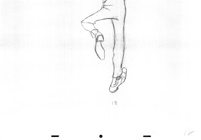
The scene is on ones except for a few twos at the end. Here are the main key drawings.


Hands and feet are notoriously difficult to draw and animate. The fact that Milt makes it look so effortless should come to no one's surprise.