Saturday, October 26, 2019

Roger Rabbit Problem Solving

This was my first scene that involved a character's eye to pop out a la Tex Avery.
I remember paying attention to the technical aspects for the scene. Roger's eye pops and then there needed to be a stagger, a subtle back and forth, back and forth, animated on 1s (like the rest of the movie).  I thought the pencil test looked pretty good until Dick Williams pointed out that during the stagger the eye still has to follow Bob Hoskins' movements.
I adjusted the animation, but there still seemed to be something awkward with the way Roger was placed into the live action scene. A lot was going on with the pillow and the blanket. They seemed to have a life of their own.
I tried a couple more times to make Roger fit into the bed, but it didn't look perfect.
Guess what, ILM placed a shadow over the screen's lower right corner to take the edge off this combination issue. It sure helped a great deal.


In the following scene Roger exits the bed before jumping back on it. It turned out that Bob Hoskins' eye line was too high before the rabbit arrived in his upward position. The solution was to stretch out Roger's arm, so Hoskins looked at the hand, and a few frames later the head.
There were times when we all had to be creative in order to make the animation/live action combo believable.
Great times!!


 '


Wednesday, October 23, 2019

From Vance Gerry to Milt Kahl

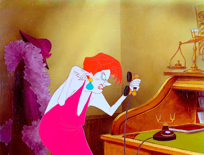
Story artist Vance Gerry boarded Medusa's introduction sequence from The Rescuers.
You can see that Vance was still kind of hanging on to her classic depiction, in which her hair mass is actually a bunch of snakes.
Milt Kahl who animated the villainess didn't go quite as far and drew her hair more conventionally.
This of course makes  complete sense since we are not dealing with Greek mythology here but instead with New York during the 1970s.

But Milt kept Vance's overall idea for the character's staging.
He mentioned in an interview that Medusa treats the phone's hand set as if it were Snoops. She is mad at him for not being able to control Penny. So she shakes the hand set, pokes it with her finger etc.
That thing represents Snoops to her. A fun way to approach this scene from an acting and animation point of view.


A few terrific thumbnail sketches for this section of the film.


A felt pen sketch that shows Medusa's unusual and entertaining body proportions.


Saturday, October 19, 2019

Mickey Mouse, 90 Years

This is a reject for a proposed illustration to help promote Mickey's 90th anniversary.
Theme park Mickey and Steamboat Willie take a selfie together.


Friday, October 18, 2019

Flying Horses

I have always loved the design and animation of the Pegasus pair in Fantasia.
Beautiful simplified anatomy combined with an elegant art deco style. And did they ever work out perspective challenges of those wings. I don't know who drew these construction model sheets, but Eric Larson did a fair amount of gorgeous animation with these flying horses.
By contrast the juveniles in this sequence look a bit too cute and cartoony to me. Their overall animation is fine, but a certain solid body structure is missing.

To me it's the adults that steel the show.


Tuesday, October 15, 2019

Appeal, Flair & Magnetism


For some reason I have a difficult time finding those attributes in recent as well as upcoming animated feature releases.
Look at how Donald Duck's world was presented in this 1944 ad. So incredibly charming and inviting. You can't take your eyes off this -I believe- Hank Porter illustration.

I could give you hundreds of other examples from the past that tell me something is missing in today's animation offerings. Not that I expect animation today to look like 1940s Disney. It's just that there was integrity and artistry to cartooning. A higher standard!
I am reminded of what Joe Grant told me, what seems like just a few yers ago: "We had the same problems making animated movies back then. It's just that we drew better."

I could argue that the advent and influence of video games has been toxic on animated features from an artistic point of view. Call me crazy, but I kind of believe that.
Yet box office success speaks for itself. Like someone said: "You can't argue with money in Hollywood."

Anyway, tons of appeal in this James Bodrero sketch for FANTASIA.


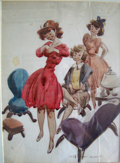
The master of appeal, Fred Moore.


I remember that these were the first Disney animation drawings I saw as a kid. This photo of Kimball was included in a small brochure that came with a Disney Super-8 film clip.
I kid you not, my heart was racing. Magnetism on a grand scale.


I am confident though that eventually more artistic "left-turns" will be made in animation. 
Art has a way.....


Sunday, October 6, 2019

Cinderella Photostats


A small selection of photostats from Cinderella
Filming all that live action to help the animators maintain realism in their work resulted in a very short animation schedule. I remember Frank Thomas telling me that they did the whole thing (animation) in six months. Unbelievable!!
Frank gave a LOT of credit for the successful portrayal of his character, Lady Tremaine, to actress Eleanor Audley. He loved her sinister, powerful voice as well as her nuanced live action performance.