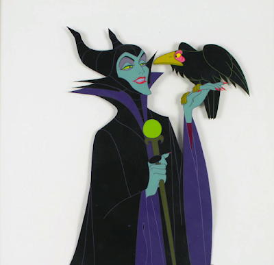
A beautiful color design for Sleeping Beauty's Maleficent by animator Marc Davis. You may notice that her main colors here are black and red. Marc told me that red to him represented fire, and he felt strongly that this should be her final appearance..
Art director Eyvind Earle had a slightly different color scheme in mind for this villainess. To him it was black and purple. And since Walt Disney had given Earle a lot of authority over Sleeping Beauty...purple it was.
Many of us might think that working on classic Disney animated films was all fun and games, when in fact there were artistic disagreements all the time.


Could it be that cool colors create more tension? Did this strange purple appeal to Disney and his vision of the story for that reason? It seems, however, that he embraced the idea of making it look different
ReplyDeleteWasn't the reason because Flora was red? Which colors do you like better Andreas?
ReplyDeleteI think both, red or purple, look good.
DeleteRed: dramatic and dangerous
DeletePurple: elegant and fashionable
A couple of years ago, I did a Halloween painting of Maleficent in her dragon form but I actually used the original colors Marc Davis wanted to have on her. Here's the link to the painting: https://www.instagram.com/p/Cyvn7H7OQzE/
ReplyDeleteHello Andreas
ReplyDeleteWill there be a post about the first version of the song performed by the vultures in The Jungle Book
Red is interesting. It makes it look like lava underneath cooled black rock. But she has more of a calculating and patient personality, so it doesn't really fit.
ReplyDelete