Monday, December 30, 2013

Classic Animation Roughs


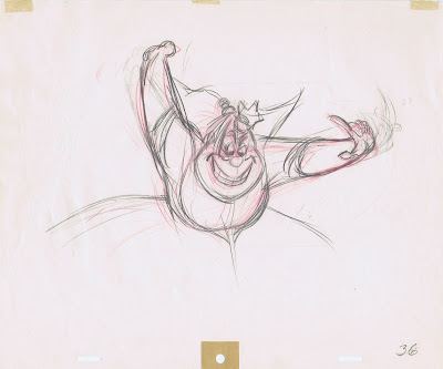
To close out the year I picked animation roughs from Walt Disney's animators, one drawing per artist. The Mickey drawing above is by Les Clark.
It's interesting to compare the different styles and approaches. Of course, each animator changed his way of drawing over the years, as the Disney style changed, too. 
Some of them welcomed the graphic change that transformed the look of Disney animation in the mid 1950s, others found themselves struggling with these modern looking designs. In the end great performances continued all throughout their careers.
They often disagreed on certain character developments, story points or design styles, but when it came to producing a great film, these guys (for the most part) put their egos into their pockets and became team players. Then again Walt Disney had a lot to do with politics not interfering with the film making process.

Happy New Year everybody!


Fred Moore


Woolie Reitherman


Ward Kimball


Milt Kahl


Ollie Johnston


Frank Thomas


John Lounsbery


Marc Davis


Eric Larson


John Sibley


Bill Tytla

Saturday, December 28, 2013

TS Sullivant 9


Another round of Sullivant eye candy! 
A while back there was supposed to be a book published with his work.
Unfortunately that never happened, so I hope that these occasional posts will help satisfy the appetite of Sullivant fans everywhere. 


Thursday, December 26, 2013

Goofy Pencil Tests


The Goofy short "How to hook up your Home Theatre" was released in December of 2007. If you missed it you can watch it right here at Disney.com (not sure if the aspect ratio is correct, it looks a little narrow):


We had a blast animating this six minute tribute to the old "How to…" Goofy shorts.
It was directed by Stevie Wermers and Kevin Deters and animated by Dale Baer, Eric Goldberg, Mark Henn, Randy Haycock, Alex Kupershmidt and myself. 
It was produced in no time and turned out to be one of my favorite shorts I worked on, Runway Brain would be another one.
Here are a few pencil tests of some of my scenes. The first shot shows Goofy trying to open a monster cable box. It was animated from personal experience. A while back I tried to rip one of those boxes open and almost broke my hand… 


Saturday, December 21, 2013

Happy Holidays


I want to take a moment and wish everybody Happy Holidays and a great 2014.

It's been an interesting year for me. With the help of good friends the story for my film "Mushka" came together beautifully. I am beyond passionate about this project, even though occasionally I wonder if I should have chosen a shorter film for the start of my post Disney years. Too late now, the thing has momentum, and I hope to get most of the animation done next year. 
The first three sequences are in great animatic shape, with camera moves, temp voices and music.
The rest of the film has been storyboarded, but needs to be brought to that level. I have animated a handful of scenes, and it's pure joy to see things come to life.
At the moment I am taking a break from Mushka in order to meet deadlines on a book project, which is also coming along well.

Wether you are an animation student or a professional working in pencil animation, cg or stop motion, I wish that in 2014 your work will take you to new creative heights. 

The medium is overdue for artistic breakthroughs. Exciting times!!

Friday, December 20, 2013

Trigger Happy


Ken Anderson drew these story sketches for a scene which appears toward the end of the film Robin Hood. The Sheriff of Nottingham has just made himself comfortable as he guards the town jail, when his vulture guard Trigger approaches and clumsily misfires an arrow from his crossbow.
The Sheriff tries his best to avoid the rebounding bolt.


John Lounsbery ended up animating this scene, but not before drawing virtuoso Milt Kahl gave him a few solid poses that show the panic stricken wolf in various positions.
These drawings are phenomenal, put down on paper in seconds with the sharpest pencil in the West. There is plenty to admire, for example I love the way Milt defines form on the lower arms by the way he angles the sleeve line. 

Beautiful, contrasting shapes throughout the figure! 


Wednesday, December 18, 2013

Centaur Family


…is the title of this stunning drawing by Heinrich Kley.
Here again he succeeds in making an impossible fantasy situation look believable.
The man was obsessed with anatomical accuracy (as was TS Sullivant).
It's wonderful to see these centaurs in a casual family setting, a snapshot of a typical Sunday afternoon.
The addition of the tree helps to create a harmonious circular composition.

I usually prefer Kley's sketchier drawings, but this piece just floors me.

To see a very different scene with centaurs by Kley go to this previous post:
http://andreasdeja.blogspot.com/2012/09/battle-of-centaurs.html

Tuesday, December 17, 2013

The Queen of Hearts


A great back view of this hearty Queen drawn by Frank Thomas. Wonderful pose, as she anticipates a croquet kick with a flamingo. Look at the dimensional quality in the drawing.
Frank handled most of her footage in the film Alice in Wonderland, Eric Larson also drew a few scenes. She is brilliantly voiced by Verna Felton, and as a comic villain, who is bad tempered and abrasive she is a pure delight to watch. The way Frank animated her constant mood swings is just sensational.

I don't know who portrayed the Queen for live action reference, but these photo stats just crack me up. 


A concept sketch by David Hall.


Mary Blair's ideas for color and staging of the Trial Sequence.


An Eric Larson animation rough.


The final clean up model sheet shows moments from Frank's rich personality animation. The heart theme sure is dominant in her design, pretty darn clever!


Saturday, December 14, 2013

Head Shakes and Nods

I am without tech help for a few days, so perhaps I can elaborate a bit on a point I brought up in my previous post. Let's say you are about to animate a scene in which the character says; "I don't know."
It would be more than tempting to shake the head during dialogue, after all, the words express a negative statement.
The good news is that by using a shake, it will add some life to the scene, providing it is well timed and the head turns correctly in perspective. When animating on 2s, you only need one in-between that favors one of the two extremes (I usually favor the most recent extreme.)
The bad news is that you don't necessarily get any personality by applying this. It is such a common and non descriptive piece of acting, and not a character specific motion.
The same can be said for the head nodding. The dialogue might be: "Oh yes, I know." If Mama Odie would nod, I'd get a nice squash and stretch in her neck area. Tempting…tempting!
I remember starting way back on my first scenes for The Black Cauldron. Many times I had no clue what a good acting pattern would be for specific scenes with Taran or Eilonwy. So…I nodded and shook their heads because I couldn't come up with anything better for them to do.
One particular scene involved Eilonwy telling Taran: "You're so boring!" I animated a head shake, closed eyes facing downward on "You're so". Then on "boring" I quickly tilted her head upward.
I remembered Medusa doing a thing like this in one of her scenes. Veteran effects animator Jack Boyd commented on my pencil test: "This kid animates like Milt Kahl".
Of course I felt like a million bucks, but there is a real problem in all of this.
Eilonwy is not Medusa, and therefor should act completely differently according to her own personality. My Eilonwy scene would call for much deeper analysis in order to communicate something unique about her. She is addressing Taran and accusing him of being a boring person, how would she REALLY act out her frustration…forget the bloody head shakes! She might point her finger at him, roll her eyes (good one) or even push him.
I blame my bad acting choices on inexperience and my infatuation with Milt's work.

So, let's talk about Milt. I encourage all of you to re-watch the sequence from Sword in the Stone, when Wart falls off a tree and right into Merlin's living quarters. Ollie Johnston animated a few scenes before Milt takes over…and the sequence becomes a festival of head shakes and nods.
Wart says: "You mean you can see everything before it happens?" Merlin: "Yes, everything!" etc.
Even Archimedes shakes his head as he asks: "Ah, ah, ah Merlin, everything?"
It goes on and on, a missed opportunity to introduce these two characters with more depth.

Of course Milt didn't always fall back on these formulas. Roger and Anita in 101 Dalmatians work just fine, and his animation of Bagheera and Shere Khan shows more sophisticated acting choices.
Then again, Edgar, the butler in The Aristocats shakes and nods his head a lot , and so do the characters he animated in Robin Hood. Madame Medusa comes off pretty good, her head is certainly holding still
when she removes her false eye lashes (which helped to make this one of the most innovative, original scenes ever).

Frank, Ollie, Marc and all the others animated head shakes and nods too, just more selectively, when they felt it was appropriate.

It's good to know that this crutch is available to you. If you absolutely can't come up with a unique acting pattern because of deadlines or whatever, go ahead and shake or nod.
But keep in mind that there probably is a more interesting way to act out your character's emotions.

Tuesday, December 10, 2013

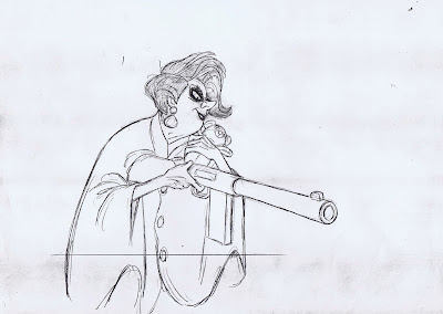
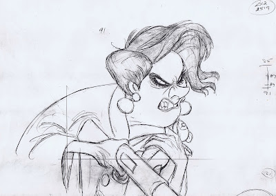
Don't mess with Medusa

Medusa is threatening Snoops and Penny in this scene toward the end of the film The Rescuers, (obviously) animated by Milt Kahl.
Geraldine Page's line is: "(If either of you try to) follow me, you get blasted!"
She is such a great character for studying dialogue. Her design is pretty much a caricature of an "over the hill" type, but her lip movements  and mouth shapes are drawn fairly realistically. Teeth, gum and lips are carefully designed, unlike some characters in films I worked on, where inter locked teeth were often drawn with a non-descriptive zig-zag line.
Her squinty eyes make her look extremely mad (# 55 would be my favorite expression), and I love the way Medusa leans into camera. Her head shake on "blasted" is very appropriate here. ( Milt had a tendency to overuse head shakes and nods starting in the early 1960s, but more on that later.)

You can tell that Milt had a grand time bringing this character to life.