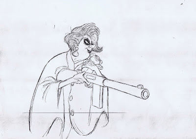
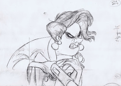
Medusa is threatening Snoops and Penny in this scene toward the end of the film The Rescuers, (obviously) animated by Milt Kahl.
Geraldine Page's line is: "(If either of you try to) follow me, you get blasted!"
She is such a great character for studying dialogue. Her design is pretty much a caricature of an "over the hill" type, but her lip movements and mouth shapes are drawn fairly realistically. Teeth, gum and lips are carefully designed, unlike some characters in films I worked on, where inter locked teeth were often drawn with a non-descriptive zig-zag line.
Her squinty eyes make her look extremely mad (# 55 would be my favorite expression), and I love the way Medusa leans into camera. Her head shake on "blasted" is very appropriate here. ( Milt had a tendency to overuse head shakes and nods starting in the early 1960s, but more on that later.)
You can tell that Milt had a grand time bringing this character to life.


Interesting...it does look like she's leaning in a bit, but there's clearly a bit of movement on the camera's part, too. I guess this is how you do a dolly shot in animation!
ReplyDeleteMedusa and her false eyelashes... No child could ever forget that!!
ReplyDeleteThat's sooo true! Amazing character!
DeleteCant.... stop........ loving this!! Whew! :3
ReplyDeleteAnd I agree about the head shakes.
This comment has been removed by the author.
ReplyDeleteJeez, I don't know what I expected but these are unbelievable! She looks so ferocious on the accent in "blAsted"
ReplyDeleteThanks for posting these!
I've been meaning to ask you, Andreas- do you have any plans to make a post about Richard Williams' work? Also, were you at the screening of the Thief last night?
I was at Disney Studios that night to celebrate 90 years of Disney animation.
DeleteI'll post something about Dick's great work soon.
Oh, of course! I don't mean to bother you with requests, I'd just heard you talking about that his stuff before.
Deletethanks again!
I've noticed this before and here it seems to be again - is it possible Kahl put his charts on the last key in a succession of keys to be inbetweened rather than the first? Like on the last drawing, which I assume is #91, he put the chart leading up to #91 instead of putting it on #85 which according to the chart would be the first in the row?
ReplyDeleteI wonder why that might be. In case the drawings were flipped the traditional way, putting the first at the bottom of the stack, the last in the middle and the inbetween on top, would having the chart on the middle drawing make it easier to look at?
Another chart-related question I noticed on your drawings: on some keys I noticed you put very long charts, sometimes covering between half a second or even a second worth of screen time. Then, on subsequent keys within that range, you put shorter charts covering parts of the same time range. Are the long charts on your main keys which you then break down into smaller charts on following keys?
I hope my wording makes sense as I don't have an example for the latter question.
You figured it out, Milt's charts refer to the previous drawing, not the next. It just made sense to him.
DeleteMy own long charts might define a slow long body action, while the head is kept busy with quicker moves. So head movements will be charted separately. A third chart could be for dialogue, which usually involves mouth and chin.
The idea being, if parts of the motion is strictly mechanical and doesn't involve creative decisions, have your assistant do those partial drawings. Does this make sense?
Perfectly, thank you!
DeleteCrickey o Blimey, such incredible drawings! Studying Kahl and Stevenhagen photostats when learning I adapted charting drawings this way. As you work with the highest numbers on top of the stack this makes sense to me, you always have the charts to look at while working. I only found out much later people did it differently when assistants would change where my charts were!
DeleteThanks for sharing these, Andreas.
ReplyDeleteAt least three of the seven deadly sins covered in these images. Another terrifying villainess.
ReplyDeleteHere's an interesting Cartoon Brew opinion piece about Milt's head nods and shakes: http://www.cartoonbrew.com/disney/the-milt-kahl-head-swaggle-80861.html
ReplyDeleteA head swaggle is different from a head shake or nod. I have read this interesting piece. Other readers should check it out.
DeleteGreat scene to flip, but there's some weird perpective going on with that rifle..Thanks, as always, fer sharing.
ReplyDeleteOnly Medusa can make holding a teddy bear look threatening, but I guess it helps when you also have a giant rifle.
ReplyDeleteI don't know who did the in-between on this scene, but sure it must have been a challenge! But it is also true that Milt Kahl's key drawings are especially clean and clear!
ReplyDelete