Milt Kahl is showing off a pencil test on his moviola. (A moviola was a specifically designed contraption for the purpose of running pencil tests on a loop. You could also view a whole reel of film on it.)
If I am not mistaken, the other person in the photo is assistant Stan Green. Someone might correct me on this one. I only knew Stan in his later years, so I don't know what he looked like when he was younger.
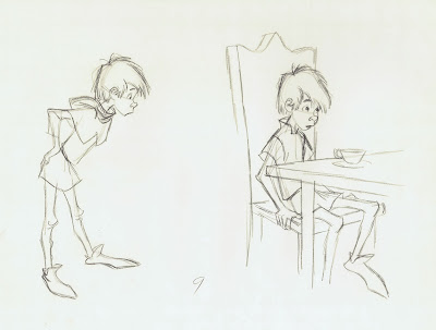
I have been meaning to post some development art for the character of Wart from the film The Sword in the Stone.
Bill Peet drew this great story sketch, which inspired Milt to restage it slightly as part of his final design research. So much personality in both drawings.
These drawings show a slightly different looking Wart. His nose in particular is more caricatured, which gives him a bit of a nerdy look, but it is still a very appealing design. (I actually prefer this version over the final one).
When I asked Milt way back, why these facial changes were made, he said that Walt Disney didn't think Wart looked attractive enough and made him alter the design.
Milt redrew many scenes in an effort to keep the look of the characters on model. The drawings below show Wart attending to the "Jousting Machine". Cliff Nordberg animated this scene based on live action, and Milt polished off the key drawings.
Not everybody enjoyed working on such a stylized looking character. I remember Eric Larson reminiscing about working on Sword in the Stone. "Boy, that kid was so skinny, tough to draw."


On that drinking picture, it´s great to see how position of arms change that mood and what character is possible thinking and feeling. I like maybe more Bill Peet´s pose, but maybe was too "scaring" feeling on that for animation.
ReplyDeleteBill Peet's drawing is so beautiful...... can't find the words!
ReplyDeleteThank you for sharing it! :)
it is stan, andreas.
ReplyDeleteI always love what the interaction between Bill Peet and Milt Kahl could achieve. The Merlin drawings next to Wart's look a little bit different from the final design, am I right? Do you know why the design change? (Most of all, I think the forehead is larger in these drawings). Thanks for the post!
ReplyDeleteMilt and other designers usually sketched a variety of versions before deciding which one would work the best.
DeleteThese are wonderful. :D
ReplyDeleteEven knowing Disney couldnt draw as good as Kahl, I think he was right about Wart look, he seams older with that nose and eyes like that, thats the way I see, thanks for sharing.
ReplyDeleteOh! these are so great! I really enjoy Milt's redesign on the sketch. The elbows really complete the drawing and it sets the attitude of young kid which I love! Genius move, Milt! haha.
ReplyDeleteawesome post, thank you!