Friday, May 29, 2015

Hercules Pencil Tests


For the longest time I had written off my tape with Hercules pencil tests as lost. But that tape recently resurfaced, and looking at the footage now brings back a lot of memories. I was one of the last animators to finalize the character's design, everybody else had found a way to incorporate graphic elements, found in the work of British illustrator Gerald Scarfe, whose edgy drawing style served as the inspiration for the film's overall look. 
As Hercules' personality was developing I felt I needed to take it easy as far as heavy stylization. He was supposed to be shy around girls and frustrated at the lack of progress in trying to become a hero.
A little clumsy, but good natured and ambitious.
In the end Adult Hercules shows only a minor Scarfe influence, just enough to fit in with the rest of the cast of characters. 
While animating I recall trying to get to the core of his emotion, which presented a challenge during short scenes. I often thought that a bit more footage for certain scenes would help me to get the business across in a stronger way.
Actor Robert Gant acted out most scenes, and I enjoyed the process of doodling thumbnail sketches in front of a monitor. That way I could pick and chose poses I liked, and eliminate others that didn't work for me. Overall the live action reference was very helpful.
The reel includes first pass animation pose tests as well as final refined versions. There are a whole bunch of scenes I'd like to rework, others I am ok with.

Here is the link to an earlier post about Hercules' design evolution:

http://andreasdeja.blogspot.com/2013/06/hercules.html

Wednesday, May 27, 2015

Einstein and Dodger


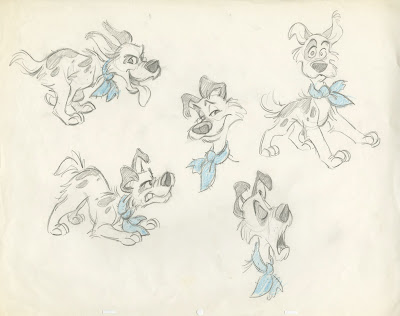
I only worked briefly on the film Oliver & Company, before moving to London to animate on Who Framed Roger Rabbit instead. These are a couple of leftover design sheets for Einstein and Dodger.
I remember trying (but failing) to come up with design that wouldn't remind the audience of other Disney dogs. Dodger looks like Tramp's little cousin, and Einstein...well, you know.
I had the chance to do a pass for all characters, including Fagin, who turned out somewhat more original.
I'll post other design doodles from the film once I locate them.


Monday, May 25, 2015

Chernabog


It's astounding to see rare cels like this one from Fantasia. It shows it's age, but nonetheless showcases the overwhelming craftsmanship of Disney Animation during the golden age.
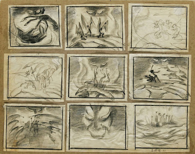
The Devil on Bald Mountain remains to this day the most impressive, fearful and powerful animated character. His animation on screen lasts only a few tens of seconds, but every scene is pushed to the limit in terms of nightmarish horror, but also elegance of motion.
The scene in which Chernabog's hands play with flames to turn them into figures has such magnificent fluidity, the upper hand seems to be dancing with the fire.

The sequence was thoroughly researched, designed, staged and storyboarded for optimum effect.


Bill Tytla's exploratory research as well as his rough animation drawings demonstrate an artist's intense relationship with his subject. There is a raw power that seems to come from within the earth.


Even the clean up work on the character retains the awe-inspiring emotion of Tytla's rough drawings.
The flawlessly drawn anatomy helps to give the sequence a level of believability and authority never achieved before.


A couple more cels of Chernabog that seemed to have survived the ages to haunt us, even as still images.


Joe Grant's model department created this dynamic maquette for Tytla. It served as a reminder to bulk up the live action reference, in which skinny director Wilfred Jackson acted out the scenes.


Images Disney/Bonhams and Heritage Auctions

More on Tytla's work here in this previous post:


Saturday, May 23, 2015

Merchandise


A silly photo for a German magazine after The Lion King had been released. I remember the photographer being fascinated with some character figurines, which were placed on my animation desk. It was always interesting to see how your character would be represented as a fast food bonus toy or other merchandise articles. 
The animators were frequently involved in the development of such figurines. We were shown little models in a "work in progress" stage, and more often than not gave input to help bring the character on model. 


Any of these could be tweaked a bit more to make them look like the film's images, but there is a quirky and naive quality to these mini maquettes which I kind of like.


This t-shirt image was taken from an actual animation drawing.


Stylized films like Hercules present a challenge when representing the characters three dimensionally, 
there are many graphic cheats used in the animation that don't make a lot of sense from a logical point of view.


I believe this Roger Rabbit set was done exclusively for the Disney Parks,  Baby Herman came out perfect.


A t-shirt illustration based on one of my pre-production sketches.


An absolutely perfect representation of bad Mickey from Runaway Brain, produced in Japan.

Thursday, May 21, 2015

Jiminy Cricket II


A little bit more on Jiminy Cricket, Kimball's iconic character. This is gorgeous frame from one of the opening sequences of the film. Rembrandt lighting in a Disney film.
Young Ward, a kid really, working on a close up scene during the "Give a Little Whistle" song. ( ...which includes some dance moves by the cricket that blow my mind.)


That scene is part of this pencil test continuity sheet. Ollie Johnston did the Pinocchio scenes .


A beautiful layout featuring one of the film's first scenes. Even in pencil form, all that intricate lighting is worked out.


I never heard Ward talk in person about live action reference for Jiminy. Maybe he ignored the reference at the time, or he didn't want anybody to know. He shouldn't have worried, there is no trace of any live action in his brilliant animation. But...having seen some live action footage, I can see an influence.


Tuesday, May 19, 2015

Milt Kahl Overload


Look at what blog reader Jeff created with images from this and other blogs...pretty impressive! A design wonderland! Milt's drawing style might have changed over the decades, but any of these drawings show a degree of excellence that is unmatched. What many people don't realize is that even his later graphic work has deep roots in a profound knowledge of realistic animals and humans.
You have to know stuff, so you can do stuff!

Monday, May 18, 2015

Jiminy Cricket


Designing a character can be a tricky thing. Sometimes the first few sketches an artist does hit the mark right away, and everybody agrees that this is the character as he or she should appear in the film. Then again, occasionally there are those times when nothing you draw seems to please the directors or the studio chief.
I remember what troubles I had when trying to get the required appearance for Gaston. Scar by contrast was a breeze. 
Ward Kimball surely was looking forward to animating Jiminy Cricket, after the bad experience he just had on Snow White. His brilliantly animated "Soup Eating Sequence" had been cut from the film, and now it was time for a fresh start on the next feature film Pinocchio. Even though Walt Disney personally assigned the Cricket to Kimball, the animator didn't seem to be able to please the boss with his initial designs. Not appealing, too grotesque and insect like! After many revised versions in which Ward de-insectified the design, Walt finally approved a design that though very appealing had very little to do with the anatomy of a real cricket. 
Joe Grant came up with these early rough model sketches, shown above.

The folks over on Fantasia drew cricket designs like this one, when a variety of insects were part of a musical piece for the film. Kimball basically used this kind of concept for his initial Jiminy designs.


Joe Grant's model department created this maquette, based on early concepts. I really love this version of the character.


The final model, in Kimball's words, turned out to be a little man with an egg-shaped head.


This beautiful animation drawing by Ward shows that he came to terms with Walt's vision for the character. Frank and Ollie thought that his animation of Jiminy Cricket was the most sincere he ever did.


In case you don't know yet, there will be Christmas this May. At the end of the month, J. B. Kaufman's book on the making of Pinocchio will be out, and I guarantee that it will be a major treat.
Here is the link to Amazon:

http://www.amazon.com/Pinocchio-Making-Disney-J-B-Kaufman/dp/1616288094/ref=sr_1_1?s=books&ie=UTF8&qid=1431930372&sr=1-1&keywords=pinocchio


Some images are Heritage Auctions/Disney.

Saturday, May 16, 2015

Celebrating Pinocchio


I don't know why there isn't more hullabaloo around Pinocchio's 75th anniversary. The film remains a milestone in animation history. Artistically and in terms of dedication there is no other film like it.
Walt and his studio were running in overdrive, there were worlds to conquer in animation.
Milt Kahl got his big break during the production of the film, he designed the title character and became a supervising animator.
Over the years Milt got criticized by his colleagues for not being emotionally enough involved in his work, and that great draughtsmanship became his main tool to communicate.
Take a look at these rough drawings featuring Geppetto's and Pinocchio's reunion.


Wednesday, May 13, 2015

A Lecture on Animating Hercules


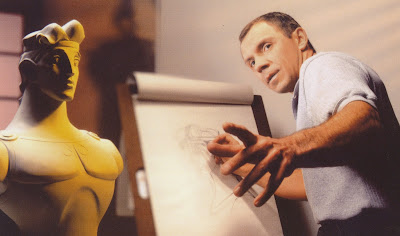
That photo was taken years ago after we had just finished work on the 1997 film Hercules. I had fun animating this character, even though it was a challenging assignment. Though stylized in appearance, his acting needed to be pretty realistic in order to communicate subtle emotions like self doubt, shyness and falling in love.
I will talk more about Hercules and share original never before shown pencil tests this coming Saturday, May 16, at 11 am PDT. My friends at Virtual Animators will make this event possible. If you are interested in joining me, here is the link:


Monday, May 11, 2015

More Mme Bonfamille


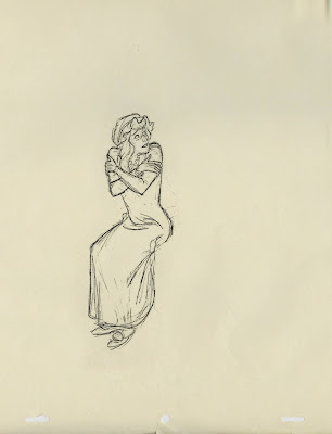
It seems extraordinary to realize that Milt Kahl animated Mme Bonfamille's scenes without any live action reference. Milt had such command and control over the mechanics of the human body, he was able to animate any human type out of his head, realistic or caricatured.
This character is as close to total realism as you could possibly get. Milt employed the might of his drawing powers as well as subtle acting to bring her too life. He reminisced later that he thought the one moment in which she comes alive is when she finds her cats gone. She shows strong feelings there, allowing Milt to show her emotionally engaged.
These rough animation drawings are from that sequence. It starts with Mme Bonfamille waking up during a stormy night.


#1


#27


#35


#43


#51


#59


#67


#73


#79


#111


#149


#181


She puts on a gown and approaches the cats' night quarter. (What stunning drawings.)


A tight close up shows her disbelief.


#7


#31


#51


#71


She runs out of her bedroom and calls for her cats.


#9


#11


#15


#87


#104


About characters like this one Milt said that though not very enjoyable to do, you know that you DO have more entertaining characters in the picture, so it doesn't hurt to do a straight job once in a while.