Monday, June 29, 2015
When Live Action Reference doesn't help...
As I mentioned before, I like a lot of things in the film The Aristocats. But the sequence in which lawyer George Hautecourt takes the stairs with the help of Edgar, the butler, always baffled me. This is potentially a hysterical moment in the film. The old man refuses to use the elevator to get to Madame Bonfamille's parlor. The stairs will be just fine. Edgar comes to his aid, but things don't go so well.
Extensive live action was filmed to help animator John Lounsbery with ideas for comedic business.
Actually those ideas weren't half bad, it's just that every animated scene in the sequence looks stiff.
At one point the lawyer hangs on to Edgar's suspenders as he looses his balance. The elasticity of the suspenders causes him to move upward swiftly, resulting in a collision with Edgar.
It is surprising that none of this cartoony business shows any weight at all. Both characters seem to float around, never showcasing believable motion.
I remember Milt Kahl being critical of this section of the film. He said he would have handled the humor differently. To me it's the execution that falls flat.
Perhaps Lounsbery, a brilliant animator, found little inspiration in the live action reference.
Here is the link to the film's youtube clip:
https://www.youtube.com/watch?v=btKw8JjyVIU
Saturday, June 27, 2015
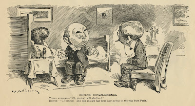
Vintage Sullivant
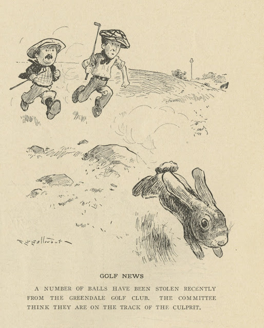
This Sullivant illustration dates back to 1898. It is one of his earlier pieces, even though he was already in his mid 40s. Sullivant was somewhat of a late bloomer when it comes to finding a personal style (but what a style it was!) Cartoony, but very much anatomically correct.
I found this wonderful image online. It represents Sullivant's art in a polished and refined stage.
Can't take my eyes off his animals, they are the best!
Wednesday, June 24, 2015
Pose to Pose or Straight Ahead...
is one of the topics I will discuss at my next online lecture with Virtual Animators this coming Saturday, June 27. Both approaches have benefits but also shortcomings.
The other issue I want to talk about is wether to chose realistic or cartoony animation for your scenes. Subtle or broad. Of course that has a lot to do with the design of the character.
I feel these are important things to discuss. Particularly young animators are faced with all kinds of such choices.
If you are interested in joining the discussion, here is the link to Virtual Animators:
http://events.r20.constantcontact.com/register/event;jsessionid=A2A8AF2EDB6B1FC3D2FD83E0FE8E81B2.worker_registrant?llr=einay4kab&oeidk=a07eb3xnuym09d0c674
This will be my last online lecture for a while, since production on my film Mushka is getting into full gear. I will give you an update on that as well.
Monday, June 22, 2015
The One and Only...
I see the essence of Walt Disney animation in this cel. (And yes, I am the proud owner of this iconic piece of art). Pinocchio just before he comes to life. There is such a beautiful feeling of "wooden" WEIGHT. No question, based on a Milt Kahl drawing. The ultimate in appeal, color and...well, magic.
Milt, Frank and Ollie were very young animators when they all focused on the film's title character.
It must have been daunting to try and meet the standards set by senior, experienced artists like Tytla, Fred Moore , Norm Ferguson and others. But the young guys proved that they were able to make major contributions.
Milt with his impeccable sense for design and dynamic motion, Frank with complex acting and Ollie with warm, sympathetic animation. SELF EXPRESSION by the animators was key in those days to make audiences believe in the personalities.
The visual development department generated equally inspired work.
Go and get this remarkable book on the making of this Disney masterpiece:
Saturday, June 20, 2015
Menagerie Exhibit
In 2010 an exhibition about animal art opened at the Forest Lawn Museum in LA. I was a part of an eclectic group of artists who were asked to contribute to the show. Any medium was represented, drawing, painting and sculpture. The above illustration which was featured on the invitation is by artist William Stout.
I had two pieces in the exhibit, a wire sculpture of a toad, and a large watercolor of a lioness hunting a zebra.
The wildlife piece can be viewed here:
Look who stopped by the show's opening! Tyrus Wong, who also showcased a piece of art. It was a beautiful vis dev piece from Bambi. Unfortunately I don't have an image of it to show here.
Today Tyrus is 104 and going strong. He is such an inspiration to me because he is constantly adapting to new challenges. After working at Disney on Bambi, he left the studio and produced stunning concept art for live action movies.
What a thrill to be included in an exhibit that featured art from this Disney Legend!!
Photos with Tyrus by Carla Fallberg.
Thursday, June 18, 2015
Anita
I am lucky enough to count both of these artists as friends. Frank Thomas and Lisa Davis, who voiced Anita in the Disney classic film 101 Dalmatians, interact with a couple of Dalmatian puppies at the studio around 1959 or 1960.
Frank did animate beautiful scenes with some of the puppies as well as their parents Pongo and Perdita, but none with Anita.
This character presented a design challenge as a new human leading lady. Marc Davis had just finished animation on Aurora for Sleeping Beauty, and his early scenes with Anita show a certain resemblance to the princess ( Anita and Roger meet awkwardly in the park before falling into a lake.) Les Clark got involved and did a few scenes when the puppies are born, but it wasn't until Milt Kahl came on board that this heroine's final design was set for the film.
This cel shows a Marc Davis drawing for a Les Clark scene.
In the end Milt Kahl drew Anita looking like Julie Andrews, which was coincidental, since the actress wouldn't become a household name until Mary Poppins a few years later.
Lisa and I are planing to get together and discuss her involvement in the film. We will take a few photos to be posted here along with lots more artwork that will demonstrate Anita's visual development. So stay tuned!
Monday, June 15, 2015
"See You All on Monday..."
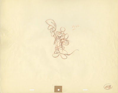
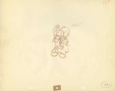
John Lounsbery animated the "Friday Mickey segments" for The Mickey Mouse Club. He has a terrific handle on the character, who wears a very involved Cowboy outfit with lots of detail.
You can tell that Lounsbery enjoyed animating Mickey, every drawing is loaded with charm. He took the classic Fred Moore model and made it his own, a Mickey for the 1950s.
The drawing in which Mickey pulls his hat down is one of the most appealing Disney drawings I have ever seen!
Saturday, June 13, 2015
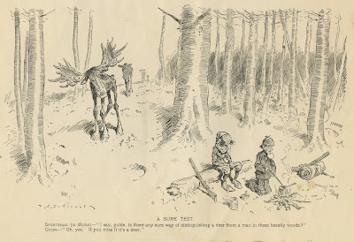
Sullivant 12
ON THE ARK
Noah - "There, now. Shem! I knew I'd forget something."
Shem - "What is it, pop?"
Noah - "Tomato-cans for the goats."
It's been a while since I posted any T.S. Sullivant material. So here are a few more high res scans right off original pages from Time and Judge Magazine, dating back from 1904 (image above) to 1925. What a blessing for us that this man was so incredibly prolific!
Wednesday, June 10, 2015
Simply Great Drawings
This amazing stylized drawing of Aurora reminds me of the graphic quality found in church stain glass windows. This clean up image is small in its original size, but look at the precision of each pencil line. The shape arrangement is incredible. This is what happens when you combine the efforts of talents like Tom Oreb, Marc Davis and Iwao Takamoto.
Same movie, a rough animation drawing of the male lead, Prince Phillip. He is in mid action, about to pull on his horse's reins to turn screen right. Animator Milt Kahl had become obsessed with depicting hands in the absolute best way possible, in a single drawing as well as in motion.
Making a handsome male face look good from this angle is no small feat either.
Four of the Dwarfs from Snow White try to stop Sneezy from yet another explosive exhale. I assume that the story sketch for this scene already showed interesting staging, but only Fred Moore could make a this situation communicate in such a simple, but entertaining way. Four hands holding up one nose should be impossible to draw, but here it is.
Even with the aid of having a dinosaur maquette at hand, this perspective would be a challenge to any artist. Animator Woolie Reitherman gets it right by analyzing the main volumes first (head and neck), then focusing on how details like cheekbone and eye unit connect to the main mass.
When expressing Tony's volatile gestures, John Lounsbery knew that interesting and precisely drawn hands were very important to achieve entertaining character animation. People say that Lounsbery's drawing of hands looks identical to Kahl's, but I can see a difference. The definition of knuckles and the palm of hands differs, yet both artists were fearless when it comes to articulating the most complex hand moves.
The guts of early rubber hose animation is astounding. Anything goes in order to get gags across in a surprising and funny way. No extensive life drawing experience necessary. The animators were free to invent animation for absurd and surreal situations.
I recently watched one of the old Oswald cartoons on the big screen, it made me laugh all the way through. This stuff is as timeless as the sophisticated feature films that followed.
Most images/Heritage Auctions.
Tuesday, June 9, 2015
Leftover African Cats
Here are just a few animal sketches in brush pen, that didn't make it to the final selection of drawings I made to help promote the 2011 Disney film "African Cats". These sketches were not made from real life. Instead I drew these poses looking at a TV monitor showing a very low res version of the film.
I believe any artist studying wildlife needs to include film footage as a resource. You just don't always get interesting animal behavior from looking at a sleeping lion at the zoo. Don't get me wrong, drawing at the zoo is incredibly important, after all you are in the presence of the actual animal.
It's just that they don't hunt, fight or make love (well, sometimes they do.)
I can't wait for the next BBC nature documentary, their cameramen are amazing. So are Beverly and Dereck Joubert, who work for National Geographic.
Here is the original post for "African Cats":
Subscribe to:
Comments (Atom)


