Thursday, August 30, 2018

More Kley Illustrations


I just came across these beautiful Heinrich Kley drawings. I hadn't seen them before. The first one features a theme often applied by Kley, modern progress against nature.
I know lizards can grow their tail back...not so sure about crocodiles.


This one is titled Two lovely Beasts.


This is a great drawing, but I don't understand the Bavarian sounding caption. So I won't even try to translate? Anybody in Germany?


Either a sketchbook page or a study for a painting.


Saturday, August 25, 2018

Roger Rabbit at the El Capitan


Another Who Feared Roger Rabbit panel plus screening will take at the El Capitan theater in Hollywood on Thursday, August 30. I will be on that panel along with my partner in crime Nik Ranieri. The host will be Tom Sito. We all animated on the film.
This image brings back memories from probably my most challenging scene to do, because the camera was moving in on Hoskins and Roger EVER so slowly, but for a long period of time.
I might be talking about what was so difficult about it at the event.

Here are more details about the screening:
https://elcapitantheatre.com/film-info/who-framed-roger-rabbit


Thursday, August 23, 2018

A Hug Squirrel


Several artists are having an influence on me while animating on MUSHKA. Swiss animal specialist Fritz Hug is one of them. I love this sketchy squirrel illustration. I find his observation intense, how about if I angle the forehead like this, how about if I define the feet like this, how about if I emphasize the knee?
Lots of intuitive solutions going on, so typical of his work.
A man who loved animals!

Here again my first post on Fritz Hug (there are others):

https://andreasdeja.blogspot.com/2011/11/fritz-hug.html


Monday, August 20, 2018

Bambi at 76


Bambi was widely released in US theaters on August 21, 1942. The film lost money in its first outing, partially because foreign markets were cut off due to WW II.
The critics weren't helping either, as they resisted the movie's realism. "The film lacked magic" was one reviewer's opinion. 
Stuff like this baffles me. The artists' dedication and sincere filmmaking is evident in every frame.
The movie's art direction is magic, the music is magic and the animation...don't get me started.
Luckily Bambi became a huge hit in re-releases over the years, and is now considered a classic and a masterpiece.
I believe this watercolor painting featuring Bambi, his mother and Friend Owl is by Mel Shaw.

The following story sketches are the work of Marc Davis, who spent years helping to develop the plot line before starting his animation career with Flower, the skunk.


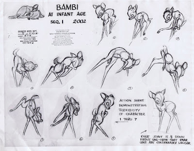
I believe I have posted this model sheet before. Just a reminder of the film's drawing as well as animation virtuosity.


Louie Schmitt drew this terrific model sheet. Super appealing. I posted more of his mouse designs here:
https://andreasdeja.blogspot.com/2013/04/louie-schmitt.html


Young child actor Donnie Dunagan (Bambi) eats out of a Snow White bowl, as he ignores onlooking movie stars.


Peter Behn (Thumper) and Donnie Dunagan promoted the film's 75th anniversary last year.


Thursday, August 16, 2018

Mickey Mouse Development


Two images from different eras in the development of Mickey Mouse.
The first one is from Steamboat Willie, 1928. A gorgeous animation drawing by Ub Iwerks, who animated the whole short. There are still graphic issues here that needed to be addressed, like the characters' black hands. You can't really see how Pete's grip on Mickey is defined. That's why later on  Disney characters were given white gloves for clarity.
Boy, I just love the energy in this fantastic sketch.

Twelve years later Mickey appeared as The Sorcerer's Apprentice in Fantasia, 1940, looking like this.
A new eye unit with pupils, draughtsmanship that showed real volume and shoes borrowed from Snow White's Seven Dwarfs.
There is greatness in both versions. Steamboat Willie shows the beginning of true, involved personality animation, while Mickey Sorcerer showcases the immense possibilities of the animated medium.


Thursday, August 9, 2018

Roger Radcliff

In the previous scene Anita gently ridicules Roger's musical talent. "What clever lyrics!"
Roger: "Melody first my dear, and (then the lyrics)."
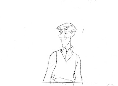
Milt Kahl is in full command of the human figure here. This allows him to play with the design of each drawing. Roger's neck would look way too long, but with his shirt's collar taking up much room, it looks perfect.
What an awesome arrangement of shapes. Flat and dimensional at the same time.
And of course Milt masters the most tricky head angles, look at # 27 through 35.

The one thing I can't tell is wether any live action was used for this scene. On Roger and Anita Milt used live action reference for many scenes, but he also avoided it when he didn't like it.


Saturday, August 4, 2018

9 Old Men Exhibit


Just a reminder of this phenomenal exhibition at the Walt Disney Family Museum. It will run until early January. Beautiful, inspiring and occasionally shocking (to realize just how good these guys were.) I believe for animators this is a once in a lifetime experience.
Just look at these drawings!


Woolie Reitherman. This study sheet for El Gaucho Goofy is part of the exhibit. The following images aren't.


Milt Kahl 


Eric Larson


Marc Davis


Frank Thomas


Ollie Johnston


Les Clark


Ward Kimball


John Lounsbery


Thursday, August 2, 2018

Johnny Appleseed II


As many of you know, Mary Blair created many works regarding color and background styling for a great variety of Disney films. Seldom did her personal vision make it to the screen though. Background painters as well as animators didn't know how to incorporate Mary's simplified almost abstract style into the film's final look. More often than not through the animation process compromises were made, and the project ended up looking like the familiar Disney house style.

Johnny Appleseed (1948) is one exception. This final background above could have been painted by Mary Blair herself. Her naive, childlike expressiveness actually made it intact to the screen, as far as art direction.
The character styling is still round and dimensional though, a quality that would change a decade later with Eyvind Earle's artistic contribution to Sleeping Beauty.


A cel from an Eric Larson scene.


A couple of Mary Blair color concepts.  


A cel set up from the film. The character cels show some airbrush shadow areas, something that was done at the studio before being offered for sale to the public.

Here is the link to Johnny Appleseed I:
https://andreasdeja.blogspot.com/2013/10/johnny-appleseed.html