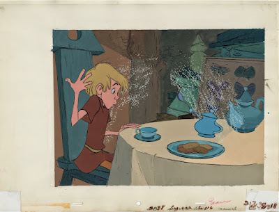
Here is an interesting experimental pre-production cel set up for one of the early scenes from Sword in the Stone. The photo shows a lot of cel reflections, but it still makes for some fascinating study.
The color styling is more monochromatic here than in the final version of the film. Wart's character drawing was done by Milt Kahl. His face is more caricatured, particularly the nose. "Walt didn't like the nose, he made me change it" Milt explained to me during one of my visits.
As I mentioned before, I much prefer this early design, it has more personality.
Look at these beautiful sketches Milt came up with before he started animation.
The sequence -like the whole film- had more color variety, based on Walt Peregoy's design concepts.
Walt Disney was never happy with this kind of color styling, he much preferred a more muted approach. The following feature film The Jungle Book would be painted without xerox lines as part of the background styling. Although the graphic look did resurface in the Winnie the Pooh featurettes as well as the full length productions of The Aristocats and Robin Hood.
By the way, watch The Sword in the Stone on Amazon Prime. It will cost you a few dollars to purchase the film, but it's worth it. Amazon offers a pristine 4:3 presentation, unrestored. It looks incredible!!


We will agree that the early Milt design has a little more personality. These are all very interesting, thanks for sharing them. It's always nice to learn more about this movie, it was one of my parents' favourite classics so there are a lot of nostalgic memories attached to it.
ReplyDeleteFunny about the Amazon thing. Itunes had an HD unrestored transfer in 4:3 before the official blu ray came out.
ReplyDeleteI friend found a way to digitize that version for me, so I have it now (I am paying for Disney Plus, and I of course have the DVD release. I refuse to buy the botched blu ray)
Speaking of restorations... Mr.Deja, I am sure you have a lot of contacts within the Disney Company. Any chance you can put in a word so we can get a proper transfer of Cinderella???
ReplyDeleteI like that earlier version of Wart too
ReplyDeleteMr. Deja your work is pretty amazing, if possible do you have a contact email where we may discuss some animation topics? Not that this isn't reliable for communication, it is having the public chiming in that makes for an uncomfortable conversation.
ReplyDeleteThis comment has been removed by the author.
ReplyDeleteHello Andreas....reading more stories on your blog. I love hearing about what you know and have learned in animation. Thank you for sharing. Again, I love your choice of artwork to share. In particular the production setup of Wart and the Sugarbowl...that is a fun playful moment when Wart gets meet Merlin of course and the magic begins...almost a mini "be our guest" moment oddly! I have had this piece in my collection for many years and always enjoy looking at it. The styling in this film is not necessarily my favorite but it does bring in that modern sense into animation art that became very typical into the 1960's. I love it when Disney experiments. Wart in that particular setup/scene looks a lot like how Milt Kahl drew him in the earlier style....
ReplyDelete