Monday, August 31, 2015
Ruthie Thompson
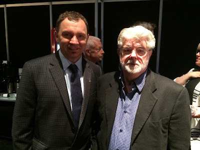
During the Legends Lunch a little over a couple of weeks ago I was happy to see a true Disney Legend, Ruthie Thompson. The first time I met Ruthie was five years ago, when she visited Disney Animation Studios, she had then just celebrated her 100th birthday. She truly validates the notion that most animation artists enjoy a long life. In this photo you are looking at a vivacious lady at 105.
Ruthie started at Disney in the Ink & Paint department during the production of Snow White. About a decade later she transferred to animation checking and scene planning, a department she would later supervise. Scene planning was very much involved in the technical aspects of multiplane scenes such as the flight over London in Peter Pan.
A while back I asked her what one one of her most challenging assignments might have been. She paused for a second and and said that the opening scene from Sleeping Beauty took a lot of brain work, since there were endless characters involved on endless cel levels.
How can you not love Ruthie Thompson ?!
Here is a link to a recent Vanity Fair article, featuring Ruthie and other Ink & Paint artists:
http://www.vanityfair.com/culture/2010/03/disney-animation-girls-201003
Wednesday, August 26, 2015
Coming to a Bookshelf near You...
...toward the end of next month:
- Hardcover, almost 400 pages
- Hundreds of drawings by the Nine Old Men, most of them never published before
- Insight into their creative process
- Stories about their artistic triumphs as well as occasional failures and disappointments
- Profiles of each animator's career achievements
- and much more...
It turned out to be the kind of book I wished I had when I was an art student.
Preorder it from Amazon, you'll have an early Christmas:
http://www.amazon.com/gp/product/0415843359?refRID=FMQBBQ9J0QDNN0P9YEV2&ref_=pd_rhf_pe_p_img_1
Sunday, August 23, 2015
Wart as a Sparrow
In this scene Wart (as a sparrow) seems for a moment smitten with Madame Mim (as a beautiful Girl). Why Mim looks like a younger version of Madame Medusa here becomes clear when you consider that Milt Kahl designed and animated both ladies.
He also set the final look for Wart (as a human as well as a sparrow.)
Here are a couple of wonderful, rough doodle sheets, which the ink & paint department used for early color model ideas.
More on Wart's original design in this earlier post:
http://andreasdeja.blogspot.com/2013/10/wart.html
Wednesday, August 19, 2015
Disney Mix II
You can find great Disney art within many stages of film production. This color sketch by Mary Blair for Alice in Wonderland is amazing to me. She uses the most intense red as the main backdrop without making it look garish. Unbelievable!
I love this publicity drawing for the short film The Whalers. The basic staging element is a dynamic triangle. Donald's and Mickey's attitudes are as usual opposite. What beautiful poses on the characters, and what great inking!
A spooky mood study for Night on Bald Mountain. Twisted perspective and eerie lighting result in a nightmarish atmosphere.
A charming pen/ink/watercolor study by Mel Shaw for The Fox and the Hound. Looking at it, the overall style is somewhat like my film Mushka. Sketchy, lots of white and selective color.
A beautiful record cover for Cinderella, inspired if not painted by Mary Blair.
Perfect color choices!
Art Deco in motion. A film frame from the end of the Pastoral sequence. Pure elegance!
Albert Hurter's studies show the interaction between Snow White and the Huntsman. These early drawings already show attitudes and acting.
What a brilliant concept for a candle holder. The poor guy is definitely concerned about the approaching flame over his head. A prop study for Pinocchio.
And because we love her so much, another Mary Blair concept piece for Alice in Wonderland.
Wonderful scale, helped by the tiny cow and Alice's head covered by half a tree.
Monday, August 17, 2015
D23
What a weekend!
!!!
I have no idea why I did this...
With Kathryn Beaumont-Levine during our lunch.
With Roy Patrick Disney, his wife Sheri and Roger Viloria.
With Ron and John.
With Dick Van Dyke and Sybil Byrnes, daughter of Milt Kahl.
Check out this LA Times article:
Sunday, August 9, 2015
World Lion Day
August 10 is World Lion Day.
In light of the recent horrific events surrounding Zimbabwe's lion Cecil, it is important to reflect on these magnificent animals...and their dwindling numbers in the wild. If you want to help, here are links to a couple of reputable organizations who are making a difference in preserving precious wildlife:
http://worldlionday.com
http://gifts.worldwildlife.org/gift-center/gifts/Species-Adoptions/Lion.aspx
Let me tell you, there is nothing more satisfying than having your own art show and donating the proceeds to animal conservation efforts. I have done it, I highly recommend it.
Which brings me back to The Lion King. I remember animating this scene during Scar's introduction.
"Life's not fair, is it? You see I...well I shall never be king. And you...shall never see the light of another day!"
This wasn't my first scene with Scar, I had done a few walks and very short dialogue scenes. But when animating this moment I started to feel the potential for the character. The mouse was beautifully animated by Brian Ferguson.
But my very first scene for The Lion King was this one. A Black Rhino rising early in the morning. I remember it like yesterday, the directors told me: "Now Andreas, this is the very first animation in the film. People will judge - is this going to be a good film or not?" Talking about pressure.
I ended up animating the scene about seven or eight different ways. Nothing seemed right to the directors.
I had the rhino lift up the head in perspective, in profile, different types of timing...etc. The final verdict was: "Well, I guess this will do."
Oh brother...I thought. Am I going to have fun animating on this movie?
Did I ever. Those were just early jitters. Scar remains one of my favorite animation assignments.
Thursday, August 6, 2015
Grand Design II
Fred Moore drew this pose of the dwarf Happy twice. First as a lively intuitive rough, then as a tie down. What I love so much about this drawing is that it shows Fred's natural sense for interesting design combined with a great feeling for personality.
Happy's waistline is set extremely high up, so the viewer can appreciate the full size of his belly.
Lots of line work on the upper body, combined with bold simplicity on his lower body. This creates contrast, the shapes show a great deal of variety. It always bugs me when a character drawing is made up of evenly sized, similar shapes.
Look at how boring the pose would have been with the waistline drawn right in the middle of the figure.
If you'd place the waistline lower, you get the contrast back, but since Happy's body is arching backward, it makes much more sense to design the pose the way Fred did.
Wednesday, August 5, 2015
Grand Design
A gorgeous color sketch of the Lackey from the film Sleeping Beauty by Milt Kahl. I love the contrast within the shape arrangements. Bulky body on very skinny legs. Milt went even further when he drew the Prince's horse Samson. His lower legs come together to almost one thin line.
The Lackey's outfit shows detailed patterns here, which were simplified for the final model design.
This is something CG can do very easily and successfully, lots of realistic detail. Hair, fur and patterns.
But this is graphic animation, and the idea is to boil things down to an essence. The balance between round and square shapes in this drawing is masterful. The overall color choices are pretty stunning as well.
My next post will demonstrate some of Fred Moore's design principles.
Sunday, August 2, 2015
Talking Flowers
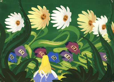
The flowers in Disney's Alice in Wonderland have attitude issues. Friendly at first when a downsized Alice approaches them, but then their demeanor turns hostile. Alice is even called a weed.
This is wonderful personality stuff. Anthropomorphic flowers with definitive character traits. I just love the way blossoms become faces and leaves turn into arms. John Lounsbery animated lot of the flower scenes.
Mary Blair did a ton of color/design studies, all of them stunning. The Technicolor process allowed for an extremely vibrant color palette on the screen.
This post is dedicated to my friend Guillaume, who wanted to become a florist after watching this sequence from Alice in Wonderland as a kid. As a matter of fact, today Guillaume is a highly successful florist in Paris. His work is as beautiful as the images you see here.
Subscribe to:
Posts (Atom)


