Wednesday, August 30, 2017

Filming at the Walt Disney Family Museum


A couple of pics taking yesterday at the Walt Disney Family Museum in San Francisco, during the filming of "The Making of Mushka". My exhibit "Deja View" will run until October 9, and we thought it might be a good idea to film a few interviews there before it ends.
That's Marina Villar Delgado in the first photo, she designs all exhibitions at the museum. An amazing talent. She has an eye for how artwork should be displayed to bring out the personality of the artist.
The second pic shows Sybil Byrnes, daughter of Milt Kahl...and me. We were discussing many things, including the influence of her father's work on my own animation.
It was an extraordinary day!


Sunday, August 27, 2017

Four Old Men & One Young Lady


On February 13, 1957 the Disneyland TV episode was titled:
The Tricks of our Trade.
Walt Disney explains various production techniques, and how his animators study real life to achieve convincing results. At that time the studio was busy with the production of Sleeping Beauty.
In one brief film clip you can see Marc Davis, John Lounsbery and Milt Kahl, as they sketch actress Helene Stanley who is posing as Aurora. Her dress was made by none other than Alice Davis.


The color footage includes Milt Kahl, Marc Davis and Frank and Ollie. This part is scripted, and the animators act out certain situations. They pretend to do research for Fantasia as Helene Stanley acts out a few animal characters from the film. In one scene Ollie shows his drawing of a dancing ostrich to the other artists. Milt criticizes the size of the feet and proceeds to enlarge them right over Ollie's sketch. Again, all scripted, but this is the kind of thing Milt would do anyway.


Milt's version of the Fantasia hippo.


The whole TV episode is included in Walt Disney Treasures (DVD) :
Behind the Scenes of the Walt Disney Studio.
I am not sure if the episode can be found on any Disney Bluray disc.


Friday, August 25, 2017

Sherry Sander


I love great animal sculptures.
Especially when there is movement involved, or when the pose reveals the animal's character.
Sherry Sander is an American sculptor who has high standards and emerges through the often uninspired scene of midwestern wildlife art. There is a raw quality to her work that reminds me of Rodin and the great Rembrandt Bugatti. Sander travelled all over the world to study animals, and it is that research that gives her sculptures a beautiful sense of authenticity.

Here is the link to her website:

http://www.sherrysanderstudio.com


Wednesday, August 23, 2017

From Story Sketch to Final Frame


It's always interesting to compare a story sketch to the way the final film frame turned out.
If you take story man Bill Peet's work, you'll find out that layout and animation poses are extremely close to what need up on the screen. That's because Peet gave a lot of thought in his sketches regarding character personality, scene continuity and overall staging.
Because of this the animators loved working from his story drawings, the scenes were practically half done.
The scene above was animated by Frank Thomas.

Next up is John Lounsbery with his beautiful animation of Madame Mim as a rhino and Merlin as a crab.


Eric Larson animated Mim as a dragon. Here she finds out that she cought a virus named Merlin.


Other story artists were often less thoughtful when it came to posing the characters or good staging in general. I have copies of some of the storyboards for the animated sections of Bedknobs and Broomsticks. Here the animators had their hands full in translating the story sketches into quality images for the final animation.


Monday, August 21, 2017

Mushka in Color


We are so ecstatic to move into final color on our film Mushka. In this scene above we find out that Sarah's and Mushka's sleeping quarters have gotten too small for a girl and a Siberian tiger. Mushka turns over in bed, causing Sarah to fall to the floor. A color pencil texture will be added in order to avoid the conventional cel-painted look. Our final color scenes rock!!
But in end the humanity of the overall story is what will really matters. And I think we have that.
CAN NOT WAIT to share our film with everybody!!

Sunday, August 20, 2017

Milt's Brom Bones


This is the official clean up model sheet for the character of Brom Bones. He appeared in the Legend of Sleepy Hollow section of the 1949 film The Adventure of Ichabod and Mr. Toad.
Milt Kahl supervised the animation of this character. I call this perfect casting, even though he probably would have preferred to animate Ichabod, a much cartoonier character. Milt had this uncanny capability for combining realism with cartoony elements, in regards to design as well as animation. He just knew instinctively how to apply correct anatomy to a cartoon character.
These clean up drawings on the sheet are based on Milt's rough animation. The clean up artist was Iwao Takamoto.
Next up are a few of Milt's roughs.


Here is a previous post on From Bones:


Thursday, August 17, 2017

Eric Larson's Cinderella


Another example of how an animator's rough drawing gets translated for the final screen version.
All rough animation drawings were redrawn and cleaned up on a new sheet of paper (until the 1960s). That clean drawing was then inked on to a cel using multiple color outlines. The shapes were then painted with special colors on the back of the cel.
These drawing/final frame comparisons almost represent the same drawing number, perhaps one or two frames apart. Eric's drawings show a slightly different looking Cinderella from the cel version, as far as facial features are concerned, Nothing a good clean up artist couldn't handle though. I wished I knew who supervised the final clean up for the character of Cinderella.


Drawings were offered at Howard Lowery Auctions.


Tuesday, August 15, 2017

Disney 1949


UK PICTUREGOER Magazine published this article in December of 1949. Disney's latest feature film offering had been So Dear to my Heart. The writer was obviously dissatisfied with Disney having turned to live action/animation mix films. At that time general audiences, too, preferred full length animated feature films.
It is interesting that the absence of those films during the late 1940s is being discussed, due to financial difficulties at the studio.

As for myself, I always thought that the story in So Dear to my Heart is a bit saccharin. But the film is beautifully shot, and the animation is terrific. Milt Kahl's introduction to the Wise Owl character at the beginning of the film is unbelievable. Very appealing, inventive actions and timing.
The three main animated sequences deal with David and Goliath, Christopher Columbus and a couple of Scottish characters, including a spider. All feature spectacular effects animation.


Technicolor publicly thanks Walt Disney for working with them.


Saturday, August 12, 2017

Milt Kahl on Medusa's Cel Colors


After leaving Disney Studios and before moving up to San Francisco, Milt Kahl reminisced about his work on Madame Medusa during a lecture. Here are a few interesting points relating to the amazing image above.

- Milt was a big proponent of the grey xerox line. To him it resulted in a slightly softer representation of the character animation. (During night scenes Medusa's cels were xeroxed in black, which makes perfect sense.)

- Originally the upper part of the towel wrapped around her head used to have the words "H O T E L    R I T Z" embroidered. The idea being that Medusa had swiped the towel from the hotel.
Only one scene shows the embroidering, when she removes her right false eyelash (screen left).

-There were several test cels being painted to explore the final look of Medusa's eyes after the removal of her false eyelashes. Milt was finally happy with what you see here. The outlines of her eyes were inked in flesh color, signaling that there aren't any of her natural eye lashes left at all.
Graphically this makes for a stronger "before and after" statement.

- Medusa's lipstick was painted on top of the cels, unlike the rest of her colors. In this image you can detect some tiny white specs on the half wiped off lipstick. The actual film frame doesn't show this.
But because a pile of cels used to include tissue paper between each cel for protection, some painted areas stuck to the tissue after filming. That's what you see here.

This cel is currently being offered at Howard Lowery:
http://auction.howardlowery.com/bidding.taf?_function=detail&auction_uid1=4736296


Thursday, August 10, 2017

Stepmother's Bedroom


Probably my favorite sequence in Cinderella. Lady Tremaine is about to discipline her stepdaughter by demanding an overwhelming number of chores around the house.
This camera angle is from behind the night stand. The focus is on Cinderella, who is shown in the light. But the grid-like shadow (an effects level) gives the impression that she is in prison. Masterful staging.
Eric Larson animated Cinderella throughout this sequence, and Frank Thomas of course gave the Stepmother her ultra chilling performance.
Above is the film frame grab, below the actual background.


Wednesday, August 9, 2017

Disney Villains Stamps


The United States Postal Service just came out with these Disney Villains postal stamps.
Pretty cool to find among them a couple of characters I helped create. These images were inked and painted on cels at Disney, based on the original clean up drawings from the films.


When I see a pose like this one it takes me right back to when I animated the scene.
"Crazy old Maurice..hmm" , Gaston says here. I recall acting the scene out in front of the mirror in my office. As Gaston (Richard White) says the line I moved into camera placing my left hand on my chin. I tried to play it subtle, so it would look like Gaston is getting an idea about what he is going to do with Belle's father.


On this cel the eye direction was changed. In the movie Scar is looking back at Simba, who has just asked :"Uncle Scar, will I like the surprise?"  "Simba, it's to die for!" Great dialogue writing, and great delivery from Jeremy Irons.


Sunday, August 6, 2017

Let the Match Begin!


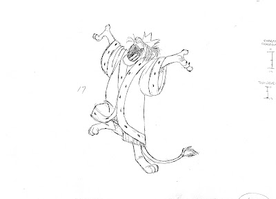
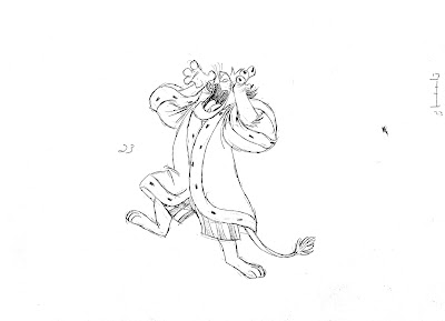
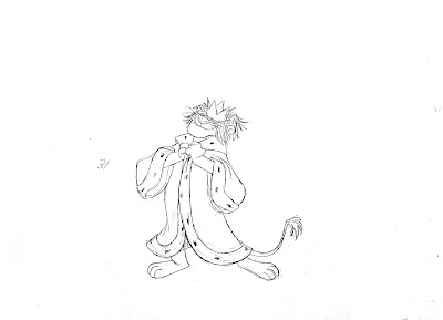
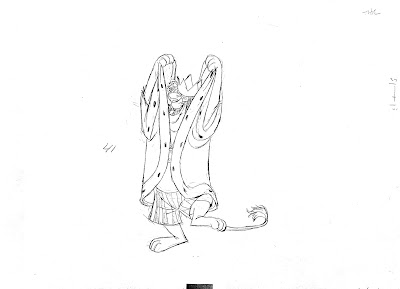
Another great Milt Kahl scene from the film Bedknobs and Broomsticks.
The King is getting rid of his royal coat as he announces the start of the soccer game.
A couple of steps forward and a hop at the end help to punch the dialogue' accents.
And what great treatment on the folds of that coat. The way Milt draws and times its overlapping action gives the coat a real sense of weight.