Sunday, December 23, 2018

The Marc Davis Touch


I love the French!
I am lucky to have worked in Paris for almost one year (Runaway Brain). So fortunate to have many French friends. My command of the language is not very good, but after a glass of wine I seem to be able to get by with French party talk. My favorite language in the world.
I don't need to point out that the French have class and taste.
When Disney published a book on animator/imagineer Marc Davis in 2014, the cover became an issue of discussion. How do you present Marc's remarkable talents?
Disney/US chose a variety of images that cover a few of Marc's achievements. An obvious choice, since he was Disney's renaissance man.
But look at the cover of the French version! WOW! One drawing that says it all. This partial development drawing of Maleficent shows strength in composition, powerful use of color and of course personality. This image is worthy of a poster!

The book does go into detail about Marc's many talents. (I wrote a chapter on his animal life drawings.) In animation he became known as the master of leading ladies, heroines as well as villainess personalities.


The cover of the US book. It does give you more information about Marc's work, but somehow the French version knocks it out of the park.


Saturday, December 22, 2018

Merry Christmas


... Happy Holidays to all of you!
This is a vintage photo to promote Disney's 1967 release of The Jungle Book.
Thumper is a trifle oversized in the back, but who cares...
Growing up in Germany meant that any Disney animated release (or re-release) was around Christmas time. That's why it is impossible for me to separate Christmas from Disney.
Best time of the year by far!!

During this holiday season we are working hard to push our 1/2 hour film MUSHKA to the finish line. I think we need one more year. There is plenty to do, but also plenty has been finished.
Recently a lot of new color scenes have been added to the reel, and I am beyond ecstatic.
We are using TV Paint, so the characters drawings need to be opaqued in white first, before getting the color treatment. We then add minimal highlights and shadows as well as some color pencil texture and film grain.
Beate, Ambrose and Ihabo, thank you so much for your hard work to get the characters to color.
And Natalie, your background paintings are always breathtaking. The look of the film is so beyond what I had imagined.
Matthieu, your staging and continuity work is stunning.
Courtney and Andreas WT, thanks so much for your outstanding animation.
Daniel, your effects animation is FANTASIA like.
And Richard Sherman, you are THE inspiration for our film. Your musical contributions are miraculous. I pinch myself every single day, realizing that you and your brother Robert wrote the soundtrack to my childhood. And to have you write music for MUSHKA is beyond words.
Fabrizio, thank you for arranging Richard's music, and for scoring our film, you are the greatest!
And of course a special thanks to my partner Roger, who wears so many hats on this production.
Editing, prepping BG work and X-sheeets, sound etc.

Here is a frame from MUSHKA, just taken off my TV screen.


© Andreas Deja

Tuesday, December 18, 2018

Song of the South Art


Some more art from Disney's Song of the South. As I mentioned before, Bill Peet's story sketches provided so much information for the animators. Staging, mood and terrific character poses.
And of course they all (Milt, M.Davis, Ollie, E.Larson and Lounsbery) loved taking visual cues from Peet's storyboards. So much energy in his drawings as well as in the final animation. 

More on Peet's Song of the South work here:


A couple of incredible background paintings from the film. With apologies regarding the tar baby image.


Friday, December 14, 2018

More Early Black Cauldron Work


A few of my early Black Cauldron exploratory sketches were recently auctioned off at Heritage Auctions. They come from the film's producer's Joe Hale estate.
I made the drawing above while I was still in Germany before joining Disney in August of 1980.
I had read Lloyd Alexander's books after finding out that Disney was going to produce an animated feature based on his story material.
I still think Alexander's books are fantastic, and would make for a terrific live action film. Or a Netflix series.
I mentioned this before, that when trying to design the oracular pig Hen Wen, a big sow came to mind because she was supposed to have magical visions.
But instead I was asked to come up with a cute piglet type for whatever reason.


If I remember correctly this witches sketch was also done way back in Germany.


This rough design of Taran was based on something Tim Burton had drawn. The idea being to somehow "disneyfy" Tim's character concepts. Well...that just didn't work.


Whoever ended up with these pieces needs to know that the medium used was felt pen and Magic Markers. When framed it is essential to use UV glass, otherwise the colors will fade drastically.


Tuesday, December 11, 2018

Sullivant in Color


Each time I discover a new TS Sullivant illustration I can't help but smiling from ear to ear.
Today brought such a moment when I found this beauty online, "Going to the Races".
Apparently monkeys are in charge here of the rest of the animal menagerie. 
Sullivant loved animals like no one else, being able yo infuse his characters and compositions with such exuberance and joy. 
I have posted plenty of his work on this blog, but there's more coming from my Sullivant files and Life magazines. Some of us just can't get enough of this man's genius.

Here is a link to my first post on TS:

Sunday, December 9, 2018

Jungle Book Art at Auction


Here are some wonderful pieces from The Jungle Book that were recently sold at auction. 
The piece above is a cel set up (matching cel with painted background). I don't know who painted this background, but the animation is by Milt Kahl. What I particularly like about the painting is the fact that some dark line work was maintained to match the characters' outlines.
I would call this a quintessential scene from the movie.

Below are a couple of concept paintings by Art Riley, who was one of Disney's great background painters. Google him and you'll find tons of his personal watercolors.


Friday, December 7, 2018

Story Sketches


It is astonishing to realize that Disney allowed his story sketch artists to work in a graphic style that was comfortable to them, and personal.
Sometimes those sketches were mere character animation poses, other times the whole background scenery was included. It was up to the story sketch artist to put down on paper what would communicate best to Walt, the animation crew, and eventually the audience. The opening scene from Robin Hood by Ken Anderson.


Not sure who boarded "How to Ride Horse" from 1941, but you can see that this story artist was all involved with Goofy's animation business.


Disney's first features were all about light and shadow, so the story sketch artists rendered  the environments as well as he characters.


James Bodrero boarded the entire Pastoral sequence from Fantasia  in color. It helped to visuals what the final film might look like.


Marc Davis did story and character design work on Bambi for quite a few years.
I think Bambi's characters works so well because of Marc's extraordinary contribution.


A fantastic story sketch by Pill Peet for Song of the South. He practically provided the animators with
key poses that could be adapted directly for final animation.


A beautiful story sketch from Cinderella, perhaps by Joe Rinaldi.


David Hall's illustrative style for Alice in Wonderland is complex and a little haunting.


Bill Peet didn't enjoy boarding this sequence for Sleeping Beauty, he much preferred working on material involving Maleficent's Goons.


Bill Peet single handedly storyboarded 101 Dalmatians. Every animator loved working on material Peet developed for a Disney animated film.


This story sketch from Jungle Book reminds me of Bill Peet's children's book illustrations. Simply staged and full of personality. 


Monday, December 3, 2018

Beautiful Things

Heritage Auctions is yet again offering unique and rare pieces of original animation art.
I just love this concept/layout piece from Cinderella. One of my favorite sequences not only in animation, but in film period. This is how the scene was established, even though we never see this particular staging in the film. So powerful, so much personality in just one sketch. I am not sure who drew this, perhaps Ken O'Connor or Ken Anderson.


Anita and Perdita in Regent's Park in London. A beautiful experimental sketch by Ken Anderson.
I posted a similar piece a while back.
https://blogger.googleusercontent.com/img/b/R29vZ2xl/AVvXsEgZMH-UuV1Ff9CN-nXCKbgJKW0FDVLyBAMnzTuVHmqoQ6KO719czLJ-dIJuXPCKN3FVnkbl4nNGmRBRIKd7QazqSX8fv15DO6vUx-CLE19E3ok8n1hQGFiNGE7j5vBnQRmWMGylA-EW6bmD/s1600/KA101.jpg


A publicity cel set up with Walt and Ludwig Von Drake. Magic!!!


Saturday, December 1, 2018

The Ludwig Von Drake Dilemma


Ludwig Von Drake is a great TV character, created late in Walt's life during the early 1960s.
According to one artist who was there at the time, one of the animators who was assigned to this new Disney personality was Marc Davis.
Marc had just finished Cruella De Vil, and he was not eager to "step down" to do animation for a TV character. Marc did produce some animation of Ludwig, which did not meet approval.
Marc moved over to Imagineering instead, and the rest is history.
Milt Kahl took over and designed Ludwig's earliest scenes for his first TV appearance in the 1961 episode "An adventure in Color". Needless to say...brilliant work.
Ward Kimball was put back into animation on Ludwig after Walt's dissatisfaction over Ward's involvement in the mostly live action musical Babes in Toyland.
In the end I believe that Milt and Frank Thomas  MADE the character into the personality we all know today.
A befuddled, often confused yet likeable professor.

More on his personality here:

https://andreasdeja.blogspot.com/2011/11/professor-ludwig-von-drake.html


Tuesday, November 27, 2018

Joe Grant


Joe Grant was one of a kind. I am pinching myself when I think about all those years working with him on various Disney films.
Many of you know know that Joe had a Disney career twice. First from the early 1930s to the mid 1940s, and then again from 1989 until his passing in 2005 at the age of 96.
His quirky sense of humor is evident in his 'Idea" sketches. He would do a series of those, and a new film sequence was born. Or a complete short film. 
Joe didn't mind answering our questions about the Golden Age at Disney, but he rather preferred to discuss the present and the future of animation. He watched almost every animated programing from The Simpsons to SpongeBob. Joe was a student of fine art, some of his favorite "cartoonists" were Kley and Sullivant.
I will never forget right after Joe returned to Disney for a second run, Frank Thomas phoned him and asked: " Why on earth are you back at the studio ?"
Joe replied:"Why aren't you?"


The brilliant short film Lorenzo was Joe's idea. His sketches are on the left, director Mike Gabriel's
designs on the right.


A brilliant caricature by John Musker. Man, would I love to animate this design. 
Oops, I just had an idea for another short film!


Saturday, November 24, 2018

Ed Aardal


Ed Aardal lived from 1910 to 1988. He worked for Disney for twenty years starting in 1935. He originally did effects animation, but was soon sent over to the character animation department.
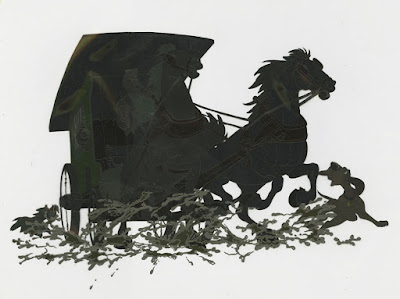
Perhaps because of his effects background Ed was assigned to complex scenes like this one from Lady and the Tramp.
It is amazing to realize that in the final film you barely see a dark silhouette of the dog catcher's wagon, taking Tramp to the dog pound. Yet in animation every detail was analyzed as if this was a daytime scene.
Ed Aardal is one of those unsung heroes who we need to shed light on for his important body of work in animation. I believe this was his last film for Disney before moving on to other studios like Hanna Barbara. An animation legend!
For a 1984 interview with Ed go here:

https://www.youtube.com/watch?v=uag5Pl03luE


Wednesday, November 21, 2018

Naughty


I just love this cel from the Silly Symphony Three Little Wolves from 1936. There is little doubt that Fred Moore animated this scene, in which two little wolves pester one of the pigs.
The whole situation is child-like without being childish. The staging of the scene is so beautiful, two bullies messing with one of the pigs.
I have a big smile on my face  looking at this image, because Naughty meets Innocence in a very entertaining manner. You just want to smack these two brats and have them leave the pig alone.
Sincere animation in contrast to Warner Brothers characters at that time, who often acted in a cynical and sarcastic way. (I love Warner's animation as well, because it differentiated itself from Disney's wholesomeness.)
But there is something special about this cel, because the business of the scene is truly based on real situations.
I wished that entertaining, graphic animation like this still existed.


Friday, November 16, 2018

Frazetta Drawings


I guess most of you know of Frank Frazetta's work. His draughtsmanship (as well as painting) is extraordinary. He became known as the world's best illustrator for the fantasy/science fiction genre.
Copied by many, but no other artist has came close to this level of expertise.
The depiction of his women and men are sexually charged figures within various storytelling themes.
Bodybuilders and pin up girls. His animals and monsters are strong and muscular as well.
Frazetta goes for maximum dramatic effect in his composition to dazzle the viewers.
There is a sense of ease in his line work. I particularly like his loose drawings. Marvelous doodles that continue to inspire today's animators and illustrators.
I would call him a modern Heinrich Kley.