Sunday, December 31, 2017

Disney's Christmas Carol 1957

From Mc'Calls magazine, many years before the animated Mickey's Christmas Carol.
My guess is that the images were sketched by Bill Peet and then painted by one of the studio's background painters (some of them did illustration of Disney stories for Golden Books).

Happy New Year!

Here's hoping that this will be my year of the tiger...


Tuesday, December 26, 2017

Developing the Character of Penny


I believe this early sketch of Penny from The movie The Rescuers is by Ken Anderson.
When child actress Michelle Stacy was chosen to voice the character, animators Milt Kahl and Ollie Johnston based their drawings a little after her appearance.
Michelle also posed as Penny, but I do not know if she was filmed or just photographed.
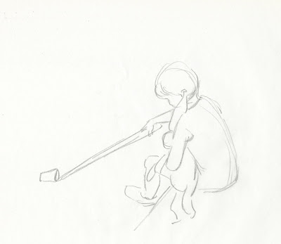
Ollie Johnston sketched these poses from that reference. You can tell that Ollie was looking for a certain melancholy within the personality. One of his key sequences to animate was the sentimental moment where Rufus the cat tries to comfort Penny in the orphanage.


Go here for previous posts about Penny:

http://andreasdeja.blogspot.com/2013/05/vance-gerry-ollie-johnston.html

http://andreasdeja.blogspot.com/2013/09/john-pomerys-penny.html

http://andreasdeja.blogspot.com/2017/01/milt-kahl-drawings-of-penny.html


Saturday, December 23, 2017

Gurgi


Tim Burton's preliminary designs for the character of Gurgi from The Black Cauldron fetched a big $ amount at Heritage's recent animation art auction. After all it's Tim Burton!!
Milt Kahl's version of the character sold for a lot less, after all, who is Milt Kahl??
When working on early designs (during the late 1970s), Milt "recycled" shapes and forms from some of his previous characters. I would say that his Gurgi is a mix of King Louie and Tigger...sort of.


I myself had just a little to do with the final appearance of the character. Animator Hendel Butoy came up with the final look of Gurgi and did beautiful fluid stand out animation.


Tuesday, December 19, 2017

Holiday Greetings


I don't know how far these marvelous Christmas cards by Mary Blair date back, my guess would be the 1960s. Her flat style with its geometric shapes reflects a mid-century modern style, but by now it looks timeless to me, because of its ultimate appeal.

I love the character illustration in this add. Minnie Merrell made somebody happy with a one year subscription gift for Walt Disney's Comics and Stories way back in 1939 or 1940.
If current representations of the classic Disney characters could look only half as charming.


Disney background painter Ralph Hulett created this beautiful nativity illustration. Hulett was a prolific watercolor artist, but he actually felt comfortable with the use of any type of paint. I presume this painting is acrylic.


Images Heritage Auctions

For more of Hulett's Christmas art go here:


Monday, December 18, 2017

Disney Cel Set Ups


About a couple of years ago auction house Bonham & Butterfields offered a number of beautiful Disney cel set ups. To see them lined up like this showcases again the studio's exquisite color palette for its animated films.
Disney background painters as well as color model artists (who came up with final colors for the characters) were experts from the beginning. Even the early Silly Symphonies displayed a refined sense for color that enhanced storytelling and character development.
One big challenge had always been to choose flat cel character colors that would fit in with the more rendered backgrounds. Not an easy thing to accomplish.

To me Disney's film images have always been a feast for the eyes and the senses. They make you feel something, you get emotionally involved.

Some of these backgrounds match the actual cel, others were specifically painted by studio artists for sale.


Friday, December 15, 2017

Cheers


I have posted a black & white version of this beautiful Milt Kahl design drawing for Sleeping Beauty before. Here it is again in color. King Hubert, King Stefan and the Lackey, all totally different personalities and body types. A celebration of pristine shape variety and contrast.

Cheers to a wonderful holiday season!


Wednesday, December 13, 2017

More Early Black Cauldron II


Certain items from the recent Heritage Auction brought back a lot of memories. Look at this dynamic pastel by Mel Shaw, Mel's room was filled to the brim with extraordinary artwork like this. He must have created hundreds of images for The Black Cauldron. One of the most prolific Disney artists I have ever encountered.
These were the days when the studio had several unique artists trying out for the film's character designs. The original idea was noteworthy, a new fresh style might have been the result.
Before I started on the movie, Milt Kahl, who had left the studio after The Rescuers in 1976, was approached to help out with character concepts. At that time Milt lived in Marin County, just north of San Francisco.
I remember during my first visit, he showed me prints of the designs he had come up with.
Milt said that these kind of characters would be easy for him to animate, but that the studio at the time didn't have artists with the kind of caliber to pull this off. He was right.
But the question remains: Should we even have bothered trying for the Milt Kahl Disney house style?
After all, Tim Burton was working feverishly to present his unique vision for the film.


I don't think I ever mentioned that Marc Davis also contributed design ideas. These sketches lack the graphic "bite" Marc was known for, but his staging is still beautiful.


Tim Burton was also extremely prolific during the early stages of The Black Cauldron. But the studio wasn't ready to apply his approach for the movie. 
I remember discussing the need of life drawing with him. He said: "I need anatomy classes more than anybody in the world."


All of this occurred more than 35 years ago!!! That's an insane realization, because I remember it like it was not so long ago.


Tuesday, December 12, 2017

Cinderella Photostat and Final Frame

Eric Larson animated this scene in which Cinderella enters frame with a teakettle and starts pouring hot water into one of the teapots.
Photostat and final image might be a couple frames off, but you can see Eric's graphic choices bases on the live action reference. Cinderella's head is tilted more toward camera so that her face is easier to read.

Amazing that the prop trays and cups are exactly aligned for the animation. But then again they had to, since their arrangement are an important part of this gag sequence involving Lucifer.
One thing I noticed is that the inking of the saucers on the cel looks poor, the ovals are all off.
This movie was rushed through production, and sometimes it shows.

But who cares, when you have such a great story and beautiful character animation!


Photostat - Van Eaton Galleries


"We Must Both Look Our Best for George"


...He is our oldest and dearest friend, you know."
English character actress Hermione Baddeley read those lines in this scene as Madame Bonfamille in The Aristocats.
Even after all those years I am still baffled at how amazingly Milt Kahl animated this realistic character with grace and believability. Of course he simplified her human figure, and what you see are vintage Kahl shapes and forms. Disney layout artist/producer Joe Hale told me once: " Only Milt was able to pull off stylized designs with strong straight lines against curves."

I just love her elegant movements and charm. And the fact that the drawings were kept rough and loose doesn't bother me at all.  I call her a "mini Kahl masterpiece".