

Here is an interesting experimental pre-production cel set up for one of the early scenes from Sword in the Stone. The photo shows a lot of cel reflections, but it still makes for some fascinating study.
The color styling is more monochromatic here than in the final version of the film. Wart's character drawing was done by Milt Kahl. His face is more caricatured, particularly the nose. "Walt didn't like the nose, he made me change it" Milt explained to me during one of my visits.
As I mentioned before, I much prefer this early design, it has more personality.
Look at these beautiful sketches Milt came up with before he started animation.

The sequence -like the whole film- had more color variety, based on Walt Peregoy's design concepts.
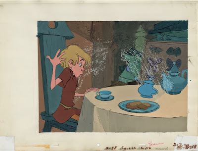
Walt Disney was never happy with this kind of color styling, he much preferred a more muted approach. The following feature film The Jungle Book would be painted without xerox lines as part of the background styling. Although the graphic look did resurface in the Winnie the Pooh featurettes as well as the full length productions of The Aristocats and Robin Hood.

By the way, watch The Sword in the Stone on Amazon Prime. It will cost you a few dollars to purchase the film, but it's worth it. Amazon offers a pristine 4:3 presentation, unrestored. It looks incredible!!