Saturday, November 26, 2011

Early "Black Cauldron"

Here is a blast from the past. 
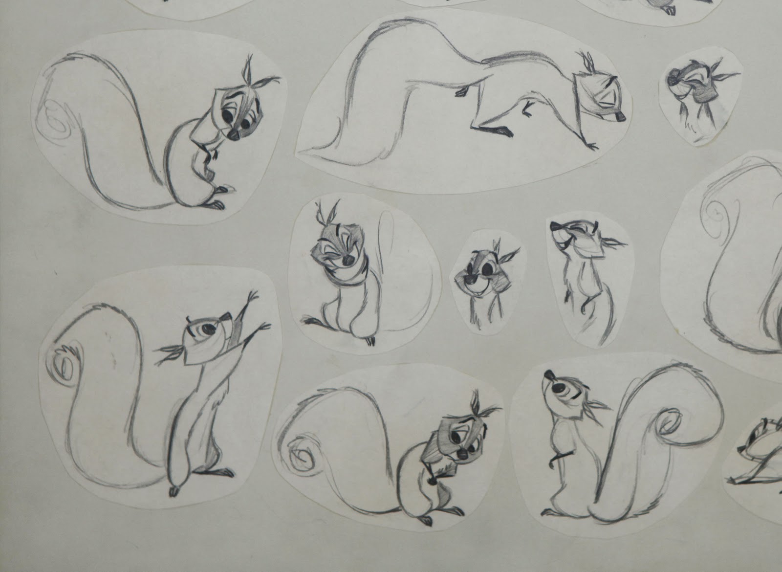
I have been going through my old application portfolio for Disney, and I am taken back to around 1979. There are life drawings, animal sketches and attempts at character designs. (I will post some of that stuff soon.) But even then I was already drawing (potential) Disney characters. I knew the studio was gearing up to produce "The Black Cauldron", based on the books of Lloyd Alexander. So I bought the books, read them, loved them. I started to imagine what characters like Taran , Princess Eilonwy, the Horned King and the witches might look like. 
I had a blast, because I had never done anything like this before.
Later, when I showed my design ideas to Disney, they liked them enough to photograph them and share them with other artists. I was flattered beyond belief.
So this is a small selection of a bunch of art I dreamed up for "Cauldron" before I started at the studio.


Friday, November 25, 2011

Animation's Most Beautiful Squirrel

There are many great squirrel characters in the history of animation.
Tex Avery's hysterical Screwy Squirrel, Chuck Jones' charming squirrel from
"Much Ado about Nutting", and the list goes on.
To me the most beautiful and elegantly designed is the squirrel from "Sleeping Beauty". Based on rough character sketches done by Tom Oreb (first Image), it was Milt Kahl -again- who drew the final design and animated a few important personality scenes. The drawings below are actual animation keys, which were cut out and mounted on to this model sheet.
I purchased a single pose from it (the one on the top right) a few years ago. It had been separated from the sheet and then reproduced for Disney's  "The Art of Animation" exhibit, which toured the world in 1959 to help promote the release of "Sleeping Beauty".
To my absolute delight, the original model sheet (minus that one drawing) was offered to me years later, and I was able to complete it again.

The animation of the character is charming with a lot of spunk. My favorite scene is when the squirrel reacts to Aurora's resignation, that the prince exists only in her dreams. Milt animated the most heartfelt, sympathetic sigh...it's adorable!

Yet when you study these drawings up close, you'll find out that they are much more than adorable. There is a graphic perfection, a conviction that this is the best and ONLY way to draw this squirrel. And yet it doesn't come across as cold, calculated precision.
On the contrary, these drawings are so alive because Milt thought about appeal,charm and personality when he was doing them.

A little character with a small role, but a high point in the career of Milt Kahl.


Tuesday, November 22, 2011

Madam Mim

Of all Disney animated classics, "The Sword in the Stone" was the last one I saw way back, in a re release in theaters. I was already an art student by then and appreciated beautiful design and animation.
When Madam Mim appeared on the screen I was blown away. There is great sophistication in her design, and her acting is fresh and full of life.
Walt Disney assigned Milt Kahl and Frank Thomas to this character, knowing that if you combine their creative forces, nothing but great stuff would come out.
Milt had perfected the way he drew hands in his animated scenes. The fingertips are squared off, and the fingernails are placed with realistic perspective. 
To give the design contrast, her body is kept short and chubby, her arms and legs are very thin and boney.
Both animators just loved working on Mim, and they agreed that there should have been more of her in the movie.
Milt's animation is full of inventive moves, like funky dance steps and hops. When Mim turns into a "beautiful" witch, her moves are almost risque.
Frank had a lot of fun with her dialogue scenes. His acting is eccentric, too, but it feels very believable and grounded.
Here is the first part of her intro in pencil test form.


These are a few of Milt's rough key drawings, beautiful and perfect.


Here you can see how Milt helped out with Mim drawings for a few Frank Thomas scenes. In doing this, graphic continuity was guaranteed.


These scans show you how Frank handled Madame Mim. His drawings are a mix of caricature, subtlety and realism. I have almost all rough drawings from this scene, where she comes up with her own rules for the Wizard's Duel (One of my all time favorites). 
I will add a few missing inbetweens myself and show the whole pencil test at a future post.


A gorgeous cel set up from the opening scene.


Sunday, November 20, 2011

Wart, Future King of England

Just got back from CTN in Burbank. Had a great time, mingling with animation students and professionals. Kudos to Tina Price, she rocks for putting this expo together.
On a late Sunday night, here are images that show design ideas for Wart from
"Sword in the Stone". At the end of that film Wart is crowned to be the future king of England. As far as making this situation visually entertaining, several artists knew there could be fun in showing young Wart wearing a crown on his head that doesn't fit him. I am not sure who drew the first two sheets, the style reminds me of Bill Peet and Vance Gerry.
The following drawings are by Milt Kahl. I never quite understood why Milt 's only screen credit for character design was "Sword in the Stone". Considering all the design work he did for other movies, it seems like an oversight.
As you can see, Milt based his studies for an oversized crown for Wart on earlier 
sketches. And this is typical for how he worked. He looked at drawings that had been done by other artists, and then he refined those ideas and polished them.
The last image was drawn for Ollie Johnston, who animated these final scenes in
the movie.
Disney team work in action.


Tuesday, November 15, 2011

Medusa, Woman of many Faces

These are a few more of Milt Kahl's extraordinary roughs for Madame Medusa.
It's the range of expression that floors me. Look at the mouth shapes, they can be small, almost minimal, or wide...and I mean WIDE open.
Milt said in an interview:" I sometimes go very far with open mouth shapes, more than other animators. I guess, I am feeling something there...."
As a matter of fact,  the mouth is open so wide, he almost breaks the jaw.
But....if you ever studied people's dialogue when they are in an extreme mood,
or singing (especially opera), you find out these extremes exist in real life.
Part of animating believable dialogue is to go this far OCCASIONALLY when a particular strong vowel calls for it. 
A character says :"How are you?". Which of the three words is emphasized?
It could be either one. Listen to the track and decide . Go bigger on that one vowel.
If you have a big mouth shape on ALL three, your dialogue and acting will look
too broad, overdone and unnatural. On the other hand if you don't go broad once in a while, your animation will look bland and too understated.
All this stuff comes with experience and developing an opinion about when a piece of dialogue looks and FEELS right in animation.


Sunday, November 13, 2011

Early "Jungle Book"

Here are a few "Jungle Book" pre production images I want to share with you.
The first painting is a background study by Walt Peregoy. Walt had been in charge of color and some layouts for "101 Dalmatians" and "Sword in the Stone".
He brought a great sense of experimentation to these projects with unusual colors and strong graphic design.
By the time the style of  "Jungle Book" was being developed, Walt Disney opted for a softer, more painterly look for the backgrounds. Peregoy disagreed with that approach and left the studio.
Personally I love the final art direction, but a jungle influenced by Peregoy's abstractions would have been stunning, too.


This is a simple Peregoy jungle backdrop with a character cel overlay.
The drawing is by Milt Kahl, and I love the rough quality in it.


Here we have another early Milt Kahl drawing, made into a painted cel. It's interesting to see that Milt drew black spots on Bagheera. I think it looks kind of cool as it reflects the appearance of a real black panther. But for economical and perhaps aesthetic reasons they were dropped in the final design.
As far as the background sketch, I am 90% sure it is the work of Vance Gerry.
In any case it's interesting to study these works in progress and to find out what kind of art was produced to get to the final result.

Friday, November 11, 2011

TS Sullivant 3

Another selection of TS Sullivant illustrations from Life Magazine.
The beautiful balance between detail and simplification is something worth studying. Look at the lioness in the first image for example. Her face, hands and feet are drawn with realism, her upright body pose is effectively simple.
Everything reads very well. Lesson: Simplicity is best, add a few details to give the design some texture and focus.

The rhino in the next cartoon is pure joy, proportions and appeal to perfection.
Sullivant draws everything well, and with a sense of invention. Bunnies, tigers, monkeys, humans and even dinosaurs. Although the dialogue on that one makes you kind of sick, knowing what it refers to. Gotta love your animals...

On a different note, Milt Kahl's daughter Sybil has left a comment on the Madame Medusa post.
It's pretty funny, check it out!