Tuesday, October 14, 2014

The Power of Breathing

I know, this sounds like advice from some health lifestyle guru.
During my online talk last Saturday I mentioned the importance of having your character breathe.
Particularly during a quiet moment, before he or she begins to talk, showing the shoulders go up and then down again during the exhale/dialogue, adds a tremendous amount of life.    
The fact that you can have your drawn character (or CG model) fill its lungs with air makes everybody believe that this is a living being. Breathing is the most basic human (or animal) trait, and is instantly connected to having a soul.
For the most part animating a breath is pretty simple. The shoulders rise, the head moves along, and the chest might come forward. (This pose should last for at least eight frames) Usually the face doesn’t need to face downward, then upward for overlapping action in a subtle move like this one. 
It is a good idea though to move the head upward during the exhale to contrast the the shoulders downward motion. 
If the sound of the inhale is in the voice track, I would definitely animate it and make it a part of the overall acting. If there is silence, but you have a little pause, I would still try and show an inhale.
You are always looking for moments that add real life, and this is one of them.

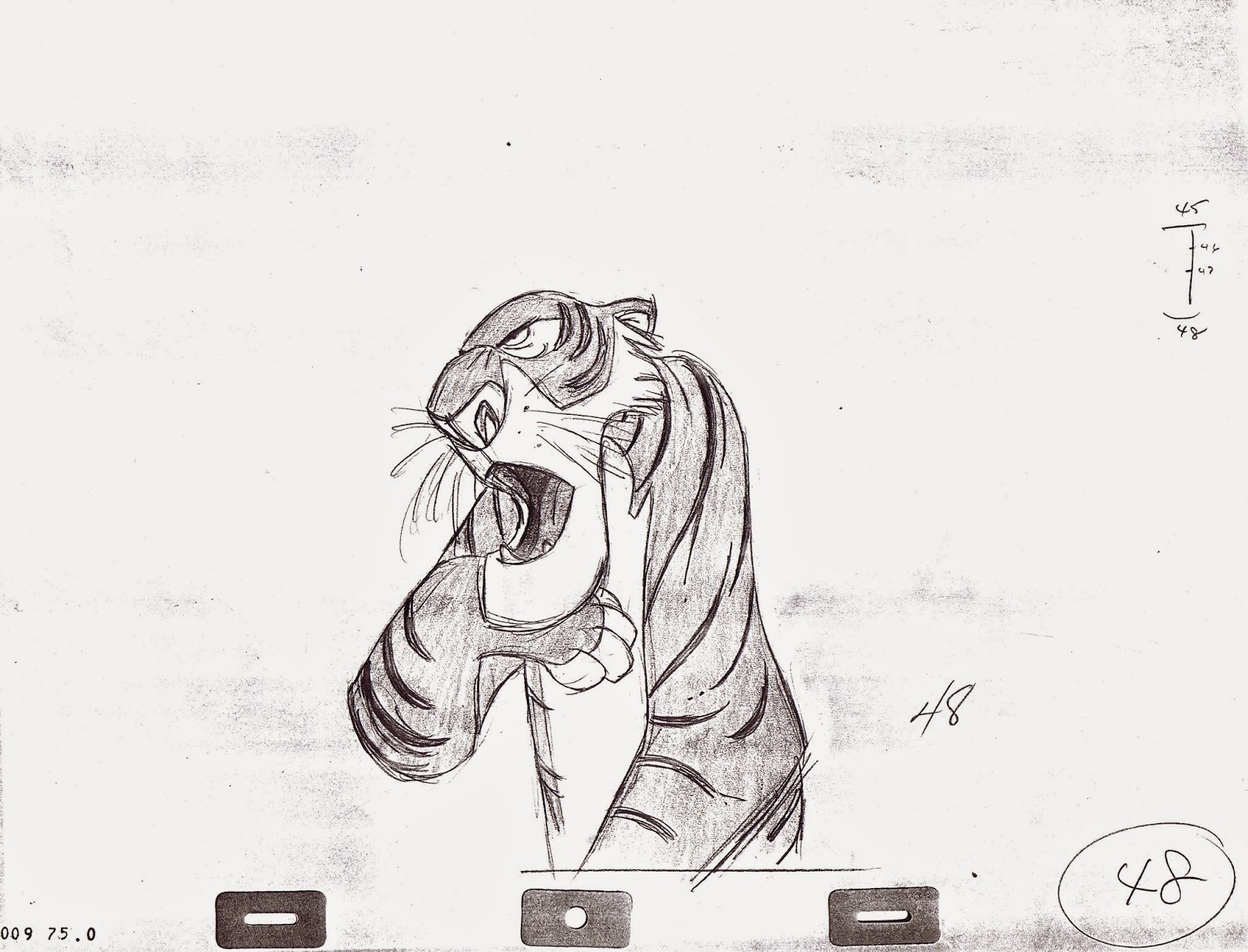
Milt Kahl animated these inhales very convincingly within different moods.

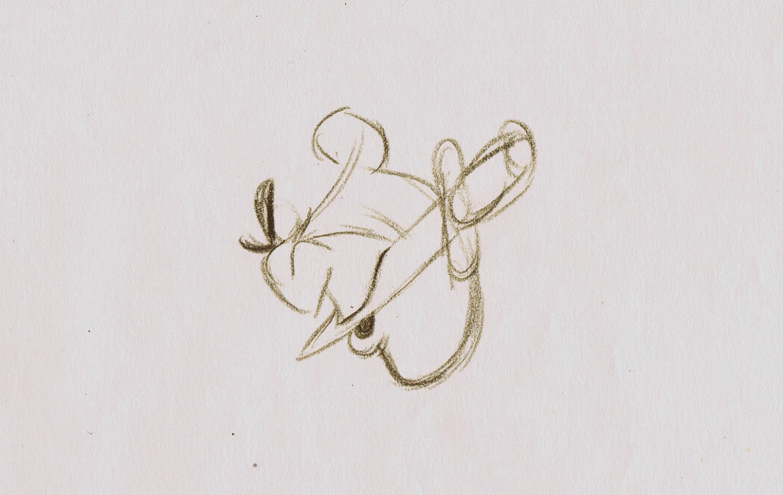
Shere Khan is mocking the vultures singing after taking a deep breath.


Medusa becomes furious when she talks to Snoops on the phone.


Wart sighs in respond to Merlin’s encouraging words.


PS. I'll answer all of your questions in connection with the "Virtual Animators" post shortly.

Saturday, October 11, 2014

Drawing Help from Kahl


The Peter Pan scene pictured above was animated by Eric Cleworth. But since Milt Kahl was the supervising animator on the character, he gave Cleworth this one key drawing, which shows Pan being goofy as he interacts with Captain Hook during the Skull Rock sequence.
This kind of drawing help was a big part of Milt’s job at Disney. Since he was the authority on quality drawing, other animators frequently asked him for drawings that would help make their scenes look better.
Milt resented this to a point, because it slowed him down as an animator, but he also knew that this process was necessary to ensure a high level of drawing throughout the picture.

As a result you find many characters and scenes that Milt never animated, but they do benefit from that Milt touch. Then there are animators like Frank Thomas who on occasion wasn’t happy with what Milt came up with, because he felt that the re-drawn poses had lost the essence of Frank’s acting.
You can see how this could become a problematic issue, but in the end I believe Milt’s “quality control” was a good thing that helped to establish visual consistency in the Disney films. 


What beautiful clarity in these broad expressions of a pirate.


Milt's early version of of Mr. Smee, which animator Ollie Johnston used as a visual springboard, but then greatly improved upon.


Thursday, October 9, 2014

Joe Rinaldi II


Here are more luscious drawings by story artist Joe Rinaldi for Lady & the Tramp.
They are story sketches as well as publicity artwork. Full of charm and personality. It’s interesting to compare Rinaldi’s early version of the encounter with the beaver (above) to the later re-drawn sketch, which shows the characters closer to their final appearance in the film.  
I am sometimes startled to realize just how many great artists worked in Disney’s story department.


A publicity cel set up with the movie’s main characters.


If you'd like to see more of Rinaldi's work on this film, go to:

http://andreasdeja.blogspot.com/2013/04/joe-rinaldi.html

Monday, October 6, 2014

Virtual Animators


A little while ago I was invited by my friends over at Virtual Animators to give an online lecture on character animation. We settled on this coming Saturday, Oct. 11. Buddies of mine like Don Hahn, Kathy Zielinski and James Lopez have already been involved in this lecture series, and I feel honored to be in their company. Click here for more details:


Since I am in the process of putting material together for Saturday, I thought I’d ask you what kind of specific subject I should talk about. Is there anything I haven’t covered on my blog, something that might be useful to you? My main objective is to give you ideas about what could help you make your characters come alive.
As you know there are no tricks or formulas to good character animation, but there are things I can point out that you might not have thought of. Let me know.

I look forward to interacting with some of you on Saturday.


A few throw-away roughs from the villains I animated, plus Mama Odie.


Sunday, October 5, 2014

Pinocchio Art II


Atmospheric studies and layout sketches from Disney’s film Pinocchio show a level of sophistication and dedication that leaves the viewer mesmerized. There is attention to detail, but nothing is over-noodled. The lighting compares to Rembrandt’s work. Disney artists were on a high, following the incredible success of Snow White. 
Long before photoshop and cintiq tablets, these drawings were carved out on paper surfaces with PENCILS. I know, how ancient. 
But look at the feeling and love for the medium in these incredible images. They date back to a time when giving all you’ve got was required and even demanded from Disney. 

Breathtaking work like his was being produced on a daily basis at the studio. It is still unparalleled, to this day. But…what an inspiration!!


Here is the link to Pinocchio Art I :

http://andreasdeja.blogspot.com/2013/06/pinocchio-art.html

Thursday, October 2, 2014

Toot, Whistle Plunk and Boom


Looking at stills or artwork from this 1953 Disney short reminds us just how great the need had become for graphic change at the studio. While quite a few short films from the 1950s showed a  commitment and drive toward experimenting, the Disney animated features would continue the style that was established during the 1940s. It wasn’t until Sleeping Beauty came along in 1959 that a new modern approach toward drawing and animating became evident to audiences. Many Disney fans were disappointed with these flat graphic designs, but the Disney staff needed to go places, and modern art continued to influence the animated films. 
Artists like Ken O’Connor, Eyvind Earle and Tom Oreb would lead the way toward re-shaping the Disney look. While animators like Marc Davis and Milt Kahl were delighted at facing these new challenges, others struggled at the beginning while trying to incorporate strong design into their animation.