Sunday, November 29, 2015

The Truth about Mother Goose


What a great color sketch by Eyvind Earle for the Disney featurette film The Truth about Mother Goose. Disney Wiki says this about the film:

The Truth about Mother Goose was an animated short, released on August 28, 1957.
It explained the historical backgrounds of three popular nursery rhymes, "Little Jack Horner", which is based on a story about a servant who stole the deed for an estate intended for King Henry VIII of England. "Mary, Mary Quite Contrary", which is about Mary, Queen of Scots, and "London Bridge", which concerns the history of the real bridge, which "fell down" and was rebuilt.

The film was directed by Woolie Reitherman and Bill Justice. I love the art direction, starting with Toot, Whistle, Plunk and Boom from 1953 Disney Modern was in full swing in a variety of short films and eventually the feature film Sleeping Beauty.


A group of animators headed up by Cliff Nordberg was responsible for the mostly limited, but beautiful  style of movement.


Wednesday, November 25, 2015

From the Desk of...


All supervising animators at Disney had personalized note pads, like this one by Milt Kahl.
The sheets were small size, just enough to put down a note, the animator might leave at someone's desk, or send through interoffice mail.
I was delighted when Milt's daughter Sybil recently sent me a note written on her dad's "Disney stationary".
Below is a key drawing from one of Milt's many extraordinary scenes for The Jungle Book.
I have spent a long time studying these vultures interacting in this shot. One of them, Ziggy, is determined to investigate the man cub Mowgli, who happenes to pass through their surroundings.
All four birds are lined up in a tree, when Ziggy starts pushing Dizzy, who then puts Buzzie out of balance and so on. In the end all four buzzards plunge down toward Mowgli.
The scene is on one's and incredibly involved as far as one character's actions affecting another, it is beautifully animated and proves that Milt Kahl is one of the hardest working animators of all time.


I will have more key drawings from this remarkable scene in the near future. It should have been featured in the Milt Kahl chapter of my book!


Sunday, November 22, 2015

Fred Moore Pin Up


Had a fantastic weekend at CTN. Met some terrific people from all over the world, and it's always great running into artists I used to work with.
A little short on time, here is a great Fred Moore pen and ink/watercolor illustration, featuring his usual subjects.

Image Heritage Auctions

Thursday, November 19, 2015

Keynote and Book Signing at CTN


This is CTN weekend!
I will be giving a keynote presentation on the topic of Disney's Nine Old Men on Saturday 11/21, at 12:30PM in the CTNers Lounge. It will include rare interview clips, fantastic art and pencil tests.

On the following day, Sunday 11/22, at noon I will sign copies of my new book in the book signing area, which is in front of the City Ballroom.
See you there!


Sunday, November 15, 2015

Disney's Most Modern


It's strange for me to realize that the most modern Disney animated feature goes back to 1961. That's over 50 years ago!!
Anything that followed (with the exception of Sword in the Stone) went back toward more conventional realism, and with the advent of CG toward hyper realism.
There is something very beautiful and important that's been lost. Stretching an audience's imagination by telling a story with visuals that are sketchy, raw line drawings and organic shapes meant that they accepted the film as a piece of art as well as entertainment. Pongo and Perdita are most definitely flat and graphically sophisticated representations of Dalmatians. Yet no audience has ever had trouble accepting them as real personalities facing real problems.
I love the snow scene above. The imagery is stylized, but the light hitting the dogs' tracks seems real.
To me this is intriguing, fascinating...and amazing.


At the end of the film Cruella's car crashes with the Baduns' truck, she gives off one last rant in utter frustration. She, along with Jasper and Horace, is depicted fairly small on the screen. The overall scenery includes the accident's wreckage.
A while ago when I was working on the Marc Davis chapter for my book, I came across the actual animation drawings for this scene. It was surprising to find out that Marc animated Cruella full size, in great detail, before her image was scaled down to fit the scene's layout.
I found myself laughing out loud at the facial expressions and body motion. There was no doubt that this scene had to be part of Marc's chapter. You'll find thirty delicious key drawings in the book.


Thursday, November 12, 2015

How rough, how clean ? II


Another batch of animation drawings that show a variety of styles. The Sneezy drawing above shows
that animator Fred Moore worked very fast and intuitively. Since he designed the final models for all
dwarfs, the clean up artist didn't need to change anything. Proportions and volumes are all in place, only a few loose details needed to be redrawn more specifically. (Like a line that separates the  
sole from the shoes' top).


Believe it or not, but this Kahl rough drawing of Pinocchio drawing as a real boy needed to be altered.
The size of his hands is much smaller in the final version of the scene. Milt most likely redrew a few hand key positions, so clean up knew how to handle the new size correctly. When it comes to hands, I can not imagine Milt leaving any changes to someone else.
Also, I remember him saying how tired he was at the end of production on the film, he wished he could do those last scenes over.


A rough from an early Art Babbit scene that was cut from the movie. Structurally there would be a bit of work left for the assistant. Hair, hands and upper body aren't quite as solidly drawn as the actual model of Geppetto.


A very clean drawing of Cinderella by Marc Davis. I remember him saying: "If YOU don't draw it well, nobody else will do it for you."


Ollie Johnston always had that light touch in his animation drawings, which allowed him to get through his footage pretty fast. Even at this speed Alice is drawn on model. A beautiful sensitive approach.


Milt became so confident and thorough in his drawing ability that nothing was left for possible misinterpretation. In this sketch he drew the upper body, while hands and legs were traced from a previous key drawing. (Those parts were not moving and held still.)


A lively key drawing of Peg by Eric Larson. All the clean up  assistant had to do here is find consistent patterns for all that moving fur. And that assistant was Burny Mattinson, who still works at the studio, in story.


John Lounsbery didn't leave his assistant guessing, Everything in this drawing of Tony is beautifully worked out and designed in a clear way. John had great rhythm in his work and tons of appeal.


Another Lounsbery key drawing this one depicting the Mock Prince from Sleeping Beauty.
Without the owl's wing flapping, this whole idea might seem highly questionable as far as logic, but Louns completely sells the idea.


Maleficent by Marc Davis as a stylized graphic design. Look at the power of lowered eye lids, 'up to no good' evil. Marc's charts were always even, no key drawing was ever favored. You'd think animation timed like this would float across the screen, but somehow Marc's scenes still show contrast within the acting. It goes to show you, every Disney animator structured a scene his own individual way.


Lots of experimental, rough work was done on the Dragon by various artists. By the time animator Eric Cleworth started production animation, his drawings were crisp and very solid, as the second image shows. Amazing design!


Another example of how gently Ollie Johnston puts his pencil to paper. Sir Hiss momentarily incapacitated.


No greater feeling than seeing your OWN drawings on the screen. You can't blame clean up for the scene not looking good, it's all YOU. I know Marc and Milt loved the whole idea of Xerox.


Images Heritage Auctions and  Howard Lowery.

Tuesday, November 10, 2015

Aristocats Stuff


I really like Ken Anderson's Vis Dev work for The Aristocats. Frank Thomas felt that Ken's work lost strength after his stroke in the early 1960s, but to me his art certainly never lost any charm. Just look at this sweat color gag sketch featuring Marie.


I don't know who the artist is behind this sketch, but I do love the atmosphere and staging.


 A couple of Anderson gag drawings showing that the kittens are spoiled and have the run of the house.


Development art by various artists for Duchesse, who was voiced by Eva Gabor.


Madame Bonfamille, animated by Milt Kahl, is a favorite of mine. She is a realistic, straight character,  brought to life by Milt Kahl with extraordinary nuanced performances and drawn absolutely beautifully. The character was voiced by British actress Hermione Baddeley, who had played a maid in Mary Poppins.
Sunday, November 8, 2015

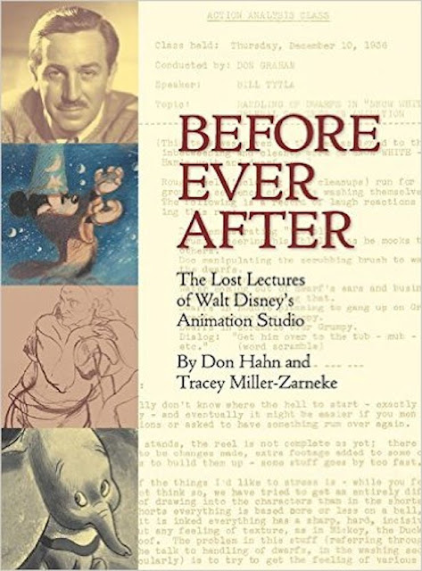
Before Ever After


If you -like me- ever wondered how on earth Walt Disney's artists reached such astronomical artistic heights, you will find some answers to that question in this new book.
The short and feature films during Disney's Golden Age didn't just happen because the staff was talented and could draw and paint well. At that time there was a serious program in place which involved drawing classes as well as lectures with topics such as acting, architecture, color theory, caricature and anatomy to name just a few.
The best authorities and teachers in these fields stopped by the studio to give an insightful talk or they  were put on staff and taught on an ongoing basis.
Luckily these lectures were transcribed back then, and thanks to Don Hahn and Tracey Miller-Zarneke, who spent a considerable amount of time searching for these treasured documents, we now can all relive and learn from Walt Disney's art training program.


This is a big book, 448 pages full of photos, sketches and reproductions of those vintage pages, which reveal words of wisdom by in-house artists like Bill Tytla, Don Graham, Ham Luske and many others.
Visiting artists include architect Frank Lloyd Wright, painter Jean Charlot and color expert Faber Birren.


I think I am going to tattoo that Walt Disney quote on my arm, it is so true!

One of the most important and and inspiring books on animation ever published:

http://www.amazon.com/gp/product/1484710819/ref=s9_simh_gw_p14_d0_i1?pf_rd_m=ATVPDKIKX0DER&pf_rd_s=desktop-1&pf_rd_r=1QC90QBHM6G035M7APS9&pf_rd_t=36701&pf_rd_p=2253014322&pf_rd_i=desktop


Thursday, November 5, 2015

Technicolor Flowers


The Flower Ballet from Fantasia's Nutcracker sequence has always been one of my favorite pieces of animation. What an unusual mix of effects and character animation.
The storyboard pastel sketches are breathtaking as well. I wished I knew who drew them.


Images: Heritage and Bonhams Auctions